

BEST BUY - STORE INVENTORY APP
I took over an inventory app already live in pilot stores, caught a systemic design flaw, and redirected the work before the inconsistencies spread.


Problem & Goals
Best Buy was rebuilding its Supply Chain app onto a new platform, one feature at a time — starting with stores that use binning and tasks run on handheld scanners (TC-52). A few scenarios were already coded and live in pilot stores.
I took over the app when the previous designer moved to another project — I had more experience with this kind of work, so the team moved me onto it. I inherited their Figma files, a few coded scenarios, and "Pull Products" as the next feature up. I started by logging bugs against the handed-off files to get familiar — and that familiarization surfaced the real problem: the new app was shipping inconsistent patterns. Five different ways to show you could scan; common actions accessed differently from task to task. Left alone, every new feature would compound the design and engineering debt.
Role & Accountability
Role: Design Lead — accountable for every new scenario in the app going forward, plus the design system and patterns underneath them. New to the team.
The handoff: A previous designer moved teams, leaving Figma files, a few coded scenarios, and "Pull Products" up next.
Constraints: 4-month contract; scanning hardware scarce even for engineers. No formal usability testing — instead I validated by showing working prototypes to store employees for quick feedback, plus in-store observation and stakeholder review.
Solution
I redirected the work before the inconsistencies spread. First I earned the team's buy-in to fix the patterns now rather than retrofit later — new to the team, I documented every inconsistency and made the case from the customer's point of view. Then I built the system: design principles, one reusable scan component that serves every scan function by swapping only its copy, and the micro-interactions to support it. Several patterns weren't in the BBY design system, so I designed them in collaboration with the design-system team rather than around them.
What I Established
My contract ended at 4 months, before my full pattern set was coded — so the proof here isn't a shipped metric. It's the system, the prototypes, and the team agreement built to outlast me:
5 → 1 patterns to indicate you can scan. The app had five different ways to show a field was scannable; I consolidated them into one consistent pattern used across every scenario.
One scan behavior, reused everywhere. Because every scanning scenario now shares the same pattern, engineering codes it once and reuses it instead of rebuilding per feature — less work, lower cost, consistent for the user.
A reusable component set with consistent motion and transitions — coded once, applied everywhere.
A documented set of design principles, adopted by Product and Engineering.
Prototypes for every scenario, plus the future-state thinking — so the team had a clear picture of what the app would become and could keep building toward it after I left.
A team agreement: all new tasks use the new patterns; legacy tasks retrofit in future sprints — design and engineering debt avoided before it could compound.
Background Knowledge
A Best Buy agent receives items into bins in the warehouse (the back of the store) and stocks the sales floor. They scan the bin and the product barcode to track each item and where it is in the store.
The device the app runs on. A mobile scanner with a side button that fires an infrared beam to read barcodes and QR codes. It's core to Best Buy's supply chain operations — the specific model is the Zebra TC-52.

Android Handheld Scanners
How inventory is organized and tracked. Shelves are divided into numbered sections, or bins, each with its own barcode placed on or above it so it can be scanned.

Binning

Problem
Inconsistent UX for the New Application
I took over from the previous designer as Product Designer and Design Lead. To get familiar with the app, I started by entering bugs against the first coded scenarios — and kept getting confused myself. There were five different ways to show you could scan, and the same action might be a swipe on one screen and a buried menu on another. Left alone, it would only get harder to fix as more features were built on it.
"If I was getting confused on what pattern to use for future scenarios, what chance did an agent have using the app — especially someone brought in for the holiday rush?"
Five Different Ways to Indicate You Can Scan
The most important interaction of a scanning device is of course the scanning action. Taking over the design for this project, I didn’t know what pattern to use since there where so many different ones. Also, the Handkey button was in a prominent position for an action that is rarely used.


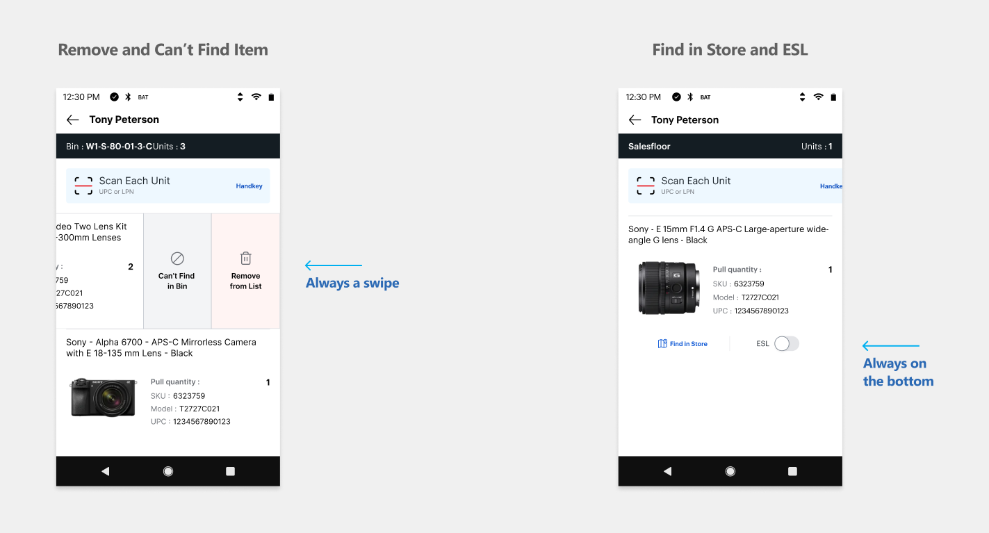
Inconsistent Ways to Access the Same Actions
Some of the most common behaviors weren’t even accessed the same way in each task. For example, sometimes a swipe would reveal Remove and Can’t Find actions. Other times a swipe would reveal Find in Store and ESL (Electronic Shelf Labels)
Remove and Can’t Find Item


Find in Store and ESL


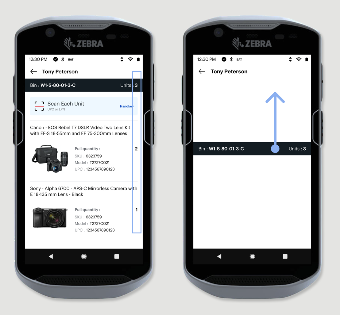
Numbers Are in Different Locations
The placement of numbers lacked consistency. There was no vertical alignment to facilitate easy visual scanning. Additionally, the Total numbers appeared either on the right or left and in varying font sizes.


Solution
One system to build on, replacing the inconsistencies task by task
The app was a pilot, and inconsistent screens were already shipping. I couldn't stop that — but I could set one consistent system every new task would follow, and convert the old screens as the new work reached them.
Phase 1
New to the team, I made the case to fix it first
The next feature was already scheduled to code. I argued we should fix the patterns first — a hard sell from someone with no history on the team. So, I didn't just argue it, I made it visible: I documented every bug and inconsistency so the problem was undeniable and prototyped the new patterns so people could see the alternative, not just hear it.
My case was the customer's: every new feature built on broken patterns only deepens the debt, and the app could keep piloting while we corrected course. I won over my product owner and design manager; from there the case went up to senior owners and engineering. We got the go-ahead: all new tasks would be designed to the new standards, and the already-coded screens would convert as new tasks overlapped them — so the pilot kept moving while the inconsistencies got replaced, not all at once.
When I told an agent we were building a new app, his honest disappointment slipped out before he caught himself — then softened once he realized I was building it:
"Oh great... a new application... they usually stink for a while. It takes a while for our feedback to get in, then it's okay."
— Noah, Stocking Agent, Best Buy, Lynnwood WA
Phase 2
I built one set of patterns and proved them on the hardest task
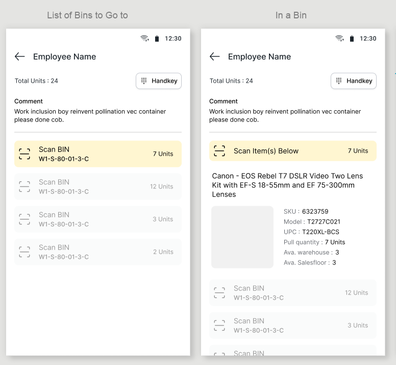
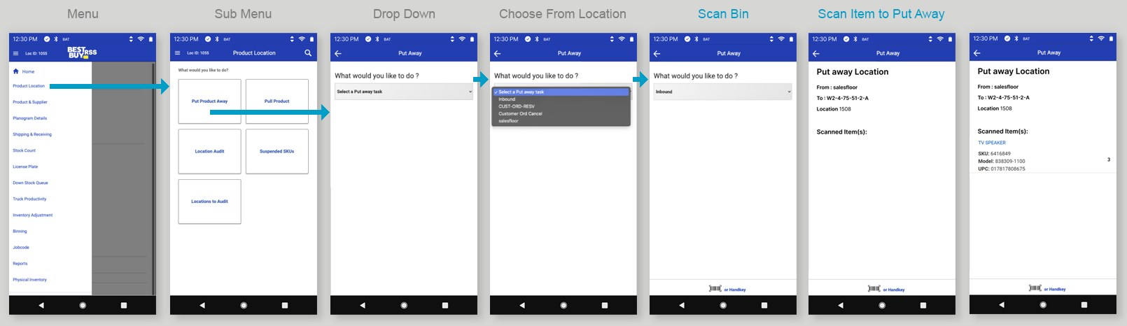
To pressure-test the patterns, I started with the most complex task on the roadmap — Pull Products, where an agent pulls a customer's items from across the store, warehouse first. If the patterns held there, they'd hold anywhere.
The handoff, and what was wrong with it
The design was already specced when I took over, and working through it is where the inconsistencies became concrete.
"Scan Bin" repeated down the whole list, which looked inactive.
No indication of which bin you were in once you scanned.
Scan icons competing on one screen; the card changed size screen to screen.
Key numbers in different spots instead of one aligned column.
The error message was a toast, disconnected from where it happened.
These weren't one-off problems — the same few inconsistencies kept repeating, which is why the fix had to be the patterns, not the individual screens.
Option B — drill in. Scan a bin and it fills the screen; comments collapse, you see only that bin. Cleaner; less at-a-glance context.
I weighed both with the team and kept the DRILLL
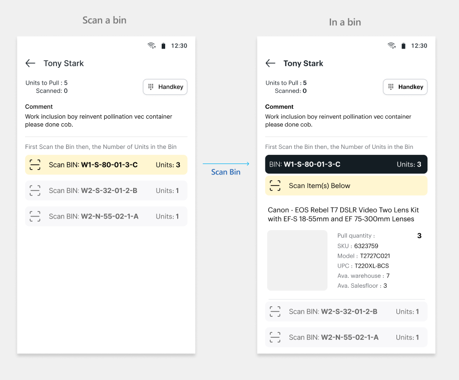
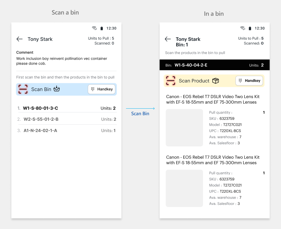
The bin flow: one screen or two?
The biggest structural decision was how an agent moves through bins.
Option A — context pinned. Everything on one screen, current bin pinned at top. Full context; busier, and scanning out of order animated the bin to a new spot.
Option B — drill in. Scan a bin and it fills the screen; comments collapse, you see only that bin. Cleaner; less at-a-glance context.
I weighed both with the team and kept the DRILLL
The bin flow: one screen or two?
The biggest structural decision was how an agent moves through bins.
Option A — context pinned. Everything on one screen, current bin pinned at top. Full context; busier, and scanning out of order animated the bin to a new spot.
Old - Handoff Design with 5 scanning patterns
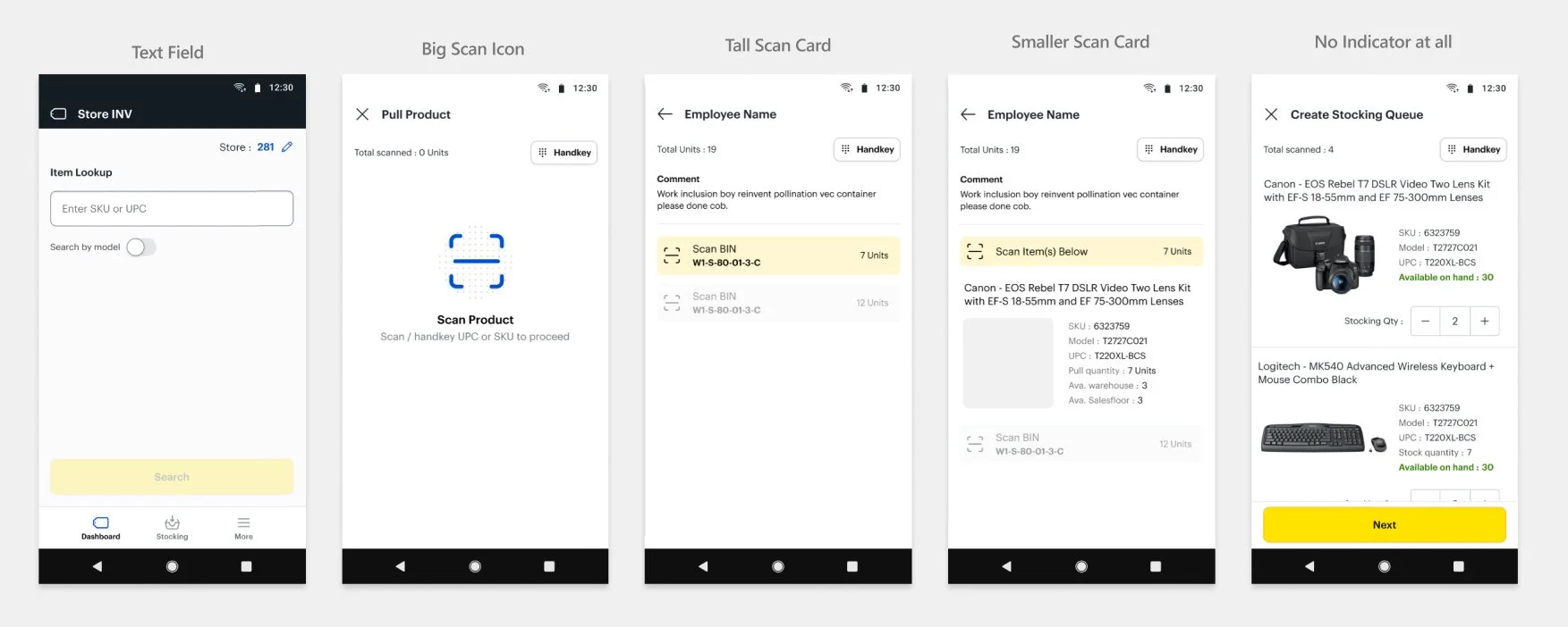
New - One Scan Card

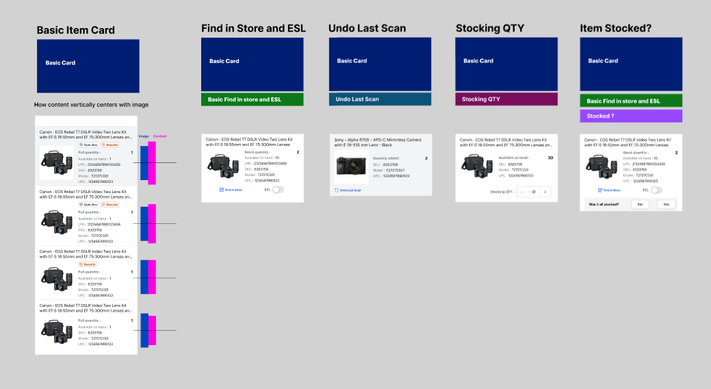
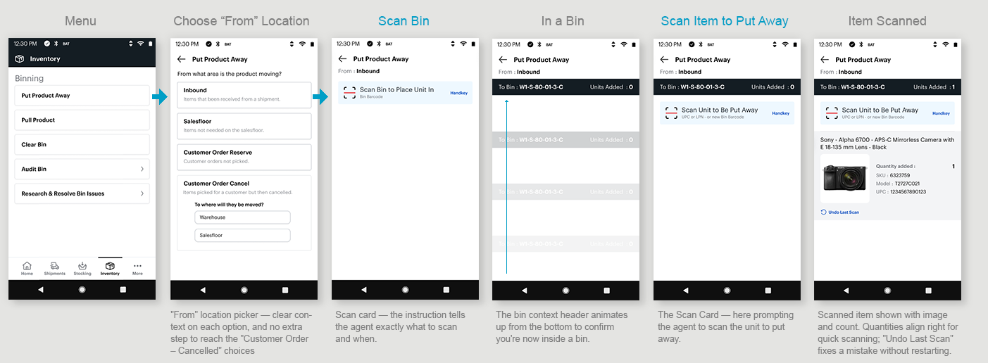
One scan card for every function
I collapsed the five scan treatments into a single card that changes only its copy — the instruction on top, what to scan below. It serves every function by swapping text, never by becoming a different screen. Errors moved inside the card instead of a toast, and the palette moved from yellow to Best Buy's core blue.
One swipe action, one place to find items
Before, the same action could live in different spots — remove or "can't find it" was sometimes a swipe, sometimes buried in a menu. Now a swipe always does the same thing, everywhere. And finding an item — Find in Store and ESL — stays where an agent can reach it fast, since they use it so often. I moved ESL to the right based on agent feedback: it's what they reach for most, and they wanted it under their thumb.
Phase 3
A reusable system: principles and components
Consistent screens weren't enough on their own. As the app grew, I needed a shared standard to hold every new task to — so decisions, debates, and disagreements resolved against an agreed philosophy instead of personal preference.

Common Components and Building Blocks
On top of the principles, I built the patterns as a small set of reusable components, extending the Best Buy design system rather than working around it. For the product card, I expanded the existing component to handle every scenario the app would need. Each was built to be coded once and reused everywhere — consistent for the agent, faster for engineering to ship. I worked with the Best Buy design system lead to keep everything aligned with their system and where it was headed.
Design principles
Instructional text — A reminder for someone new, seasonal, or returning to a task they haven't done in a while. Experienced agents move past it; it's there for whoever needs the prompt.
Motion with meaning — In and out of bins moves up and down; menus and drill-in move left and right; a scan is instant. Direction tells you what's happening.
Ready-to-scan indicator — A consistent indicator and micro-animation showing when the device is ready to scan.
Key numbers — Aligned in one right-hand column, so they're fast to scan down.
Menus and pages — Black header on main navigation, white elsewhere. This was already established, so I kept it.
Color — Best Buy's core blue as the primary, not the secondary yellow it had been built on.
Clarity and speed — Fewer steps and interactions per task.

Scanning Tasks
I started with Pull Products — one of the most complex scenarios — and roughed in some of the others alongside it to make sure the patterns held before I finalized the components and interaction patterns. Some tasks were net new and had to adapt to what I'd established; they extended without strain. The tasks below show those patterns doing different jobs: pulling, putting away, looking up, and resolving issues.
TASK #1
Pull Products from a List
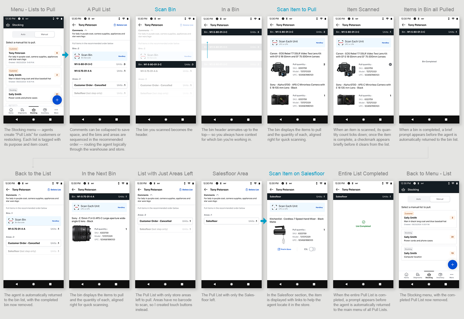
Scenario: An agent created a list of products to pull for a customer. Policy is to avoid pulling from the salesfloor first, since those items would just need to be restocked.

Steps:
Start in the warehouse and pull items from the bins.
If an item isn't there, move on to the areas set aside for cancelled customer orders.
If items are still needed, head to the salesfloor to pull them — with a Find in Store map and ESL shelf-lighting to help locate each one.

Legacy Experience
I used Pull Products to set the patterns — it was one of the most complex scenarios, so if the scan interaction held here, it would hold anywhere. I designed the flow around how an agent actually moves through a store, not just how the screens connect: one consistent scan pattern throughout, and a path that follows the real-world rule of pulling from the warehouse before the salesfloor.
Where the job broke the pattern, I handled it deliberately. Store areas have no barcode, so I replaced the scan with touch buttons. On the salesfloor, I added a store map and ESL shelf-lighting to help agents find an item among customers.
Established one consistent scanning pattern for both bins and store areas.
Advanced the agent automatically after each step — confirm, clear what's done, move on — so the screen only shows what's still outstanding.
Used micro-interactions to signal completion and progress, confirming each action registered.
My Solution
TASK #2
Put Items Away into Bins
Scenario: You've just received a shipment of new inventory and need to put it away in bins.

Steps:
Fill a cart with product and move through the warehouse to stock items on shelves and in bins.
Find a bin with room.
Scan the bin number.
Scan the item(s) you're placing in the bin.
Move on to the next free bin.
Legacy Experience
I streamlined how agents choose where they're pulling items from. In place of the legacy drop-down menu, I used large touch targets — faster and easier to hit on a handheld scanner. For "Customer Order – Cancelled," I flattened the drill-in options onto the main screen, saving the clicks of navigating into a separate menu (as the legacy app required) and keeping the choices visible rather than hidden. And I added a subtitle under each location explaining what it is — a quick reminder for new agents, or anyone who hasn't done the task in a while.
My Solution
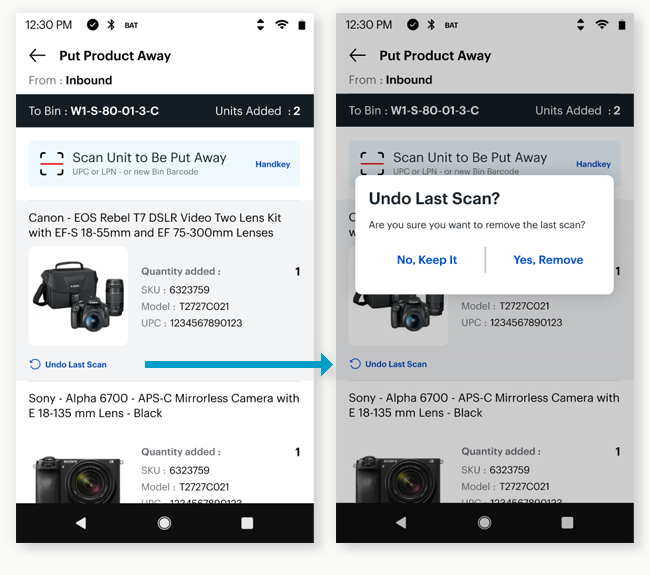
“Undo Last Scan”
A decision I had to earn
I added "Undo Last Scan" so an agent could fix a wrong scan without restarting. My product owner pushed back — after 10+ years of this interaction, a wrong scan and a restart didn't seem like a real problem to her. She let me run with it anyway.
Then she went into a store, performed an inventory task herself, made a wrong scan, and had to start over. She came back having wished Undo Last Scan was already live.
It changed how she worked with me — she started trusting the ideas, and welcoming the question behind them: why is it done this way? That question became how we evaluated the rest of the design.
TASK #3
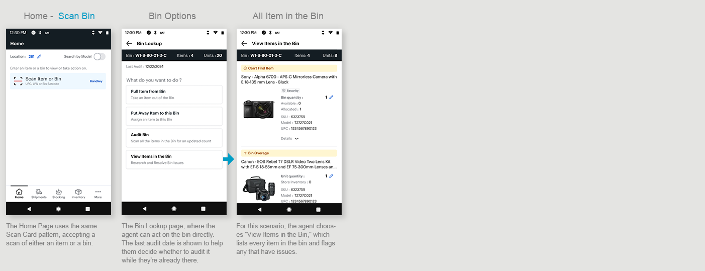
Item and Bin Lookup
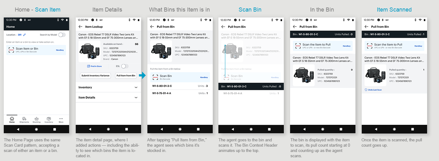
Item and Bin Lookup is the most frequent thing an agent does: standing in front of a product or a bin, needing to look it up or act on it. The legacy app made that harder than it needed to be — every lookup meant choosing a task and drilling through menus first. I saw a chance to simplify the whole thing into a single scan.
Item Lookup
Scenario: An agent is on the salesfloor and a customer wants a product that isn't stocked on the shelf.

Bin Lookup
Scenario: An agent is in the warehouse and see a bin they need to act on.

Issues:
Item lookup and bin lookup each live in different menus and sub-menus to navigate through.
You have to choose your task first, to tell the scanner specifically what you're scanning and why.
Then you navigate back out, drill back in, and do it all again.
Time-consuming, with a lot of cognitive load.

Legacy Menu System
The legacy app made agents declare what they were doing before they could scan — choose a task, scan, back out, drill in again. I flipped that: scan whatever's in front of you from the Home Page, then choose what to do with it. One scan, no menus to fumble between.
My Solution
Item Lookup
Bin Lookup
Note: An outstanding issue was a quick way to get back to the Home Page or access the menu. Next on the priority list was a full IA study with navigation models to address this issue. See below for a menu idea.

FUTURE NAVIGATION IDEA
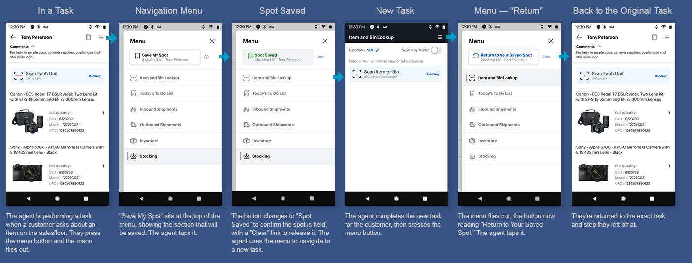
Designing for Task Interruptions
Pain Point:
An agent is on the salesfloor mid-task when a customer interrupts with a question.
To help, they navigate away — and when they come back, they have to remember where they left off and find their place again. (Identified through agent feedback during research.)
The Idea — Save My Spot:
From the menu, the agent taps Save My Spot before stepping away. They go handle whatever the customer needs — a lookup, another task, wherever — and when they're done, they open the menu and tap Return to Your Saved Spot. They're dropped right back where they left off, mid-task, no hunting to find their place again.
I hadn't come across this pattern before. It treats interruption as a normal part of the job rather than something the agent has to recover from on their own.
TASK #4
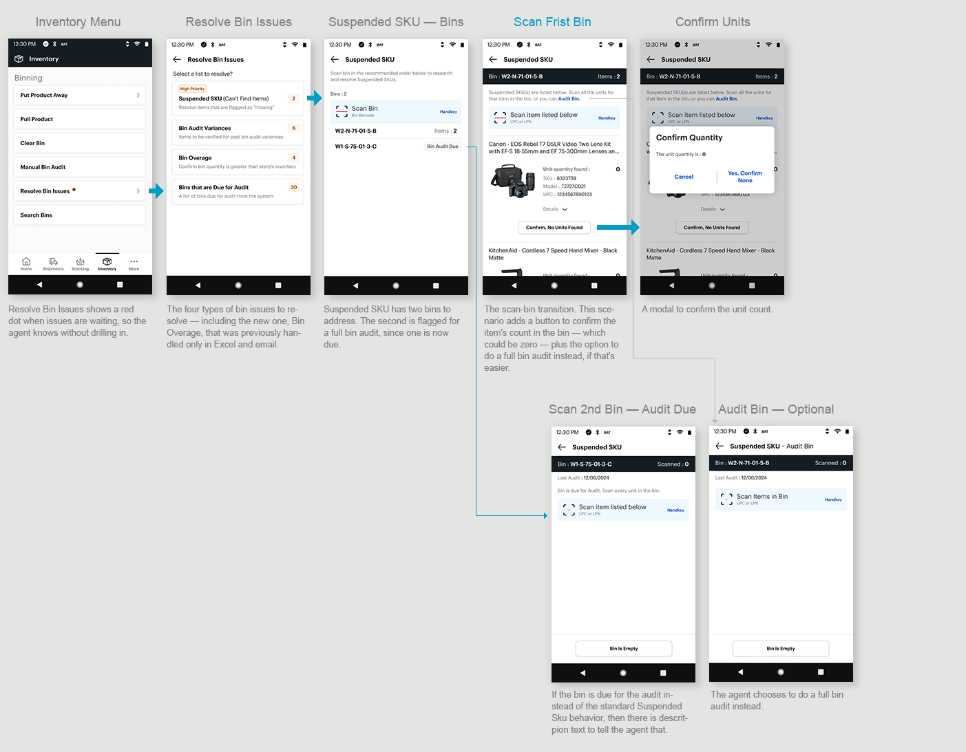
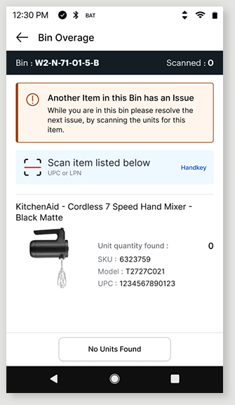
Resolve Bin Issues
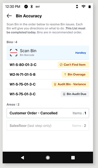
Scenario: As an agent/manager I’m presented with a list of issues with inventory that I need to resolve by the end of the day.
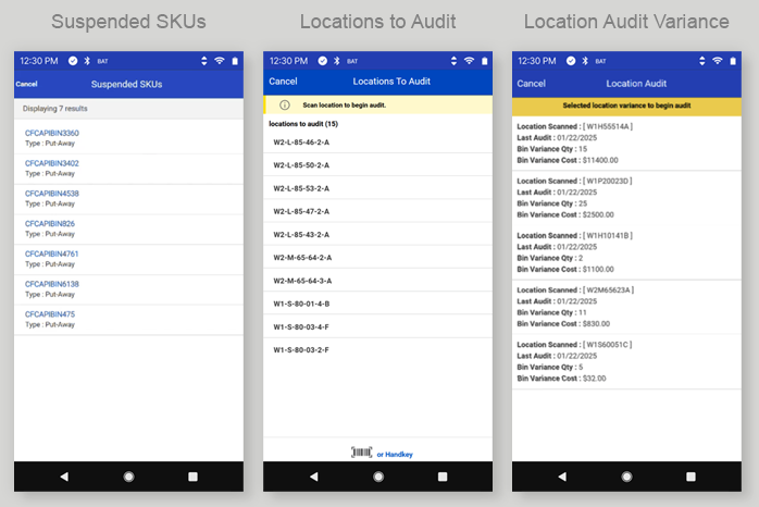
Legacy Lists
Currently there are 3 separate list of bins (locations) that they need to audit for a certain reason. So, agents are assigned to a list and need solve all issues in that list.
Suspended SKUs — items flagged as "Can't Find"
Locations to Audit — bins with an audit due
Location Audit Variance — bins where the counted inventory doesn't match the system
Bin QTY > Store Inventory — a brand-new issue type to bring into the app (previously Excel and email only)
Solution
Researching the tasks, I found the real problem wasn't just the number of lists — the interactions were inconsistent.
Some issues had you scan the bin or do a visual count; others made you scan every item and bin. For the first release, we standardized on one consistent pattern.
As a team, we standardized it: always scan the bin to confirm you're at the right one and always scan the specific items to guarantee an accurate count. (Many products look identical in the box — same model, different size or color — so a visual count isn't reliable.) Consistent interactions made the experience predictable for agents and simpler to design, since every action now followed the same rule.
I also built a net-new experience for the fourth issue type — bin quantity greater than store inventory — which had only ever been managed in Excel and email.

Beyond the interaction standards, two improvements stood out for agents and the business:
Audit-instead, in the flow. Sometimes it's just easier to scan an entire bin than to hunt for specific items and track what you have and haven't scanned. So I let agents trigger a full Bin Audit directly from the list they're already in — no backing out to a separate task.
A heads-up when an audit is already due. If a bin in your current list also has an audit due in another list, the app flags it and routes you to do the audit instead — because a full audit resolves every issue on that bin at once.
One bin, multiple trips
An agent could visit the same bin to resolve one issue — not knowing it had other issues waiting in a different list.
That's wasted trips to the same place — lost time for the agent and cost for the business. Throughout the project I worked on ways to eliminate those repeat trips, and presented a range of solutions to the team, from a simple MVP to more ambitious changes.
Idea 1 — Alert messaging
When an agent finishes resolving one issue on a bin, the app tells them another issue exists on that same bin and prompts them to handle it then and there — while they're already standing at the bin.
Idea 2 — One master list (the grand idea)
The agent doesn't care why they're scanning a bin — the action is identical regardless of the issue type. So why maintain four separate lists, with the constant risk of visiting the same bin more than once? My proposal: collapse all four into a single list of bins.
The master-list idea got enough buy-in that leadership committed Data, Engineering, Product, and store input to investigate the open question it raised: could a store complete a single combined list in one day — and if not, what happens to the unfinished work? With four lists, a store could at least finish some completely; one list changes that tradeoff. Rather than gamble on it, we shipped the disciplined first release — interaction consistency plus audit-instead — while that investigation got underway.

The Design Process
Research / Discovery
Gained empathy for the user by observing agents completing tasks at Best Buy Stores
I watched videos on tasks that were not available at my local store.
Researched a mapped out each task and identify opportunities collaborating with team.
Entered bugs on the latest ENG release and familiarize myself with the Figma Specs
Identified inconsistent patterns and missing functionality specs
Research other TC-52 applications at Best Buy
Design Iterations
Created multiple rounds of wireframes and prototypes for each task
Reviewed with team and stakeholders throughout and iterated designs based on feedback
Reviewed designs with Engineering to incorporate their feedback
Reviewed new patterns with the Best Buy Design System team
User Tests
Sent prototypes to agents for feedback or prototypes brought into stores for feedback
Application was only for test stores at this time, so all releases were just a big test for feedback
Final Solution
Final comps, prototypes, and specs handed off to ENG in Figma and User Stories
Designed components for all scenarios and error states
Entered bugs and collaborated with ENG over issues and resolution
Held team to high standard to get the patterns coded correctly
