

BEST BUY - AGENT CALL CONTROL
I interviewed customer support agents to find the small things that slowed them down or caused costly mis-clicks, then designed 0-to-1 call controls to fix them.


Background
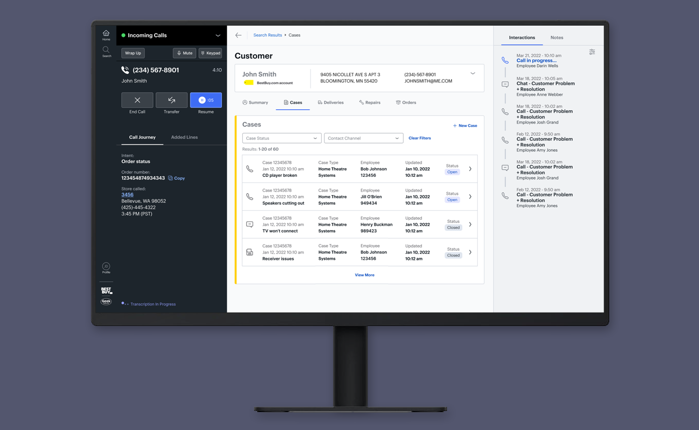
Best Buy was building Support Workbench, a new customer support app to replace its legacy agent desktop, and support teams across several lines of business would move onto it. Call Control is the panel in Support Workbench that agents use to manage every call. Agents take calls back to back, and every minute of their day is tracked.
Problem & Goals
The legacy tools set agents up for costly mis-clicks. Status was easy to set wrong, Hold sat right next to hang up, and transfers relied on memorized codes. Rules for wrap-up, transfers and status also varied by team. The goal: call and status controls flexible enough to fit each team’s rules, designed for speed and fewer user errors.
Solution
I designed the call and status controls from scratch: one status list, controls for each line, End Call moved away from where agents reach, and readable phone numbers. The move to a new calling platform limited what the MVP could include, so I also designed past it: a Transfer Directory, callbacks after a dropped call, and machine learning to predict where a call should be transferred, pitched before ChatGPT. In prototype testing, 6 agents completed 100% of tasks, and 29 agents rated it 4.38 out of 5 for simple and clean.
Responsibilities
I was the Lead Designer for Call Control. I was accountable for agent research, the design principles, the panel’s interaction design, and accessible icon and color states, especially for the hold, resume and refresh cycle. I partnered with the product owners and engineering, and worked with the design system designer on visual style. Beyond the MVP, I designed the future vision: a single communication panel for every way agents reach customers, including calls, chat, video, text and email. I also pitched AI ideas, like predicting which team to transfer a call to, before ChatGPT was released.
STARTING POINT
A Strong North Star, With Call Control Still Undefined
The North Star
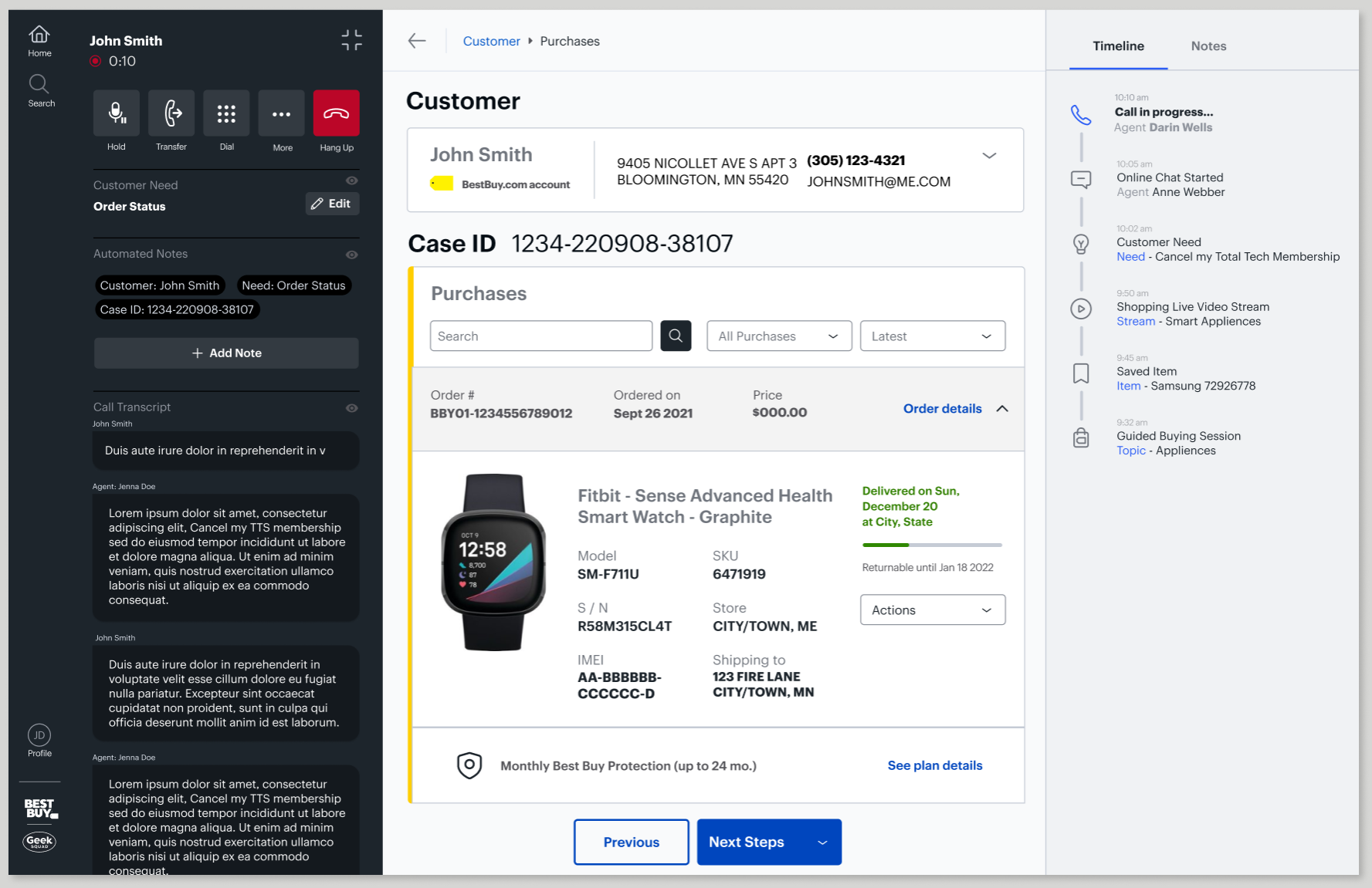
The core team had a north star vision and a template with four areas: left navigation, Call Control, center content and a right rail.
What Wasn’t Defined Yet
The north star’s Call Control was a strong visual concept, but it was busy, and the real interactions, agent needs and states behind it hadn’t been defined yet. It also raised open questions, like where machine learning transcriptions and automatic notes would fit.
Where I Came In
I was brought in from outside the core team to own the Call Control panel, including agent status. Before this, I led the buy-vs-build research on workforce management and quality assurance software for customer support, so I had already mapped how agents juggled status, schedules and time clocks across separate systems.
A Design System in Progress
The template was set, but the design system wasn’t. Best Buy had no design system for internal tools, so the team was building one on top of Best Buy’s web and e-commerce system. I worked back and forth with the design system designer as my components took shape.
Define the Problem
Learning What Agents Really Needed
When I was assigned Call Control, it looked like a small piece to design: answer, hold, transfer, end call. Then I talked to agents. I saw how much rides on those few buttons, and learned about agent status, and how every minute of their day is tracked.
I interviewed 7 agents across 3 legacy tools and several lines of business, and had them walk me through real calls. I also reviewed other call control software for ideas, and presented the findings to the support team and executives. I came away with a lot of empathy for agents, who do stressful work with no room for a wasted minute or a wrong click.
An Agent’s Day, One Call After Another
Once an agent is ready for calls, the day becomes a loop. The only way out is to change status, at exactly the right time.
Pain Points in the Legacy Tool
I interviewed agents as they walked me through Breeze, their legacy tool, and watched some take live calls. These three pain points came up again and again.
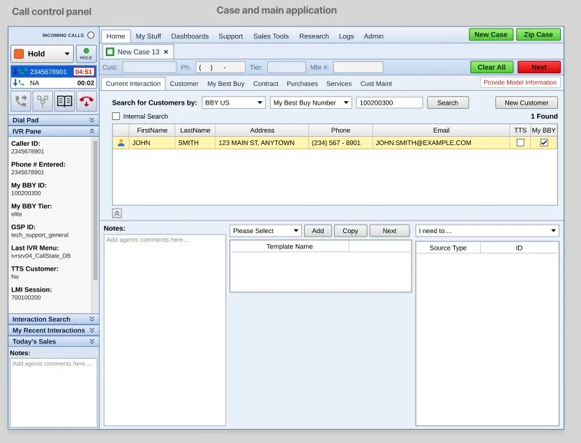
The call control panel sat on the left of every screen, so agents used it on every call.
PAIN POINT #1
No Time to Get to the Right Status
Agents had to set their next status while still talking to the customer, or the next call would connect. Setting it took two menus, and a wrong pick was easy to miss.
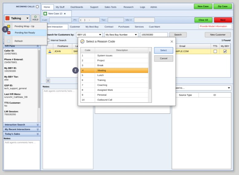
Two Menus to Set One Status
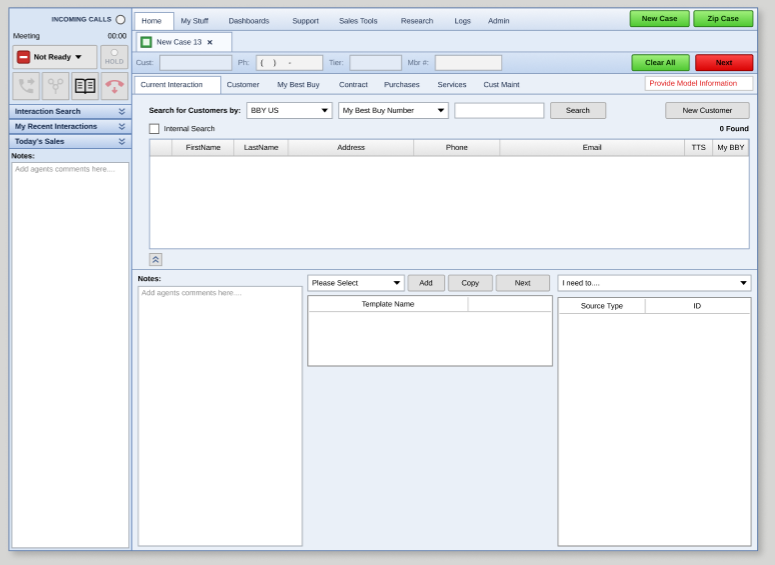
To set Not Ready during a call, agents opened the status menu, picked Pending Not Ready, then scrolled a second window to find the right reason. All of this happened while they were still talking to the customer. Moving fast, it was easy to pick the wrong one. Meeting and Lunch were close together in the list, and agents hit Meeting by mistake.
The Wrong Status Was Hard to Spot
After the call, the panel showed Not Ready, with the reason in small text above it. An agent who picked Meeting instead of Lunch often didn't notice. They fell out of adherence and had to fill out forms to fix it. This mix-up came straight from agent interviews.
Bottom line: with the next call coming right away, agents set their status mid-call, and the tool made that slow and easy to get wrong.
PAIN POINT #2
Easy to Make Costly Mistakes
Agents were so worried about adherence that they clicked fast, and fast clicks on small, crowded controls led to mis-hits.
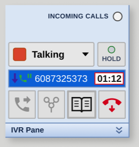
Hold Sat Right Above End Call
The two buttons agents used most were small and close together on the far right. Agents meaning to put a customer on hold sometimes hung up on them instead.
"...you meant to put him on hold and you hung up."
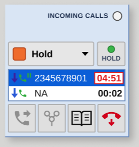
One Set of Buttons for Two Lines
With two calls going, there was only one set of call buttons. They acted on whichever line was selected, shown only as blue or white. With just two lines, it was hard to tell which color meant selected. If the wrong line was selected, Hold or End Call hit the wrong person.
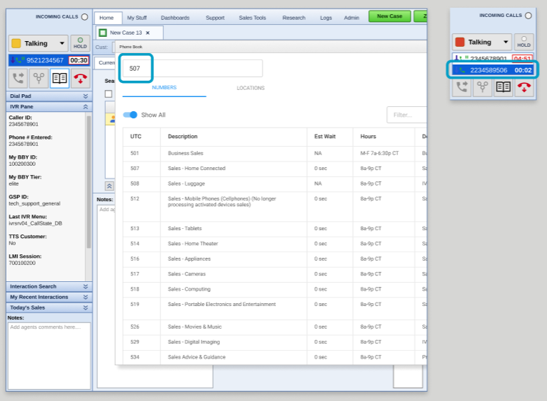
Transfers Didn't Show the Team's Name
To transfer a call, agents typed or picked a team's transfer code (UTC) in the phone book. The code stayed in the search box, but the team's name didn't show anywhere. Once the call went through, the second line showed Best Buy's main transfer number, the same for every transfer. Agents had to trust they'd picked the right code, with no way to confirm the team before the call connected.
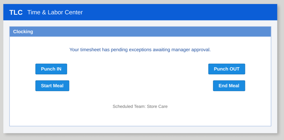
Lunch and Sign-Out Meant a Second App
Lunch meant switching status in Breeze, then punching out in a separate time clock app, and doing both again on the way back. The time clock had its own confusing interface, which led to more mistakes. Forgetting to punch back in put agents out of adherence. Forgetting to fully sign out at the end of the day was worse: calls could still route to them, and a manager had to log them out.
Bottom line: one slip could hang up on a customer, put an agent out of adherence, or send calls to someone who had gone home.
PAIN POINT #3
Hard to Read at a Glance
Agents needed to read their status and phone numbers in a split second, while talking to a customer. Small text and colors that meant more than one thing made that hard.
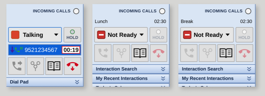
Break, Lunch and Project All Looked the Same
The main status showed only Ready (green) or Not Ready (red). The reason, such as Break, Lunch or Project, sat above it in small, thin text. Red also meant two things: Talking and Not Ready. Because agents are measured on staying in the right status, a missed label is costly. One agent stayed in Break for 2.5 hours without noticing.
"…this tiny little font on the light blue background... that tells me I'm in project."
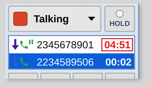
Phone Numbers Were One Long Run of Digits
Numbers showed with no spacing. Agents read them back to customers and copied them into other tools, so they read them digit by digit to avoid mistakes.
Bottom line: agents had to stop and read when they needed to glance.
I presented these findings to the full customer support team and the project’s executives. From them, I set three design principles that guided the design from there.
From Findings to Principles
Exploration
Designing Around How Agents Work
From the research, I set three design principles. Agents repeat the same actions all day, so the little things would matter: quick access, numbers that scan at a glance, and fewer clicks. Each of my three rounds took on every pain point and refined the last, based on feedback from product, engineering and the design system designer. Along the way, the MVP scope was set, and many ideas moved to later releases.
Principles
• SPEED: The next action is always one step away, even with the next call coming.
• ACCURACY: Make the costly mistakes hard to make, and easy to see when they happen.
• CLARITY: Every state reads at a glance, with a label and an icon, never color alone.
SPEED · ACCURACY · CLARITY
Fitting Call Control Into a Fixed Panel
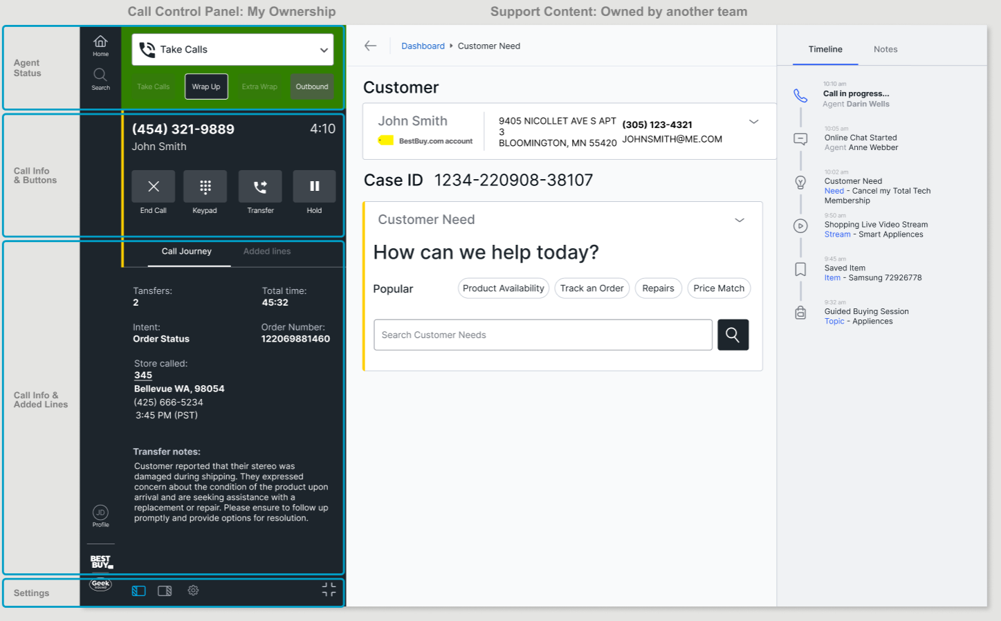
The workspace team owned the app and the template, and they had already set the panel's size. I designed Call Control to fit that space, then decided what belonged in it.
I built on their north star vision, then added what agents and the business actually needed. To make the space work, I held one rule: Call Control and agent status only. I split the panel into three areas: agent status at the top, call info and buttons below it, and tabs for the call journey and added lines. Settings and panel controls were planned for the bottom but were cut from the MVP.
I pushed to move everything else into the workspace. That kept the panel focused, and it left room to grow into a communication panel for chat, video, text and email. I designed it for touch as well as mouse.
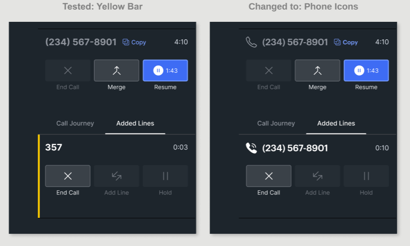
Note: The yellow bar marks the active line, following the workspace’s pattern for the active module.
Agent Status: Current and Pending
Drop-down
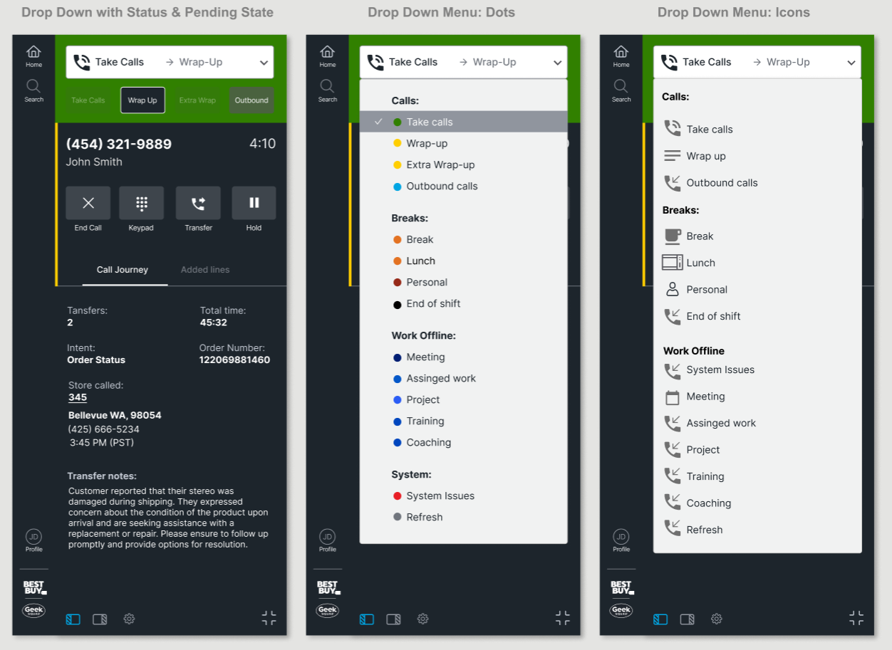
Status got its own area at the top of the panel, showing the current status and the pending one next, in words, not just color. I also started on quick access buttons below it to offer the next logical status, so agents could skip the menu. Those would be explored more after the MVP.
Drop-down Menu
The menu became one list, grouped into Calls, Breaks and Work Offline, with no scroll bar and no second window. It needed fully custom code, and I convinced the team it was worth it. I wanted it spaced for touch, but with this many statuses the list got too long, so I kept it compact.
Refinement:
Keeping Status in the Dark Theme
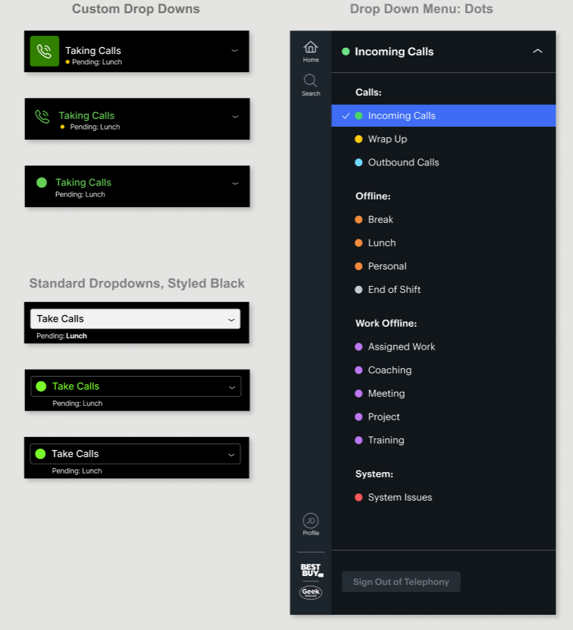
I explored two directions for the status control: custom drop-downs, and the design system's standard dropdown styled in black. I reviewed them with the design system designer, and we went with a custom black drop-down and a matching black status menu, so the whole Call Control panel stays in one dark theme. Both had to be custom built to get the colored dots, alignment and spacing right. We chose the simplest style: a small colored dot with the label.
Fitting the Pending Status in a Short Bar
I wanted the pending status to be impossible to miss, but the status bar had to line up with the other headers on the screen, which left room for only one small line under the status. The user test focused on task completion, so I couldn't test the dot or the pending size directly, but neither one came up as an issue.
Call Info and Additional Lines
Each Line's Info and Call Actions
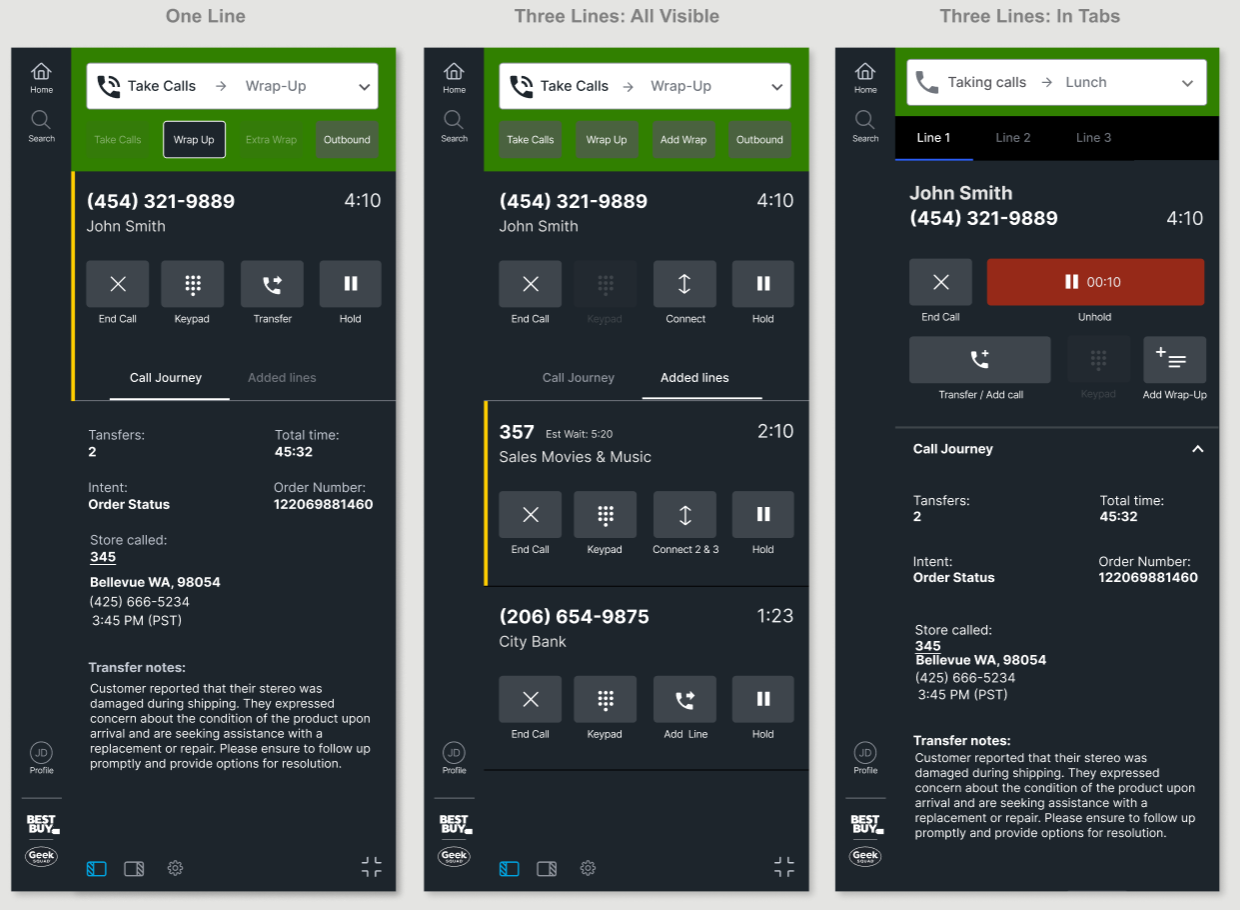
Agents can have more than one line on a call, like a customer on hold while they connect to another team. The business needed up to three lines; the MVP needed two. I designed for three, all visible. I explored two layouts: tabs with one line at a time and shared call actions, or every line visible with its own actions. Tabs looked cleaner, but I chose all lines visible for clarity, accuracy and speed.
Clarity: every line is labeled with who's on it, the customer's name or the team a call is going to, and phone numbers use standard formatting, so agents read them at a glance. With tabs, the panel didn't have space to label each line clearly.
Accuracy: in Breeze, the old tool, one set of buttons served up to three lines, and it was easy to act on the wrong one. Giving each line its own actions removes that guesswork. For a transfer, the label also lets agents confirm they reached the right team.
Speed: with tabs, agents would have to switch tabs to act and remember who was on each line. The tabs also took the space for the quick action buttons, which let agents set their next status, like Wrap Up or Outbound, without opening the status menu. With every line visible, the next action is always one click away.
Refinement:
One Keypad Instead of Three
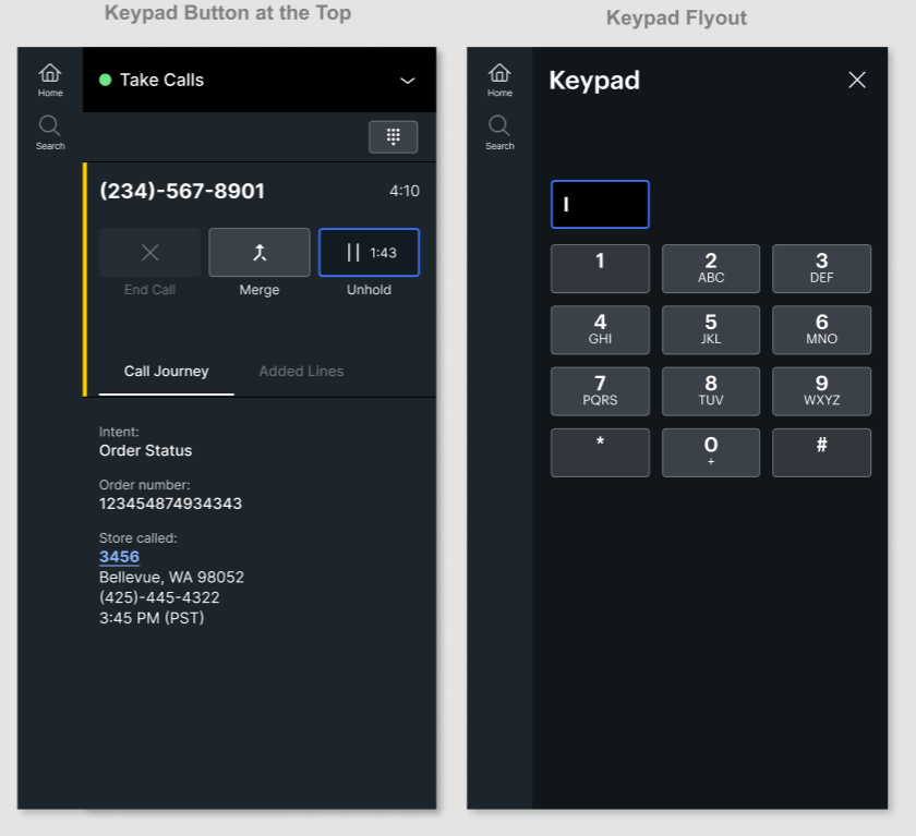
Every line had its own keypad button, so with three lines the panel got crowded fast. I replaced them with one keypad at the top that works for whichever line is active. That cut each line from four buttons to three. Buttons also change with the call instead of adding new ones: Transfer becomes Merge once a transfer starts.
Dark Buttons in the Design System
The north star vision and my first rounds put the buttons on a dark panel. The design system lead didn't want to maintain a second, dark set of buttons, and asked me to switch to white like the rest of the application. Once he saw how the dark buttons worked in the panel, he added a dark set to the design system just for Call Control. I worked through the interaction states with him to get them right.
No Accidental Hang-Ups

End Call
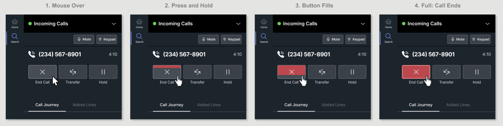
I moved the button to the far left, away from Hold and away from the page content agents reach for. Ending a call takes a press and hold of about half a second, so a quick slip can't hang up on a customer.
Staying in Adherence
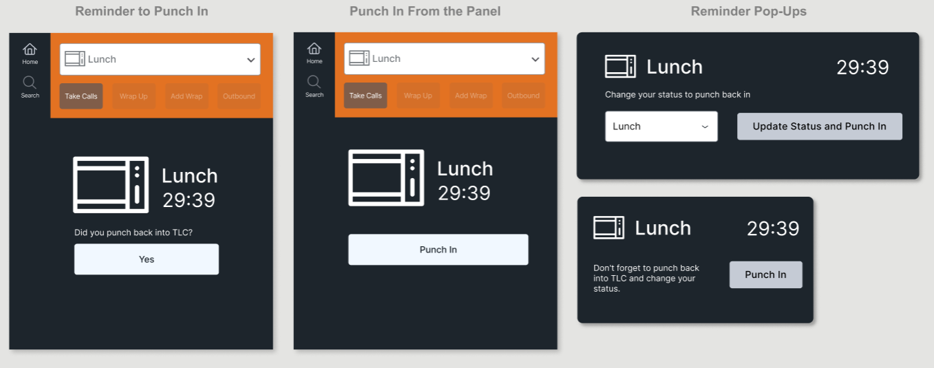
Reminders or WFM Integration
Forgetting to punch back in after lunch, in a separate workforce management (WFM) system, caused a lot of adherence errors. I designed reminders in the panel: a countdown during lunch or break, a prompt to change status and punch back in, and an idea to punch in straight from the panel without opening the other app, shown in Post-MVP below.
Transfer Directory
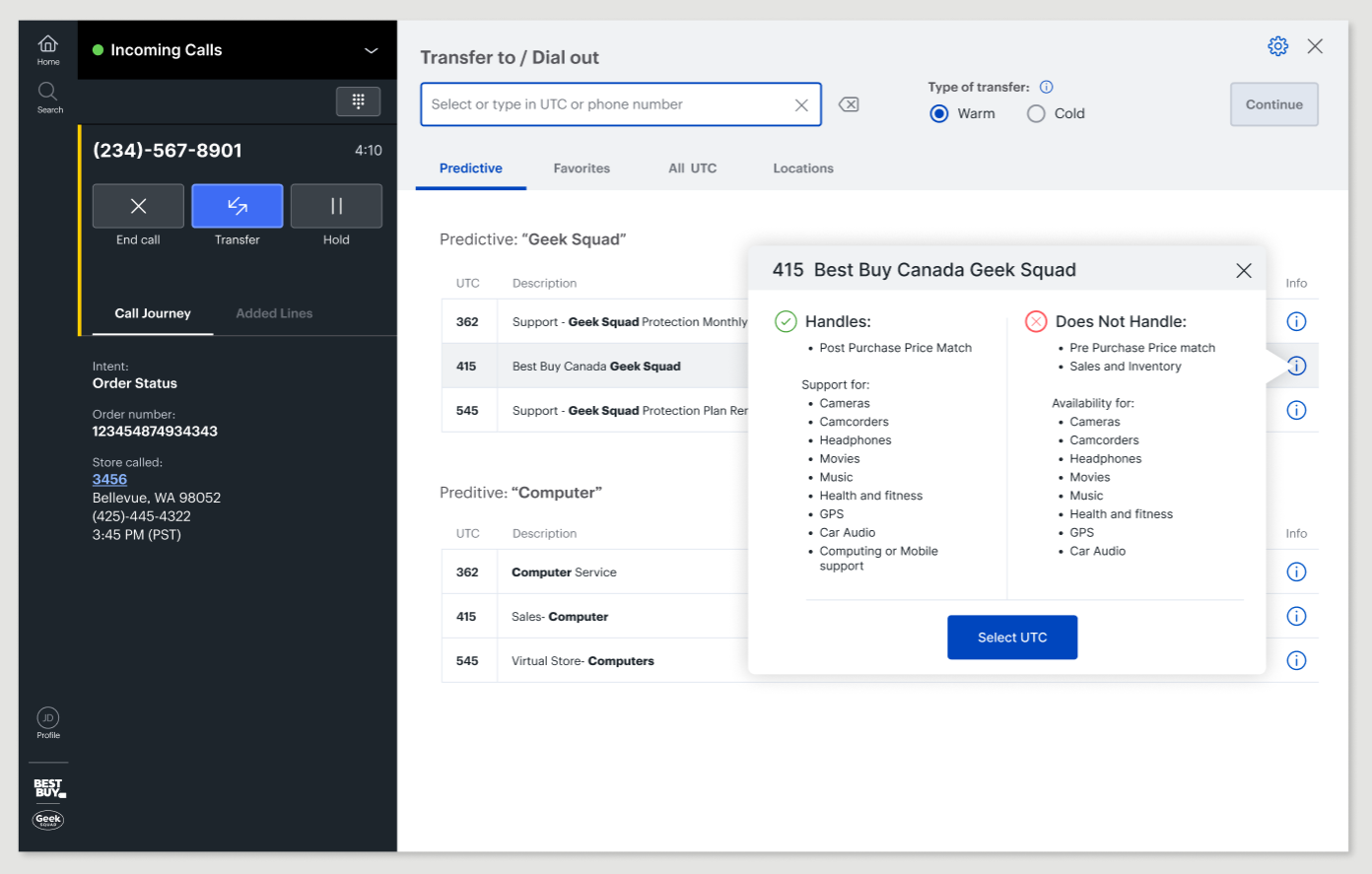
Transfer Directory (Moved to Post-MVP)
I designed a Transfer Directory of the teams agents transfer to, with their UTC codes, filters for the most common areas, and a clear note on what each team handles.
The new phone platform didn't support a directory with transfer codes, so it was cut from the MVP. I had to design a flow that was harder for agents than I wanted, and the Transfer Directory moved to a later release.
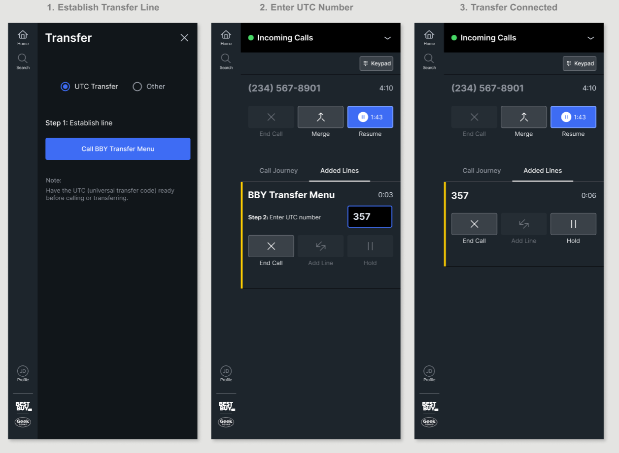
Transfer Call Without the Transfer Directory
With the Transfer Directory cut from the MVP, I designed the transfer flow the new phone platform could support. This is what agents tested.
Step 1: Call the Best Buy transfer menu to open a second line.
Step 2: Once it connects, enter the team's universal transfer code (UTC).
For agents, this was a step backward. Breeze had a built-in phone book, and now they had to look up codes in a separate tool we couldn't link to. Before release, engineering found a way to skip the first step, which you'll see in the MVP.
User Testing
Validating the Design With Agents
The Call Control panel kept evolving through the explorations. This is the design I took into testing. The research team ran two tests of my prototype:
• USABILITY TEST: 6 agents worked through 9 common tasks, from changing status to transferring a call.
• LAB TEST: agents used the prototype for a week and rated it on their first day and their last.
The Prototype Agents Tested
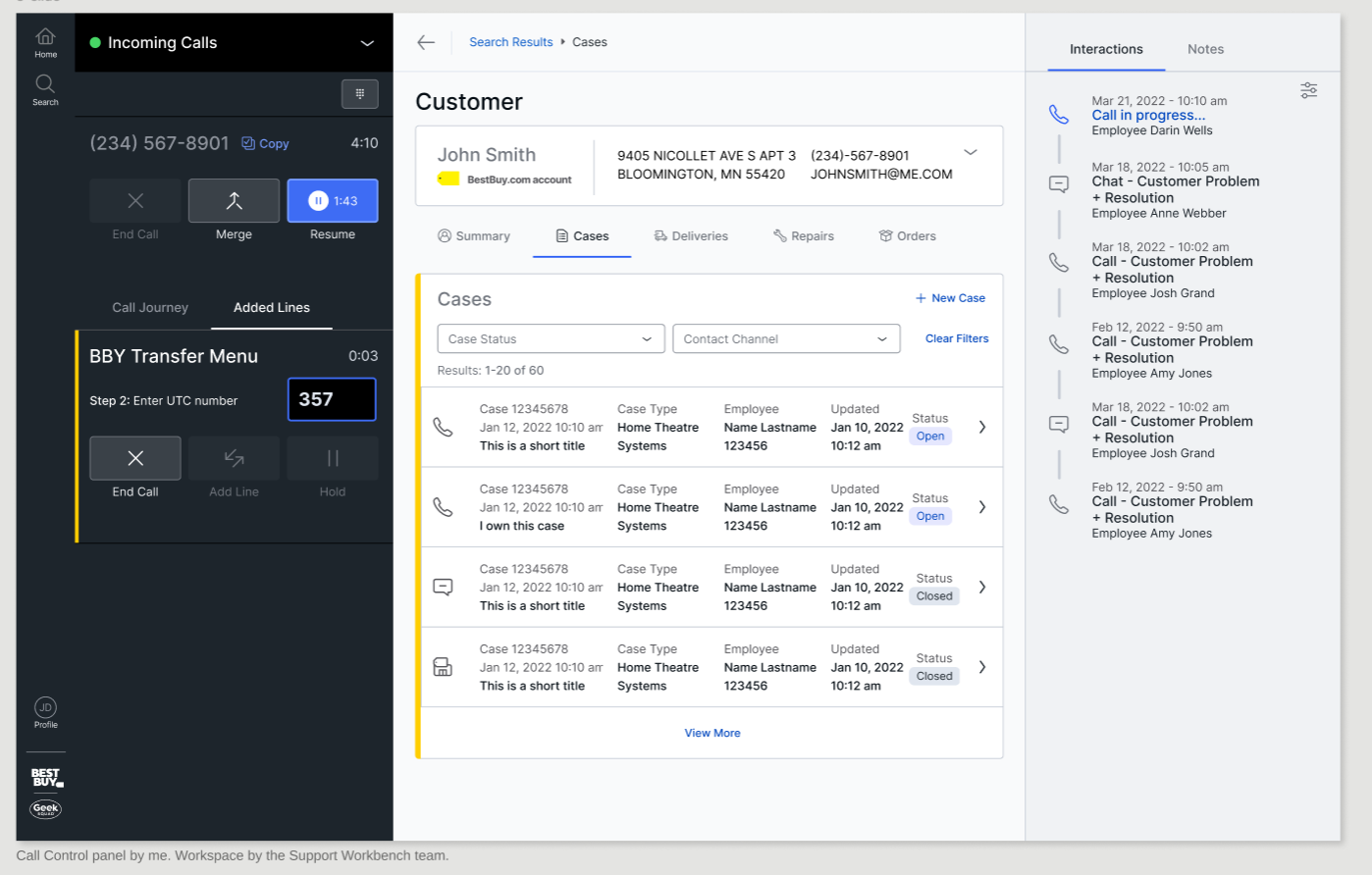
USABILITY TEST
Findings and Fixes
All 6 agents completed all 9 tasks, and they rated nearly every task 7 out of 7 for ease. The test also turned up a few misreads. Not every one needed a change, so I sorted each by what it would cost agents and what we could build for the MVP.
Changed for the MVP
- Active line indicator
- Keypad button
- "Copy" button (later removed)
Needed more data
- A call timer on the keypad
Moved to a later release
- A green active-line icon, if feedback called for it
- Keypad placement, if it stayed an issue
The Yellow Bar Meant Something Else
The workspace marked the active step with a yellow vertical bar, so I matched it for the active line. But agents tied yellow to wrap-up from their old tool, so they misread it. I asked the design system lead to change the bar to blue or green, and he said no, so I explored icons instead and we settled on one. I leaned toward green, to match the Incoming Calls status agents already knew. He wanted to try white first to keep the colors on the page down, and we agreed to revisit green after the MVP if feedback called for it.
Keypad Was Hard to Find
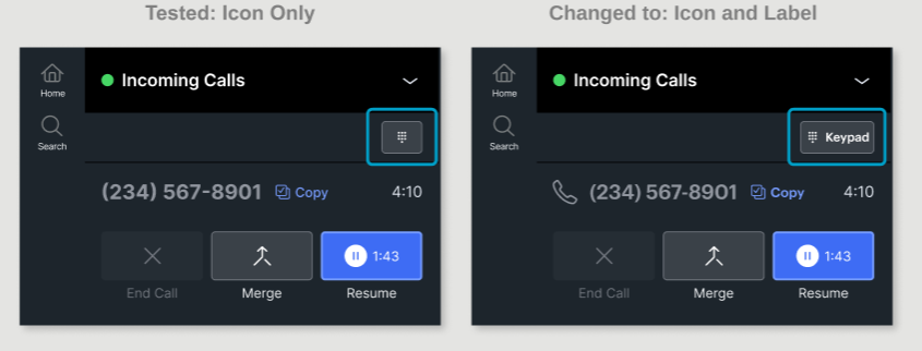
I started with the keypad as an icon only, to save room in the top bar. The future plan for that space was quick action buttons and Mute, so I knew we'd need it. I also thought the keypad icon was well recognized. But agents were used to a keypad next to each line, not at the top. I added the word "Keypad,” which made the button bigger and easier to find. I kept it at the top, because a keypad on every line would add a lot of noise, and one keypad works for whichever line is active. If it was still an issue after release, we'd look at it with real usage data.
The "Copy" Button Was Hard to See
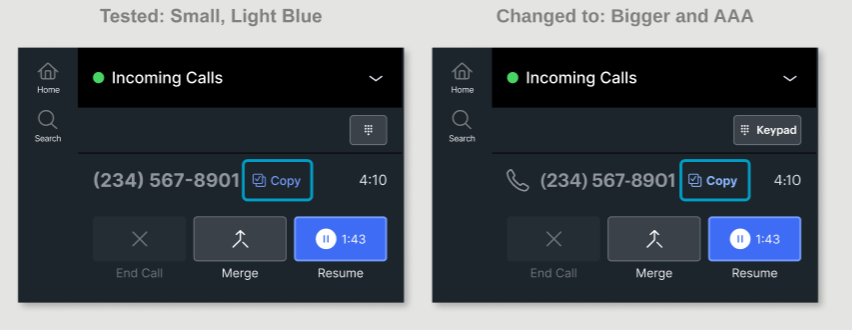
The “Copy” button next to the phone number used a light blue from the design system, a color I’d worked on with the design system lead. Agents still found it small and hard to read. We lightened the color from AA to AAA contrast, and I made the label bold. “Copy” was there because engineering first said the system couldn’t search by phone number. For the MVP, they found a way to search automatically, so we ended up removing it.
"I would say it feels smoother overall than what we've currently got on Breeze."
Agent, Store Care
"It's laid out pretty nice and intuitive."
Agent, Store Care
LAB TEST
A Week of Hands-On Use
I updated the prototype with the fixes from the usability test. Then 29 agents tried it over a week, and rated it on their first day and their last. Scores rose by the end of the week. The lowest scores were for capabilities, because the MVP was missing features agents wanted, which became the post-MVP plan. Scores are out of 5, where 3 is average.
Simple and Clean
Highest score, both days
Easy to Navigate
Up from 4.00
Intuitive
Up from 4.10
Overall Satisfaction
Up from 3.71
"A very basic and intuitive model for call control. Easy to digest for employees at any level."
Lab test agent
"The layout is smooth and easy to read."
Lab test agent
Solution
What Shipped in the MVP
After testing, engineering built the Call Control panel for the first release.
Two Things Got Simpler
Transfers in one step: engineering found the system could connect to the Best Buy transfer menu on its own, so agents no longer had to do that step.
Automatic customer search: in the prototype, agents copied the phone number, pasted it into search and pressed Enter. I'd pushed for automatic search from the start, and the usability test backed it up, so engineering found a way to build it for the first release.
Try the Call Control Panel
I rebuilt the Call Control panel as a working HTML prototype for this case study, using Claude and Figma's MCP server and working from my original designs. Set your status to Incoming Calls, and a call connects. Use "Skip to call" to jump ahead.
A few things to know:
- Only the Call Control panel is fully working. In the workspace area, you can select a customer and create a new case.
- When a call ends, the panel goes into wrap-up. In this prototype it lasts only 4 seconds, so you can see it and get to the next call quickly.
- After the user test, a partner team added automatic call transcription and AI summaries of agent notes. I kept the transcript out of the panel and added a small animation to show when transcription is running.
- This prototype includes Mute, one of agents' biggest asks. The phone platform didn't support Mute at launch, so it was planned for after the MVP.
- This prototype uses Inter in place of Best Buy's own typeface. Best Buy's font weights fall between Inter's, so some text looks slightly heavier or lighter than the original.
- Sample data. Workspace and AI call summary designed by partner teams, shown for context.
You don’t have any added lines right now
End Call: Hang-Ups Only on Purpose
Agents press and hold End Call until the button fills, and letting go early cancels it.
It shipped as I first designed it, far left and away from Hold. It takes a moment to get used to, but it stops accidental hang-ups.
If the hold felt too long, the timing could be tuned with agent feedback. Try it in the prototype above.
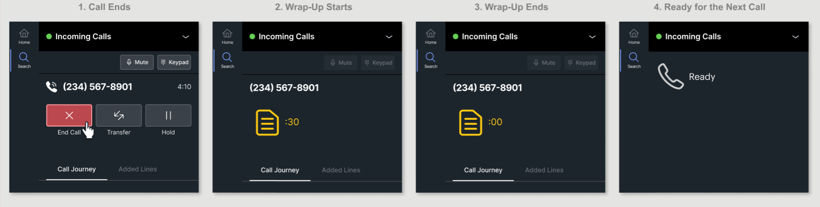
Wrap-Up: Time to Finish Notes
For lines of business that turn on automatic wrap-up, the panel moves into wrap-up the moment a call ends.
Agents finish their notes before the next call connects, without remembering to set it mid-call.
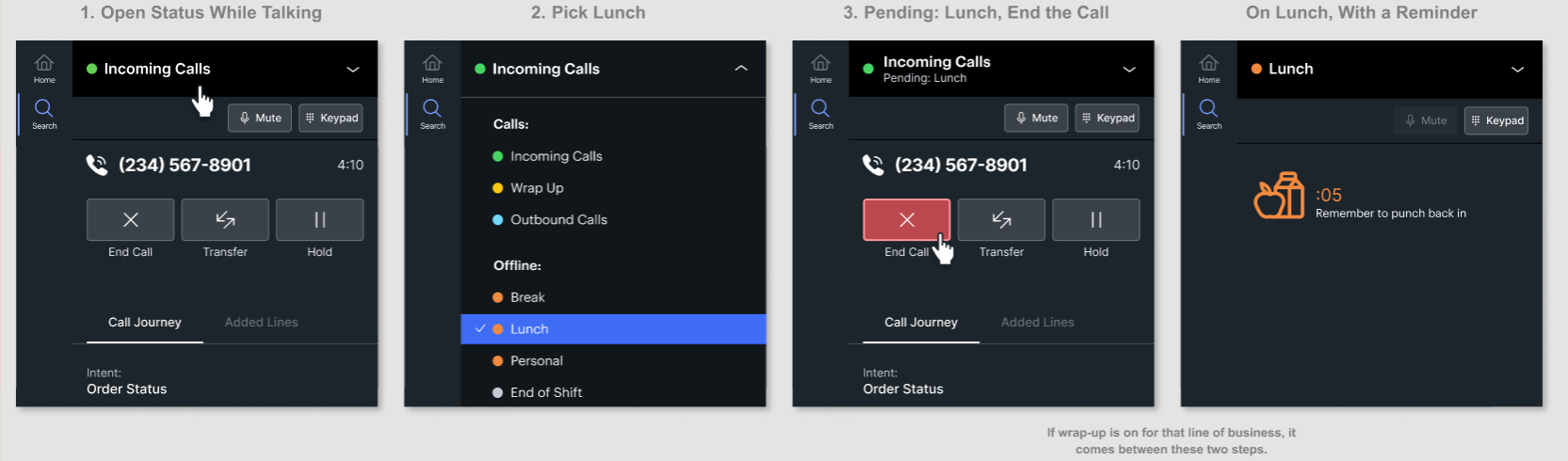
Going to Lunch: One Clear Status
The status menu is one list, now grouped by type: Calls, Offline, Work Offline and System. Lunch is one click away, instead of two menus in Breeze.
Breeze, the old tool, showed "Not Ready" in large text and the real reason, like Lunch, in small text, so agents had to read both. My design shows one status. Mid-call, "Pending: Lunch" sits under the current status.
Once lunch starts, the status just says Lunch, with its own icon and a reminder to clock back in.
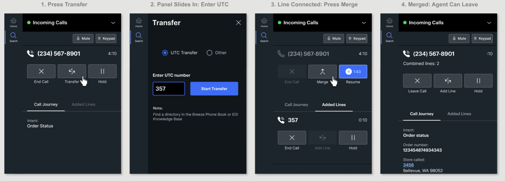
Transfers: Now One Step
In the user test, transfers took two steps. Once engineering could connect to the Best Buy transfer menu automatically, I redesigned the flow as one step: agents just enter the team's code.
A second line appears with its own controls, so agents never act on the wrong call.
Once the line connects, agents can talk to the team first (a warm transfer) or merge right away (a cold transfer), with one press of Merge.
After merging, I changed End Call to Leave Call, so agents can drop off without hanging up on the customer.
"I do like the 'Leave Call' language used. I believe it was previously 'End Call' and this previously led to confusion where I'd think I'd be ending the entire merged call."
Lab test agent
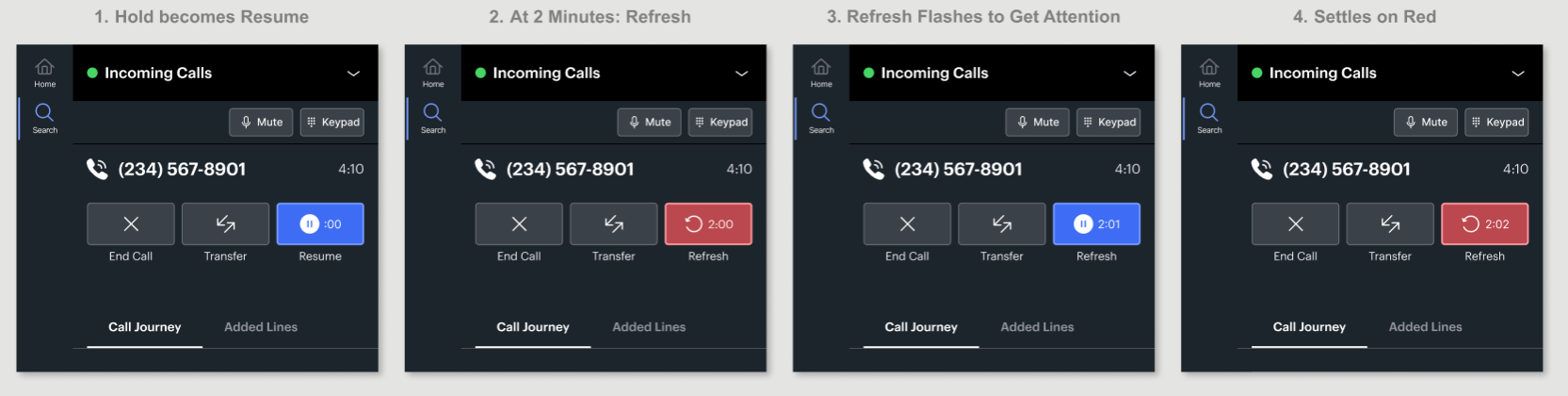
Hold: No Customer Forgotten
On hold, the button changes to Resume with a new icon, label and color, plus a timer for how long the customer has been waiting.
After 2 minutes, it turns into Refresh, a reminder to check back in with the customer. It flashes 4 times, settles on red, and flashes again after a set time chosen by each line of business.
Every button state and the flash animation follow WCAG accessibility guidelines: nothing relies on color alone, and the flashing stays short.
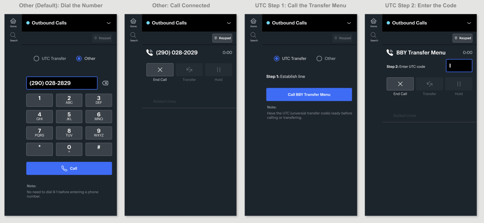
Outbound Calls: Two Clear Ways
Outbound calls have two options, and Other is the default.
With Other, agents dial the number on its own. The system adds 9 and 1 automatically, so the call connects without extra digits.
UTC is for calling another Best Buy support team. It takes two steps: call the Best Buy transfer menu to open the line, then enter the team's code.
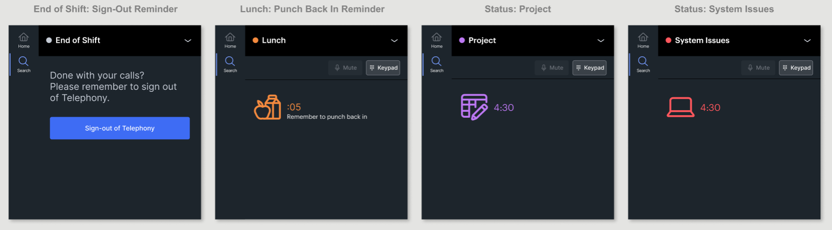
Adherence: Reminders and Clear Status
Automatic clock-in and clock-out with workforce management couldn't make the MVP, so I added reminders to punch back in after lunch and to sign out at the end of the day. I wanted them to link to the schedule tool, but couldn't for the MVP.
Outside of calls, the panel shows only the agent's status: an icon, a timer and a color for its category. With no call controls, nothing invites work in the wrong status.
In Breeze, agents sometimes worked for a long time before realizing they'd never switched status. Now it's hard to miss, which makes it harder to fall out of adherence by accident.
Post-MVP
Designing the Next Releases
With the MVP scope set, I kept designing for the releases after it. Some concepts bring back ideas cut from the MVP that agents asked for in testing, like the Transfer Directory. Others are new, like connecting status to workforce management. Budget cuts ended design support for Call Control soon after, and I moved to another project, so I can't say which of these were built.
Speed, Accuracy and Clarity, Taken Further
Each concept below pushes one of my three principles beyond what the MVP could support.
Transfer Directory That Learns
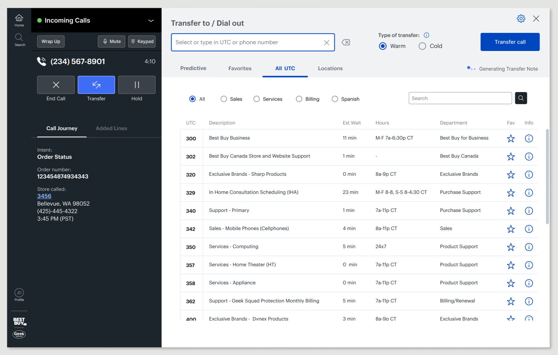
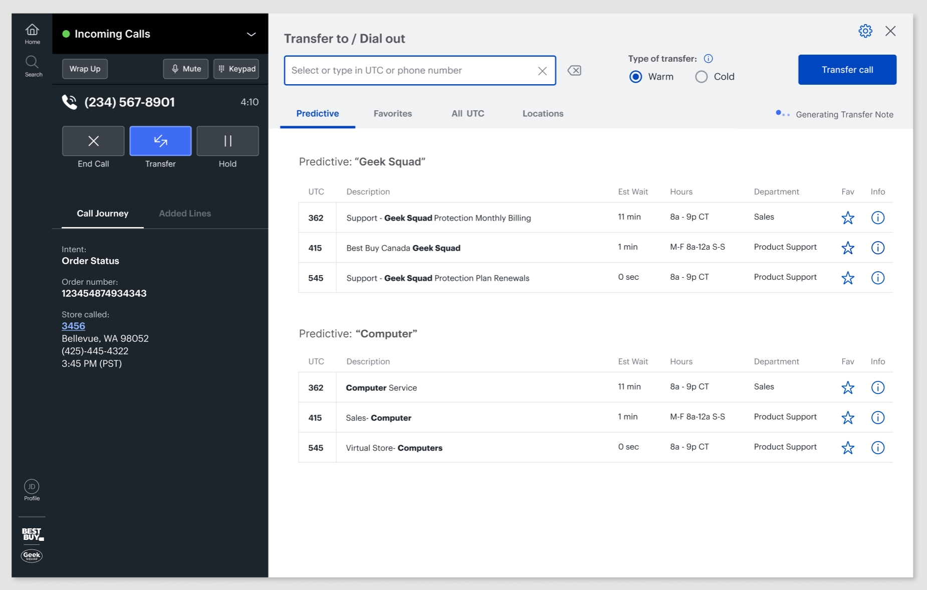
A basic Transfer Directory was planned for the MVP, but it was cut when the new phone platform couldn't support it. This is my full vision for it, designed in three layers, from what we could build easily to what would help agents most.
1. All UTC Numbers
Every team and its transfer code in one searchable list. I added quick filters for the most-used categories, like Sales, Services and Billing, as buttons instead of a dropdown, so agents can narrow the list in one click.
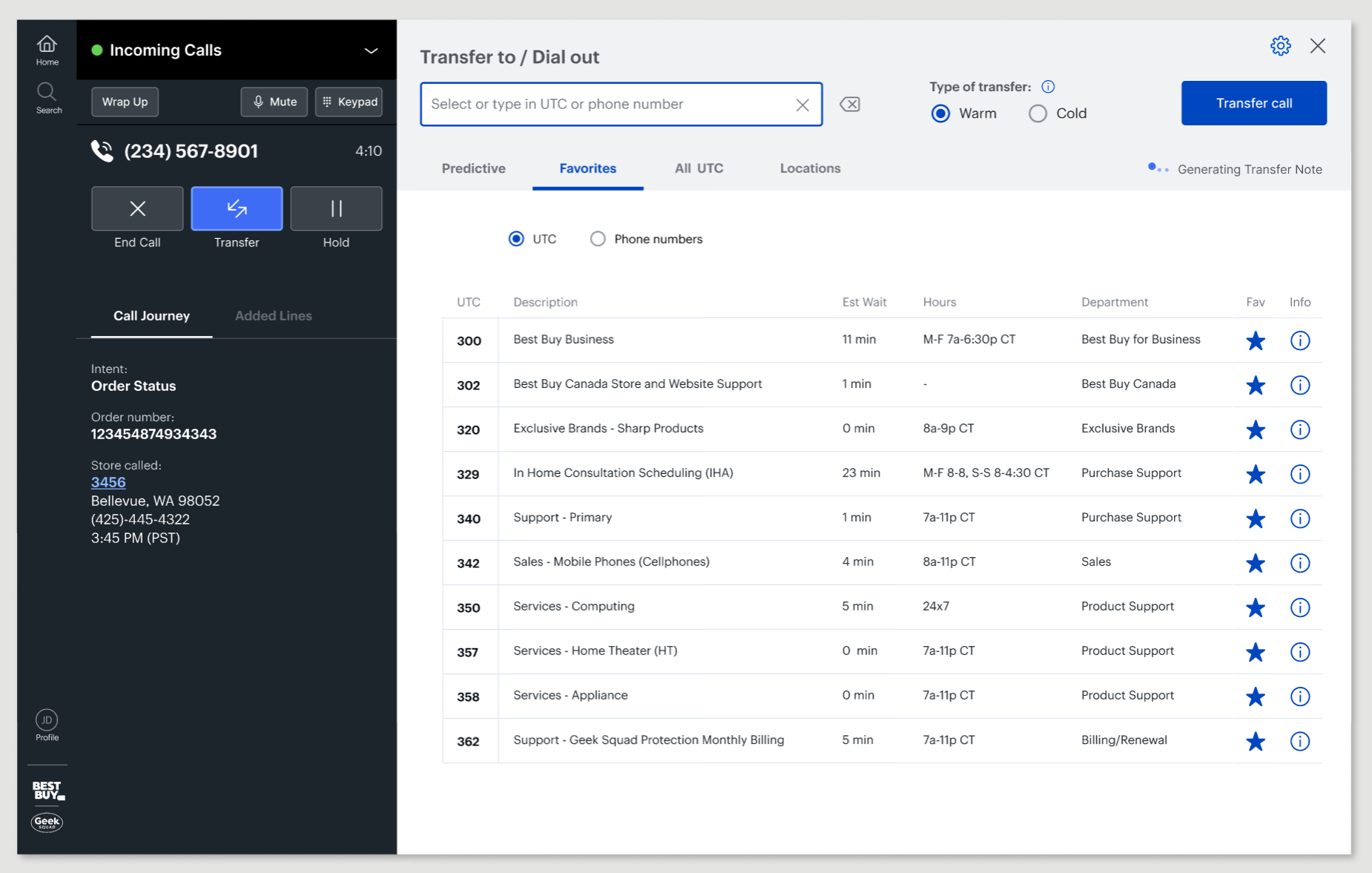
2. Favorites
Agents told us they kept their most-used codes on paper notes or in memory. Favorites puts those teams first, and agents can add, remove and edit them. It works for both transfer codes and outbound numbers, since some teams mostly make outbound calls.
3. Predictive
The workspace had just added machine learning to transcribe calls. I proposed using it to also listen for what the customer needs and suggest teams to transfer to. I imagined it hearing the top keywords in the call and predicting where to transfer from those words. I later revisited this idea with today's AI, shown at the end of this page.
Cold Transfers: The System Finishes the Job
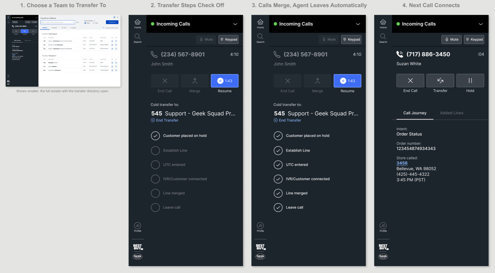
In the MVP, the system already put the customer on hold and connected the line, but agents still had to listen to make sure it worked, then merge the call and leave themselves. For cold transfers, this concept finishes the job. Agents pick a team in the Transfer Directory, and a checklist shows each step as the system works through it, including merging the call and leaving it. On lines of business that auto-connect, the next call comes right in. Agents can end the transfer at any point, and warm transfers stay the same, so they can still talk to the next team before handing off.
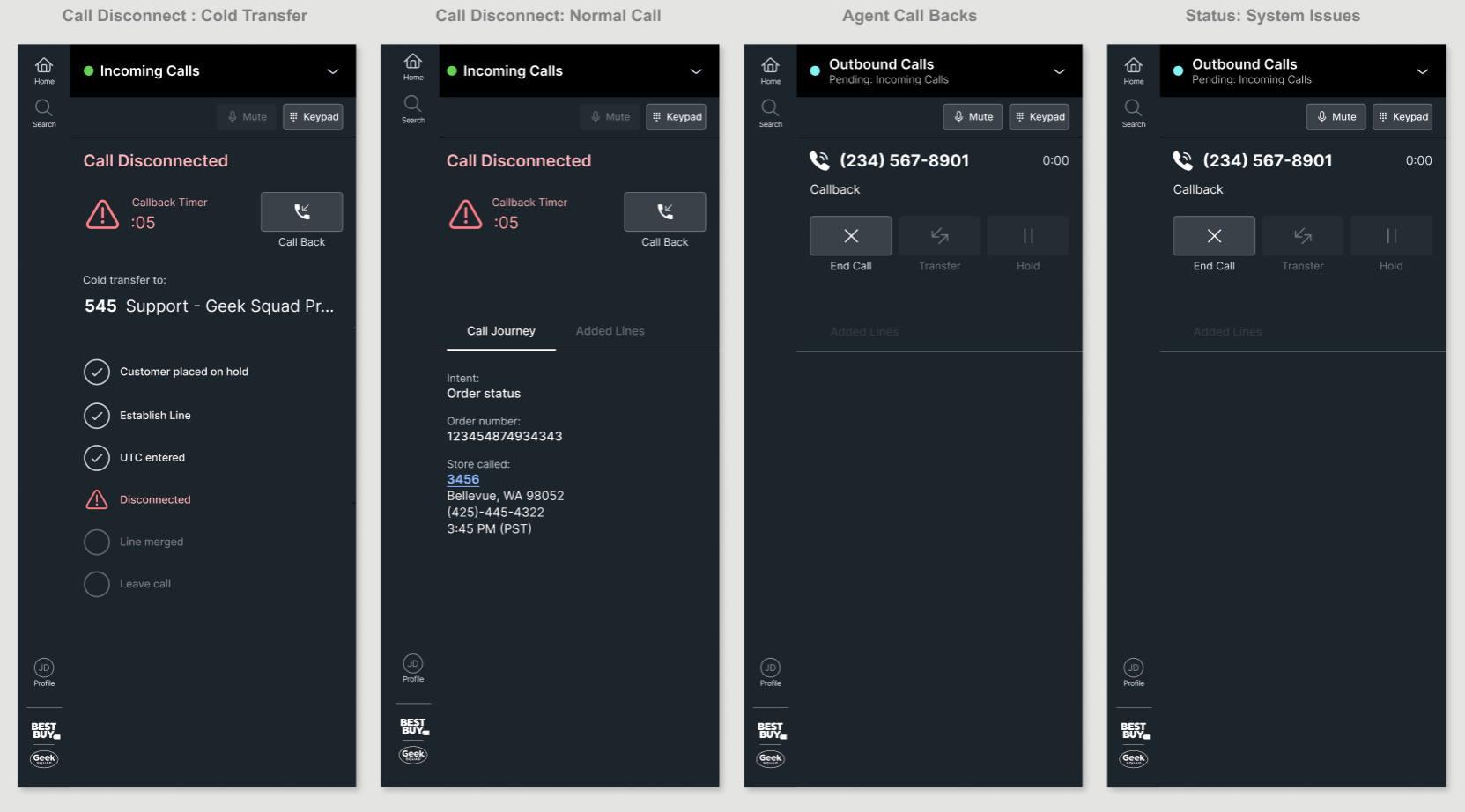
Dropped Calls: Call Back in One Click
Calls drop, whether an incoming call fails on auto-connect or a transfer doesn't go through. When it happens, the panel opens a short callback window, 3 to 10 seconds set by each line of business, with one Call Back button and the customer's number already filled in. For transfers, the checklist shows exactly which step failed.
Calling back switches the agent to Outbound Calls with Incoming Calls pending, so the time is tracked correctly with no status changes by hand. When the callback ends, the agent goes straight back to Incoming Calls, ready for the next call. If the timer runs out before they call back, the next call comes in.
Lunch and Breaks Without a Second App
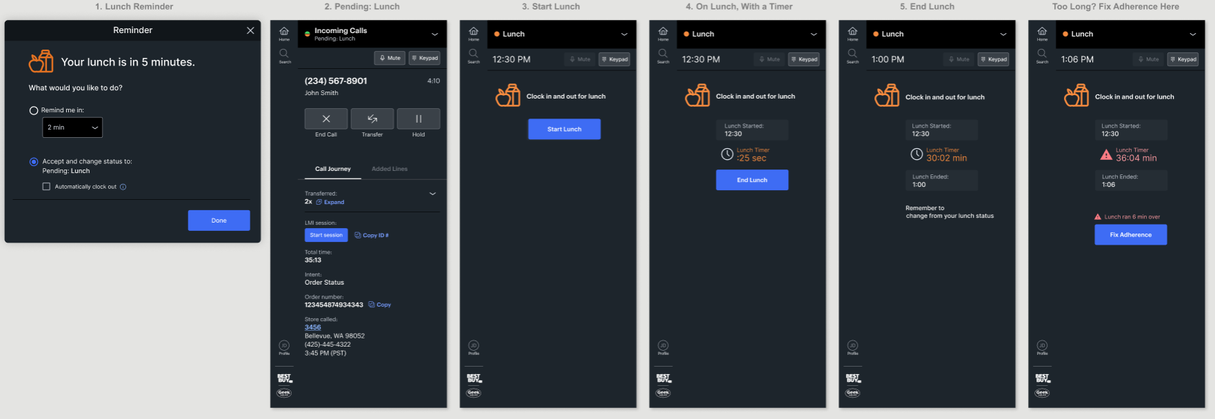
I explored several ways to connect lunch and breaks to workforce management, so agents no longer had to clock in and out in a separate app. This flow shows the manual version. Before a scheduled lunch, a reminder asks if they want to take one more call or set their status to Pending: Lunch. Then they start and end lunch right in the panel, with a timer as they go. If they run long, they can fix their adherence from the same screen. In another exploration, changing status clocked agents in and out automatically.
Sign Out of Telephony and Tools at Once
In the MVP, a reminder at the end of a shift told agents to sign out. In this exploration, they sign out right from the Call Control panel. When their status changes to End of Shift, the panel shows sign-out options: just telephony, or telephony and their tools together. The same options sit at the bottom of the status menu, so agents can sign out anytime without leaving the panel.
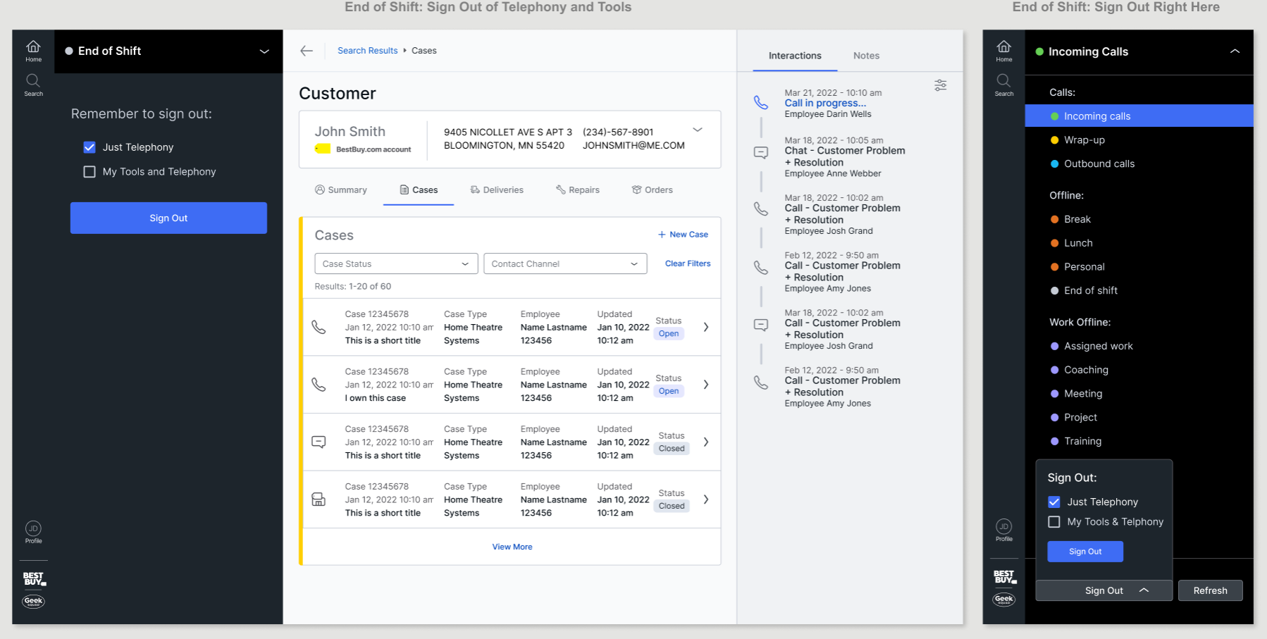
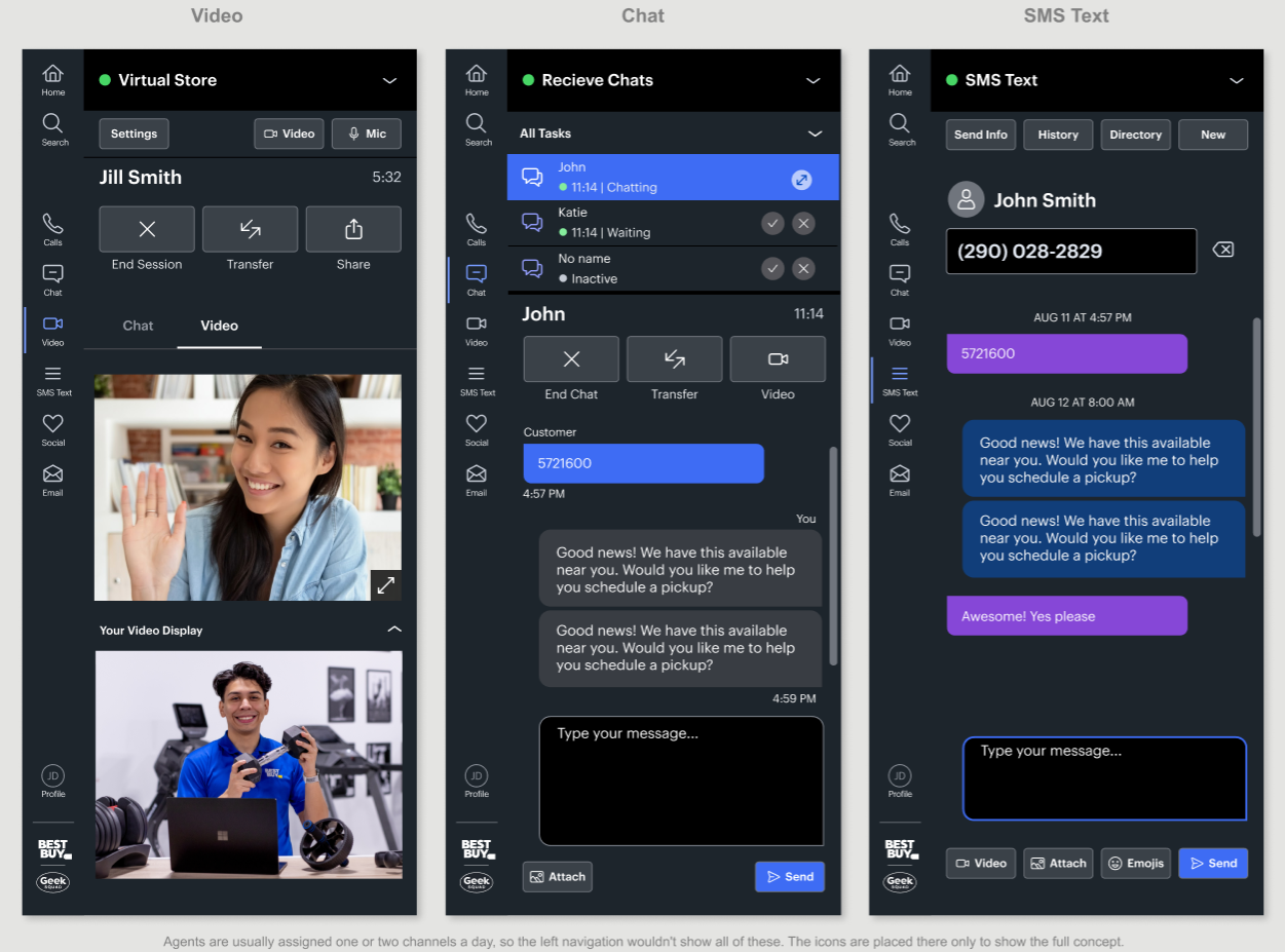
From Call Control to a Panel for Every Conversation
Support Workbench was built to serve customers across every channel, not just phone calls. That meant Call Control would need to grow into a communication panel that handles every way agents talk with customers. I explored panels for video, chat and SMS text. I showed the concept to stakeholders and handed it off to other designers when I moved to another team and project.
A Past Idea, Updated
AI That Suggests Where to Transfer a Call
At Best Buy, before ChatGPT, I pitched using AI to predict where a call should be transferred. My early concept matched keywords from the call to teams. Years later, AI can understand what a customer means, not just the words they use.
I revisited the idea with what's possible today.
Predictive Transfer, Step by Step
The AI listens to the call, sums up what the customer needs, and suggests two or three teams. Favorites and All UTC are still one tap away for agents who want to pick on their own.
How It Learns
No ratings or forms: agents are moving fast and can't come back to this screen. The system learns from what they do instead: which team they picked, whether it was suggested, and whether the call had to be transferred again because it went to the wrong place.
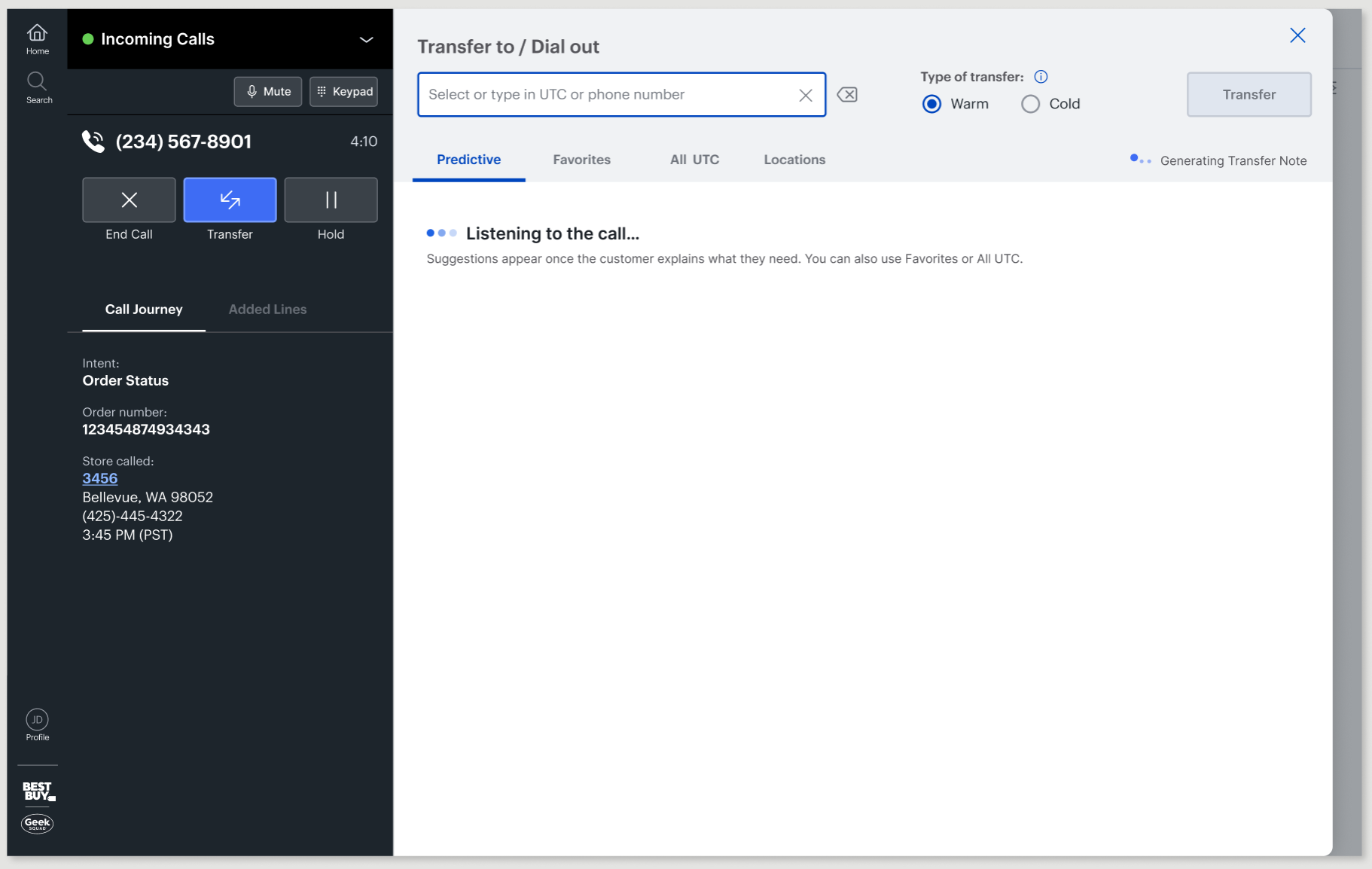
1. The Directory Opens on Predictive
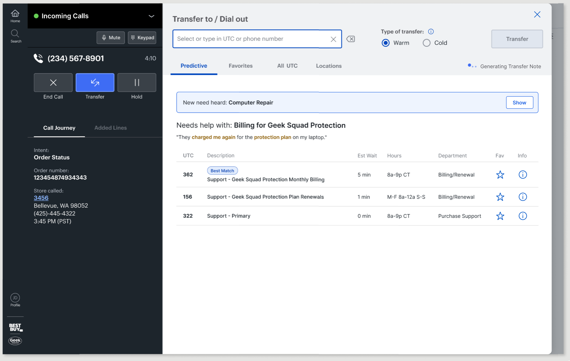
When an agent presses Transfer, the Transfer Directory slides out and opens on the Predictive tab. If the customer hasn't explained their need yet, the tab shows that it's still listening to the conversation. Agents will rarely see this state, because they usually don't know a call needs a transfer until the customer explains the problem.
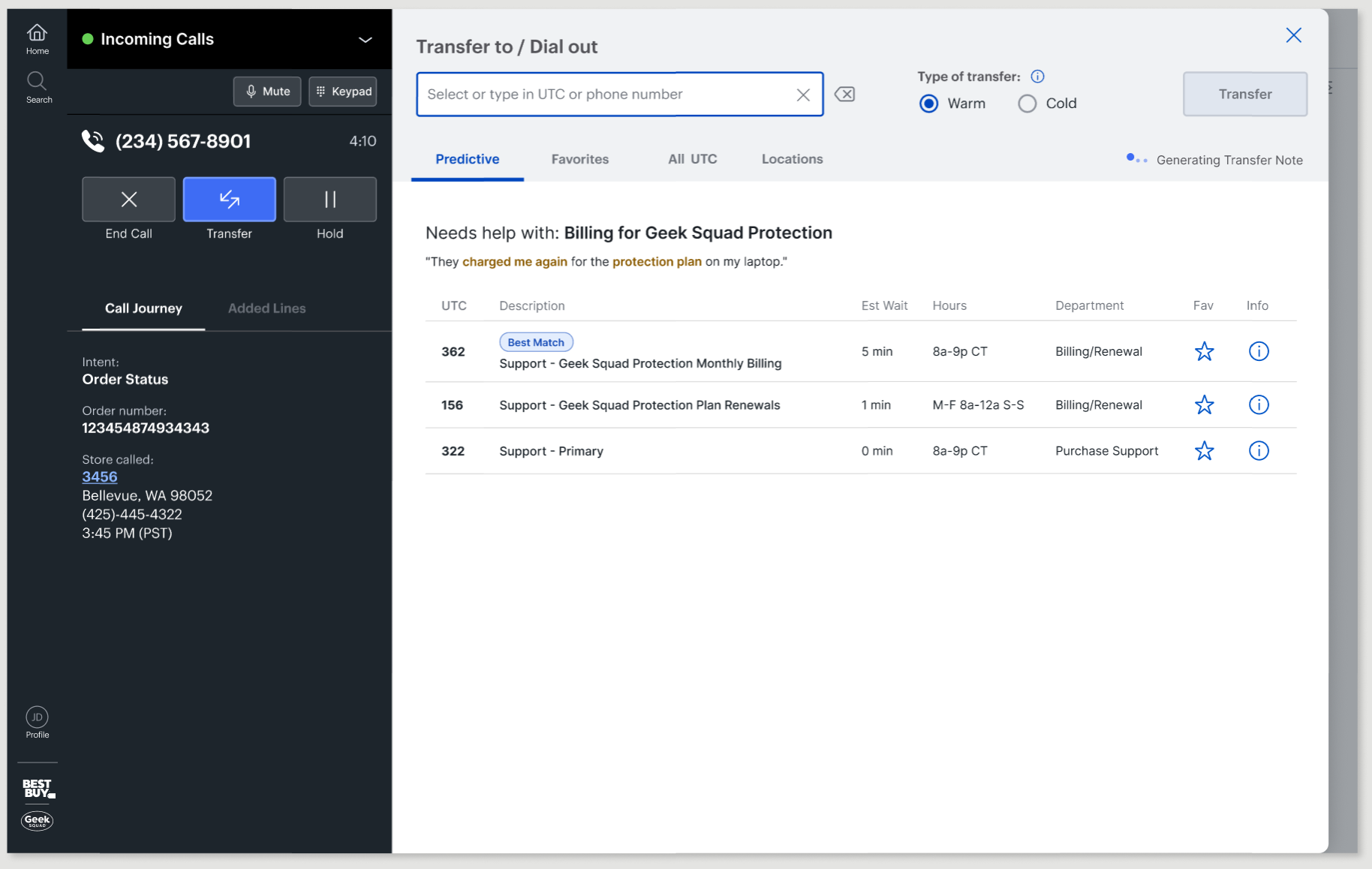
2. AI Identifies the Need
Usually the need is clear by the time an agent transfers. The AI sums it up in one line, shows what the customer said, and suggests two or three teams. It listens for meaning, not keywords, so "they charged me again for the protection plan" reads as a billing need. Best Match marks the top pick in plain words, not a percentage, following guidance from Google's People + AI Guidebook. It isn't selected for the agent, so a person, not the AI, decides where the customer goes.
3. Customer Raises Another Issue
Calls change direction. If the customer raises another issue while the directory is open, a bar offers it instead of swapping the list. An agent might be about to pick a team, and a list that changes under them is how wrong transfers happen. The list only changes when the agent chooses Show.
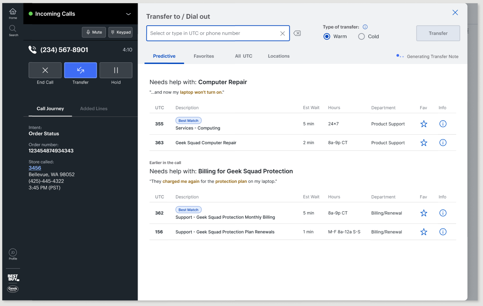
4. Both Customer Needs Stay Visible
The newest need moves to the top, and the earlier one stays below it. If the customer goes back to their first question, the agent doesn't have to dig through a history tab. If the agent opens the directory after both needs come up, they're already there.
Reflection
What Came Next
After I delivered the MVP and next-release designs, budget cuts ended design support for Call Control. My senior design manager made a case to keep me at Best Buy and moved me to the Repair Workbench team. While on that team, I kept meeting with engineering during the MVP build and with product and other designers to share the vision going forward, especially for the Transfer Directory and chat.
What I'd Do Differently
I wish I could show that agents made fewer mistakes, like accidental hang-ups or picking the wrong status, but none of that was measured, since agents don't report their own mistakes. Next time, I'd run a short survey on the small things before and after launch, and pair it with data the system can track, like calls that end in the first few seconds. Revisiting this project, I used Claude and the Figma MCP server to rebuild the MVP as a working prototype and update my AI transfer idea. It changed how fast I can go from an idea to something people can click through.