

MICROSOFT SURFACE CONFIGURATOR
I replaced a four-step configurator that hid prices and buried cross-sell with a tested two-step model that I initiated, proved, and shipped.
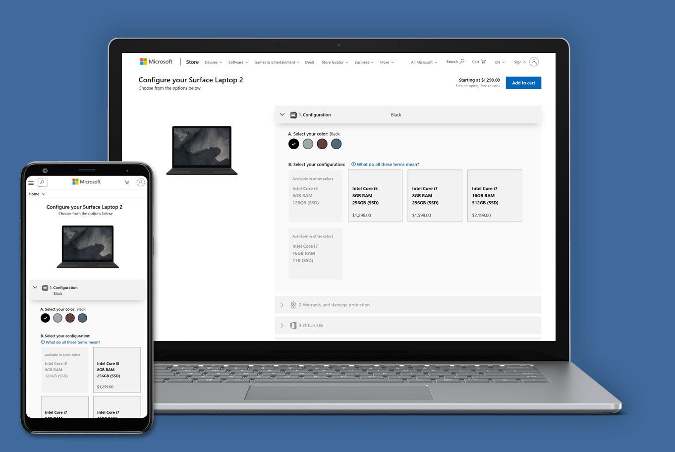


Scenario
Problems & Goals
Solution
Responsibilities
As the Senior UX Designer on the Experimentation team, I was responsible for identifying and proving revenue opportunities across Microsoft's e-commerce site through testing. On my own, I started looking at the Surface configurator — which was outside my team's scope at the time — and saw a significant business opportunity: poor interaction design and buried cross-sell were costing revenue.
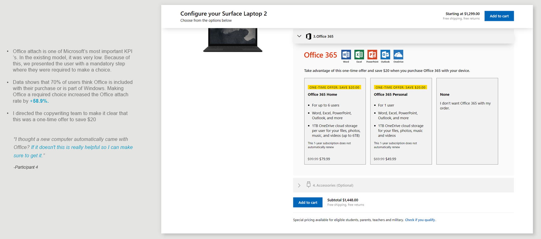
The configurator had a default SKU selected — people were buying the cheapest one without realizing they had a choice, leading to angry customers and returns. I had a hunch that customers were also angry about the Surface Pro Type Cover — the ads showed it as though it was included with the device, and it wasn't. That hunch proved right. Help was hidden behind eye icons almost nobody saw. Video session replays showed people clicking the icons, reading, closing, opening the next one, reading, and then making their decision more quickly — the help was doing the work, and it was buried. Interaction patterns and button placement changed from page to page. And Office — the biggest cross-sell opportunity — sat below the fold, treated as an afterthought. Data showed over 75% of users assumed Office was included free when they bought from Microsoft.
I prototyped a two-step configuration model on my own initiative, pitched it across Windows Design, Engineering, and Marketing, built the team's first combined qualitative-and-quantitative testing roadmap, proved the model across three experiments, and triaged a broken Device Day launch. The new configurator deleted a page from the funnel and moved all cross-sell onto the configuration step.
As the self-initiator and eventual experimentation lead, I was accountable for the concept and vision, all research and data, the prototypes, the testing roadmap, the interaction model, cross-team buy-in, and the launch recovery. Marketing required leading with color and no individual prices for processor, RAM, and storage — constraints that made the UX harder. I worked with Windows Design, Windows ENG, Surface / Office / Warranty business owners, copywriters, Microsoft Store retail specialists, accessibility, and user research.

Phase 1 · Self-initiator
I saw an opportunity outside my team's scope,
and I built a solution
I was on the Experimentation team, under Marketing, testing hypotheses for the Surface marketing site — including interactive motion heroes that increased revenue. On my own, without anyone asking, I started looking at the Surface configurator, which was owned by a different team, and saw business and customer opportunities in a poor user experience. I built the concept, research, design, interaction model, and Axure build myself, checking in with my manager and a Surface marketer along the way for feedback.

Phase 1 · Self-initiator
I saw an opportunity outside my team's scope,
and I built a solution
I was on the Experimentation team, under Marketing, testing hypotheses for the Surface marketing site — including interactive motion heroes that increased revenue. On my own, without anyone asking, I started looking at the Surface configurator, which was owned by a different team, and saw business and customer opportunities in a poor user experience. I built the concept, research, design, interaction model, and Axure build myself, checking in with my manager and a Surface marketer along the way for feedback.
Research and Findings
I researched competitor sites and car-dealership configurators, then pulled Clicktale data on page engagement to support what I'd already seen. I built the themes for what makes a good configurator and developed wireframe prototypes in both desktop and mobile.
Note: My manager knew I was doing this.
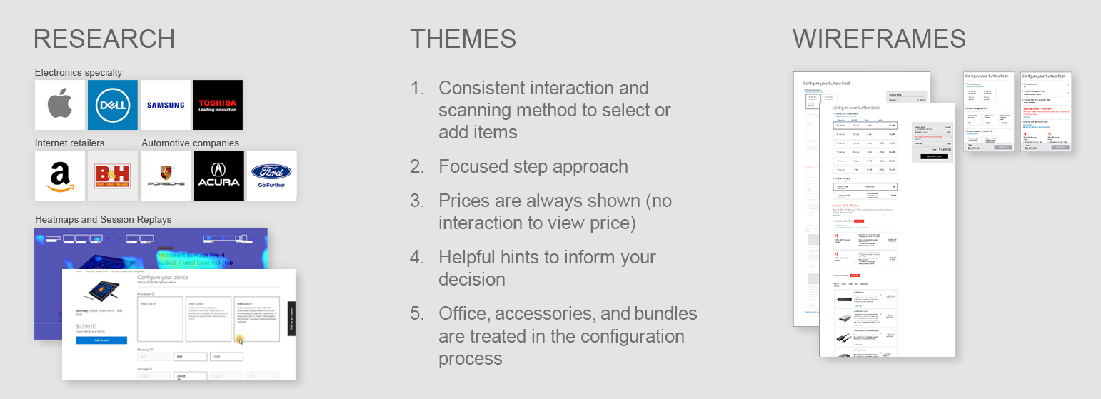
What I’m Trying to Solve
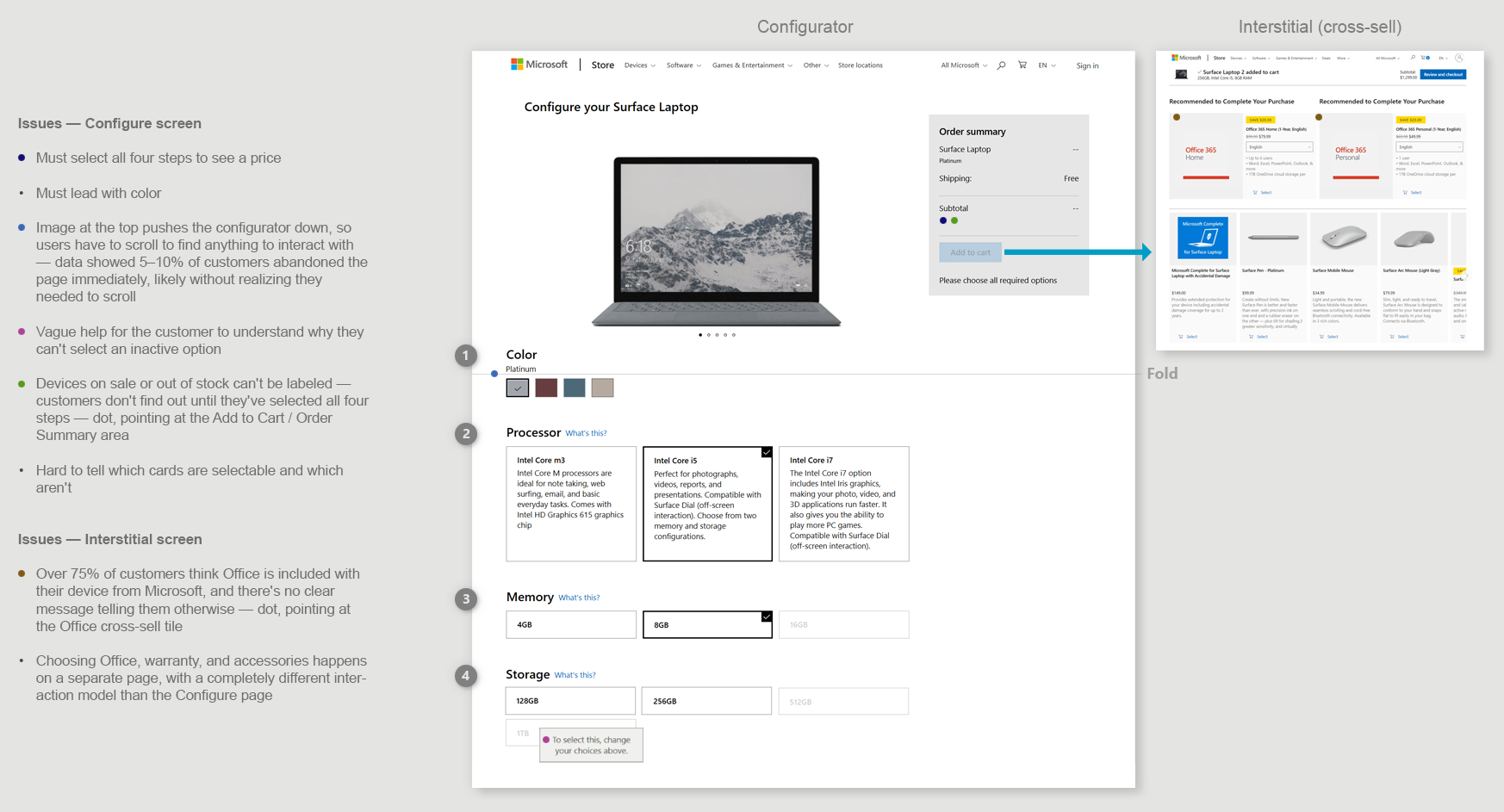
This was the current Surface Configurator flow — from the Surface PDP to the configurator to the interstitial cross-sell page. It had inconsistent interaction issues and left users unsure what the specs meant unless they researched the tech jargon elsewhere. Office, a key product, was treated as an afterthought below the fold — and over 75% of users think Office is included with their device, which it's not.
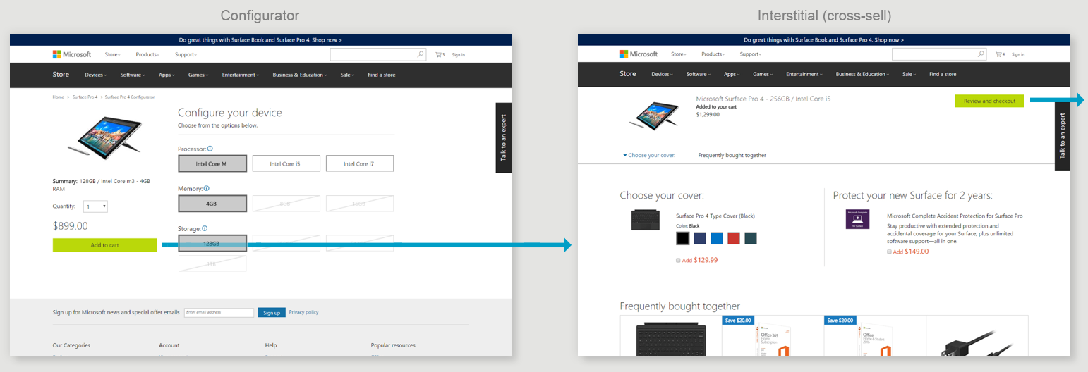
Issues
Default SKU pre-selected — the cheapest option, so customers could buy it without realizing they had a choice. (Data later confirmed this was happening.)
Price is off to the side, not on the selections (Configure)
Inconsistent interaction model from page to page (big blocks to click vs. very small check marks)
Inconsistent “Next” (Add to cart, Review and Checkout) placement page to page
Help is hard to find (Configure)
Office is below the fold (Interstitial)
Office is sold as an afterthought for something they "need" (Interstitial)
"Choose your cover" makes it seem free (Interstitial)
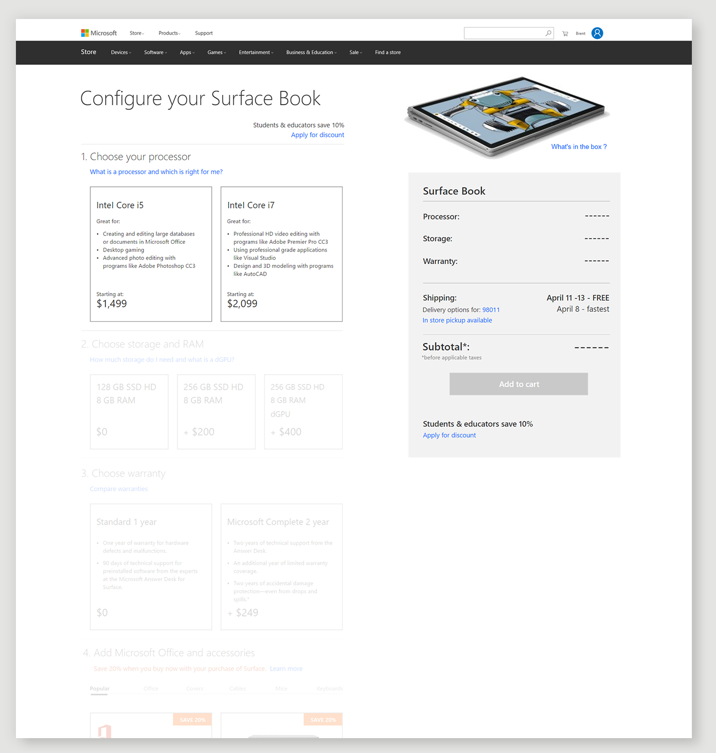
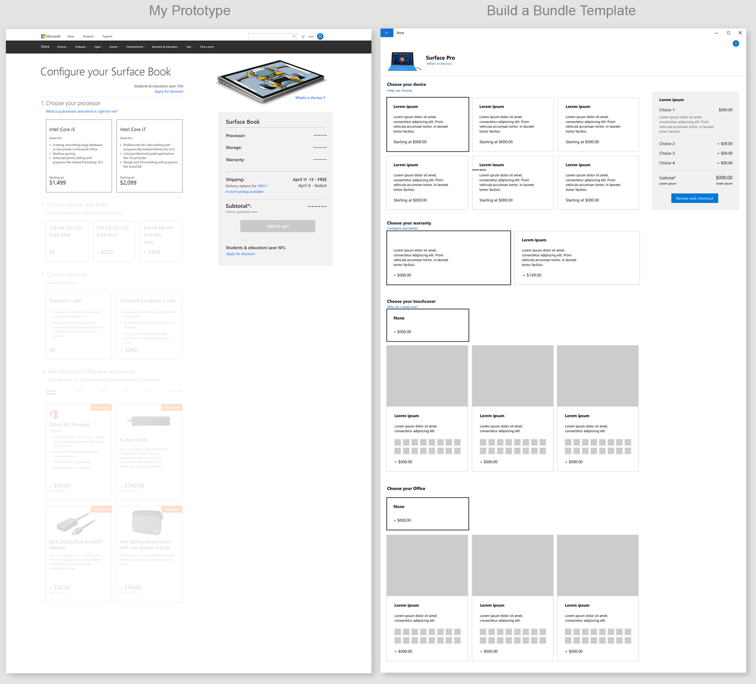
My Wireframe Prototype Solution
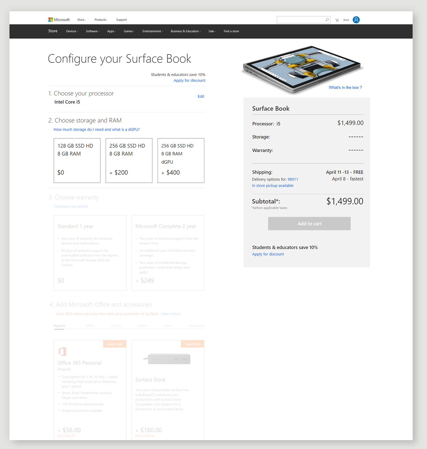
My approach was built on a few core principles: no default SKU selected — the user makes a conscious decision for each section — with help along the way, a starting price in every card, and just enough information at each step to make their decision.
1. Choose Your Processor
The processor cards use plain-language helper text — what each processor is good for — instead of raw spec names and numbers customers don't recognize, so they can decide by common tasks, not jargon
A starting price shows in every card so they can compare from the first step
As you select, the step collapses and the next comes into focus
2. Choose Storage and RAM
RAM and storage were priced together, not separately — there was no clean individual price for just RAM or just a drive — so I combined them into one card that could show a single price, like +$400, for the whole option
The dedicated graphics card (dGPU) called out in the most expensive SKU — a value prop for gamers and designers that's usually buried in tech specs. I haven't seen another configurator do this.
A clearly labeled help link — "How much storage do I need and what is a dGPU?" — opens an overlay explaining both, for users who don't know the terms
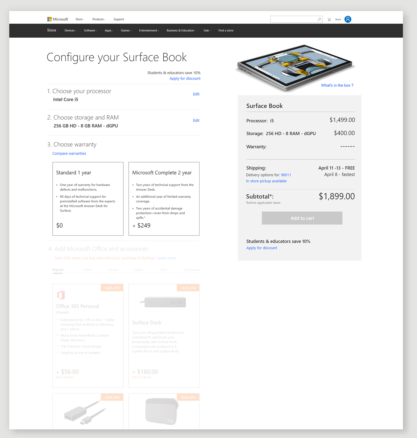
3. Choose Warranty
Warranty shown as a side-by-side comparison of standard vs. the upsell — something I'd never seen done before
It lets the customer compare standard and the upsell right on the page, instead of hunting for it, and builds trust by letting them choose rather than scaring them into it like a lot of companies do ("Are you sure you want no protection...")
It also keeps the pattern established in every step: a conscious choice here collapses the card and brings Office into focus as the next cross-sell item
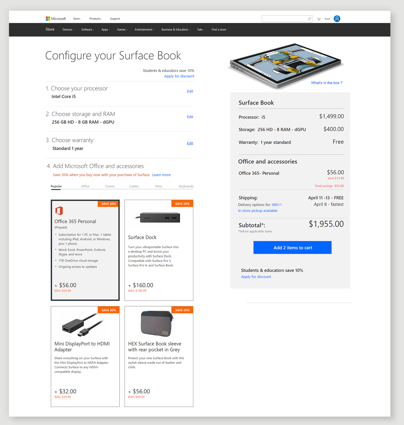
4. Add Office and Accessories
I grouped accessory types into categories under tabs, with a "Popular" tab — since Marketing is always pushing Office, it would live there, but it also got its own dedicated tab
I also explored pitching Marketing on a 20% discount for all accessories bought at the same time as the device — the way a bike shop discounts every accessory you buy alongside the bike at time of purchase. It's a proven model for moving accessories.
The screen shown has Office added to the summary — the user selected it deliberately, it wasn't pre-selected or automatically added.
Password: Surface
Phase 2 · Cross-team influencer
The reorg put e-commerce in my lane, and I already had the prototype
We were reorged from the marketing side to take over all experimentation for the digital store. My scope went from ideas on marketing sites to ideas across all of e-commerce — the marketing Surface site and the Store Surface site were combined into one during the same period. So the configurator was now legitimately in my lane, and the prototype was already built.
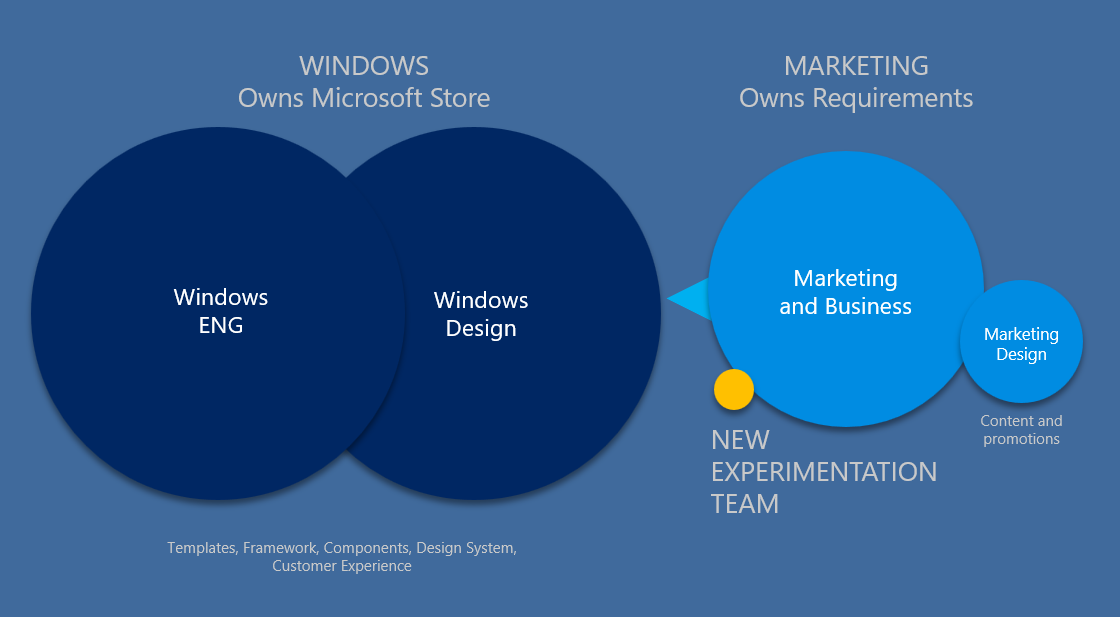
Pitching an idea across teams at Microsoft is not easy — especially when you have no ownership of any requirements or the build, and nobody has worked with you before. No one knew me, my manager, or trusted us yet.
The Pitch That Didn't Land — and the One That Did
First pitch
I built a road show deck with my research and video session data and presented it to the design director of the Windows team — since Windows owned the design of the e-commerce/store experience and its templates. Neither he nor his team knew me or my manager, and pitching a concept from outside their org, with no prior relationship, is a hard room to win. It didn't resonate with him as well as I'd hoped.
The pivot
I came back and worked to earn trust with the team, rather than pushing the same pitch a second time. I got hold of new template designs they were working on that hadn't been released yet — Build a Bundle — and rebuilt my pitch inside their own template. If I could show my model working inside their real, unreleased design language, it would prove the idea wasn't a hypothetical from an outsider — it was something that already fit where their design was headed.
The new design
I deliberately left out the drawer-style expand/collapse interaction from my original prototype — I wanted the pitch to match their new template one-to-one, not compete with it, so I kept the ask simple and could test drawers later if it proved out. Presented it back, and it landed. Once they saw it in their own design language, they could see the vision as their own, not mine.
On to the PMs
Since design doesn't own the requirements — Windows project managers and marketing project managers do — I presented to them next. Once the Windows engineering team got hold of it, it became a real project.
Results
A concept I'd built on my own became a real, funded project with a crawl / walk / run roadmap.
Phase 3 · Real Funded Project
They owned design. I owned the testing roadmap.
Once it was a real project, the Windows design team owned the design decisions and I owned the testing roadmap. We planned the release as a crawl / walk / run model — ship something simple first, then layer in more robust interaction and testing as we proved each step worked, rather than trying to get everything right in one release.
I needed to educate the teams on experimentation — this was a new concept, especially for the engineering team, who were used to releasing what they wanted to release. I had influence without authority. I earned trust with the design team and had a good working relationship with the design lead for the configurator, mentoring him on interaction models along the way.
Marketing handed down a set of requirements — some of which made the UX harder, and one we actually agreed with:
Can't show individual price for processor, RAM, or storage
No default SKU selected — the customer must choose at each step, to keep them from accidentally getting something they didn't want, and to reduce returns
Must lead with color, even though it makes the UX harder on the customer
Every SKU must be labeled on sale or out of stock
Error messages must clearly tell the user what they missed, and every card must be fully clickable — not just a small checkmark or icon
What shipped without testing (crawl model)
The design and engineering team needed to release something quickly, so the crawl model shipped without any user testing — my prototype ideas and testing would happen in the next iteration. A couple of my ideas made it in, like the copy helping customers understand the difference between processors, and no default SKU being selected — but the interaction model itself was the design team's call, not mine. I call this the four-step model — it takes four steps to configure the computer, and the customer can't see a price until all four are complete. There's no way to tell how much more one processor or memory option costs than another along the way.
Video of the Interaction issues
Learning — The interaction model must be fixed.
Phase 4 · Influence Teams to Slow Down and Test
I knew the four-step model, in drawers, would fail
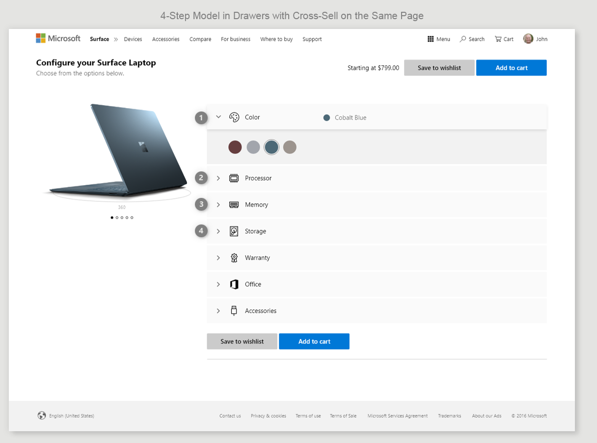
The Windows design and engineering team was going to move forward with the walk model. They fell in love with the drawer idea from my prototype — but kept the same four-step interaction pattern and put each step in its own collapsed drawer. That would make the interaction and customer confusion even worse.
The Compounded Issues- Four Step Model in Drawers
The relationship between what you choose first and how it affects what's available next was no longer in line of sight — it was hidden inside individual collapsed drawers. Choose your platinum color, go to storage, choose the terabyte drive, then go back to change to blue. That's a normal thing to do — and blue isn't available with that storage. What do you do? Do you make them start over? What do you communicate? None of that was being thought through by the design team.
Issues
"Hiding" each step in a drawer makes the relationship of how a choice might narrow their selections for the next step even more confusing
Price is not shown for each step, so the user needs to go through all four steps to see a price
If the customer goes back and changes something, they must start all over again because the new choice might change the subsequent options "hidden" in the drawers
My Solution — 2-Step Model
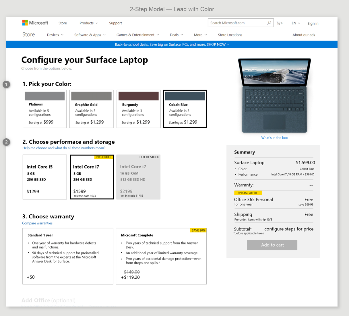
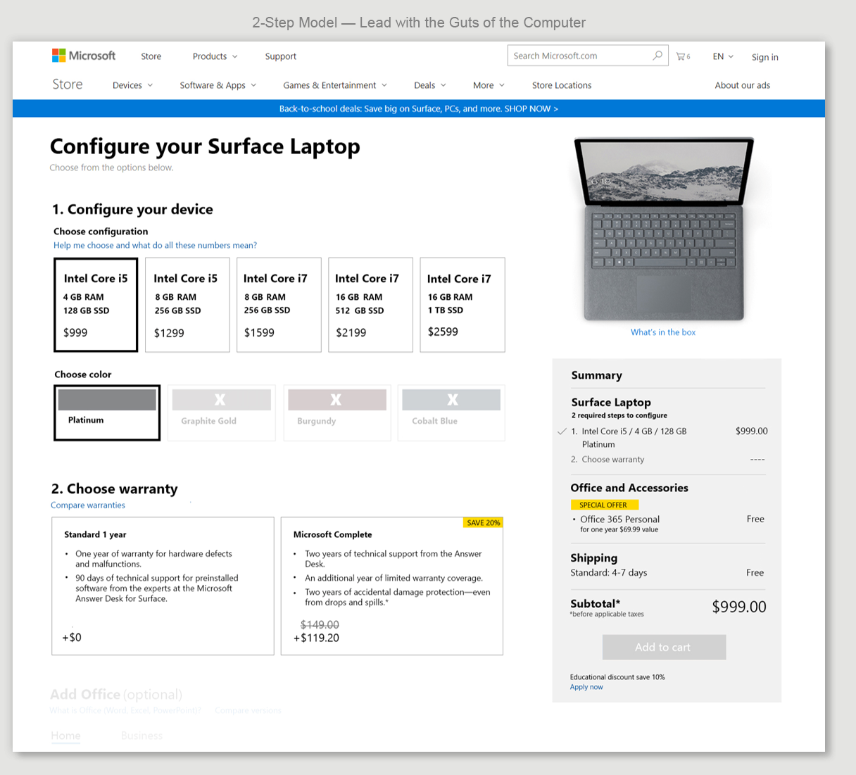
Earlier in the design process, I explored multiple configuration models. This is the 2-step model, done in a custom Build a Bundle template I built before Windows updated their design style. To me, the 2-step model solved the interaction problems of the four-step model — I could put a price on every card and label it on sale or out of stock right where the customer was looking and making their selection. I built two versions: one led with color, to meet Marketing's requirement. The second switched the order, since it was a cleaner, more consistent model with less cognitive load, and matched design patterns used across other e-commerce stores.
Ran Surveys to Make the Case to Marketing
Lead with Color (Meets Marketing's Requirement)
The color step tells the user how many SKUs are available in that color, with a starting price — giving them a sense of how their color choice affects the options below
The second step groups processor, storage, and RAM together, which is harder to scan — but it lets me label each card with a price, and mark it on sale, out of stock, or pre-order. A bit harder to scan, but a good trade-off for showing price right on the cards being selected.
Lead with the Guts of the Computer
I led with the computer's specs since it's the simpler model — choose your spec, see the price
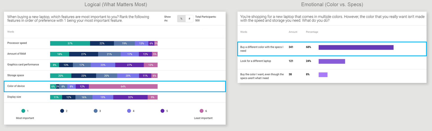
The second step is choosing which colors are available for that spec. It's like choosing your shoe size, then the color it comes in — your size isn't optional, but the color is. That was my hypothesis for the computer too, so I ran surveys to test it and see if I could make the case to change the marketing requirement.
Leading with specs was much less cognitive load on the user, and matched design patterns used across the web. I ran two Suzy surveys to 1,000 people to test whether color mattered as much as marketing's "lead with color" requirement assumed — one from a logical angle, one from an emotional one. Both came back the same way: color ranked as the least important factor to customers. I brought the data to marketing to make the case for dropping the lead-with-color requirement. They agreed — but only for version two, not this release. A partial win, but it shows what I do when I disagree with a requirement: I bring data, not opinions.
Earning the Resources to Test It Right
Convince the Team and My Manager to Qual Test
Windows engineering had already started building the drawer model the design team wanted. I needed to influence them to test another model — or at minimum, qual test the drawer model — to catch issues a flat comp wouldn't reveal. Walking through the happy path forward through a configuration flow, without ever going back to change a choice, makes it very hard to catch real interaction problems.
Convincing the Windows Team to Prototype and Qual Test
Knowing the four-step model would fail, I pushed the design team to get a working prototype built — so they could see the interaction problems themselves, and so we could user-test it before building the real thing. The designer tried to get engineering resources from the Windows team. They said they had no resources.
Convincing My Manager for Qual Test Resources
I went to my design manager and asked to use our own Experimentation engineers. She said no — that's Windows' responsibility, they have more resources than we do. I pushed back: we have to code anything they release for a test anyway, so why not get ahead of it? Build the prototype, user-test it, catch the problems early, fix them in code, then run the experiment faster with better results.
She agreed — our Experimentation engineers would code the prototype for the qualitative test, and we'd reuse that same code for the quantitative A/B test.
Getting My 2-Step Model Approved to Test
I brought the roadmap back to the design team and marketing — including my own 2-step model, which they hadn't planned to test at all, going up against the drawer model they'd already committed to building. Both teams agreed to the full plan.
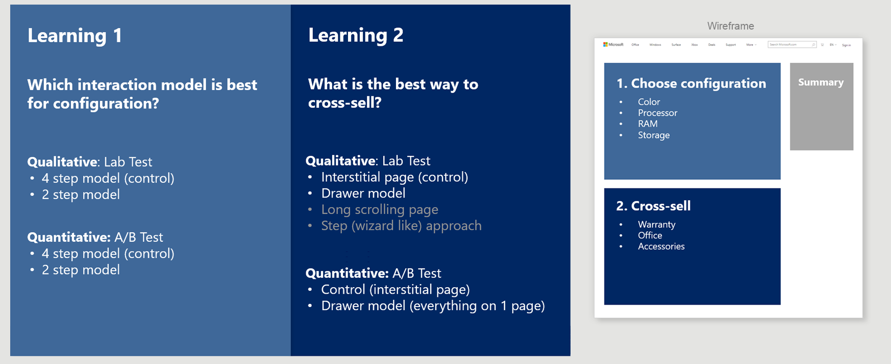
I Created a Testing Roadmap: Two Learnings
Qual First, Then Quant
Raising the Testing Standard for the Experimentation Team
This was the first time the Experimentation team built a testing roadmap using both qualitative and quantitative data to inform the outcome. I used our own Experimentation developers to build the working prototypes for the qual tests, so we could tweak them and turn the same build into an A/B test.
This project also helped me push for and win budget for a qualitative testing program for our Experimentation team, to complement our quantitative testing and get better results and learnings. Experiments that started with qualitative testing had an 81.8% win rate, compared to 40% without it.
Now that we had the resources to build a fully interactive configurator, I broke the plan into two learnings, each tested the same way — qualitatively first, then quantitatively. Qual testing let us catch issues and make improvements before committing to the cost and time of a full experiment, so each A/B test had the best chance of being a winning experiment. Learning 1 was which interaction model is best for configuration. Learning 2 was what interaction model is best to cross-sell — though we only had time to test the drawer model, since it needed to ship in time for Device Day, which had three new Surface models releasing.
Phase 5 · Experimentation Lead
The Test Plan Execution and Results
This is where the roadmap became real. Following the qual-first approach from Phase 4 — catch issues, iterate, then test — I led and executed two qualitative tests and three A/B tests that decided whether the 2-step model or the 4-step model shipped, how cross-sell worked, and what the final design looked like. Every decision in this phase came from something a test taught us.
LEARNING #1
Which Configuration Model is Better?
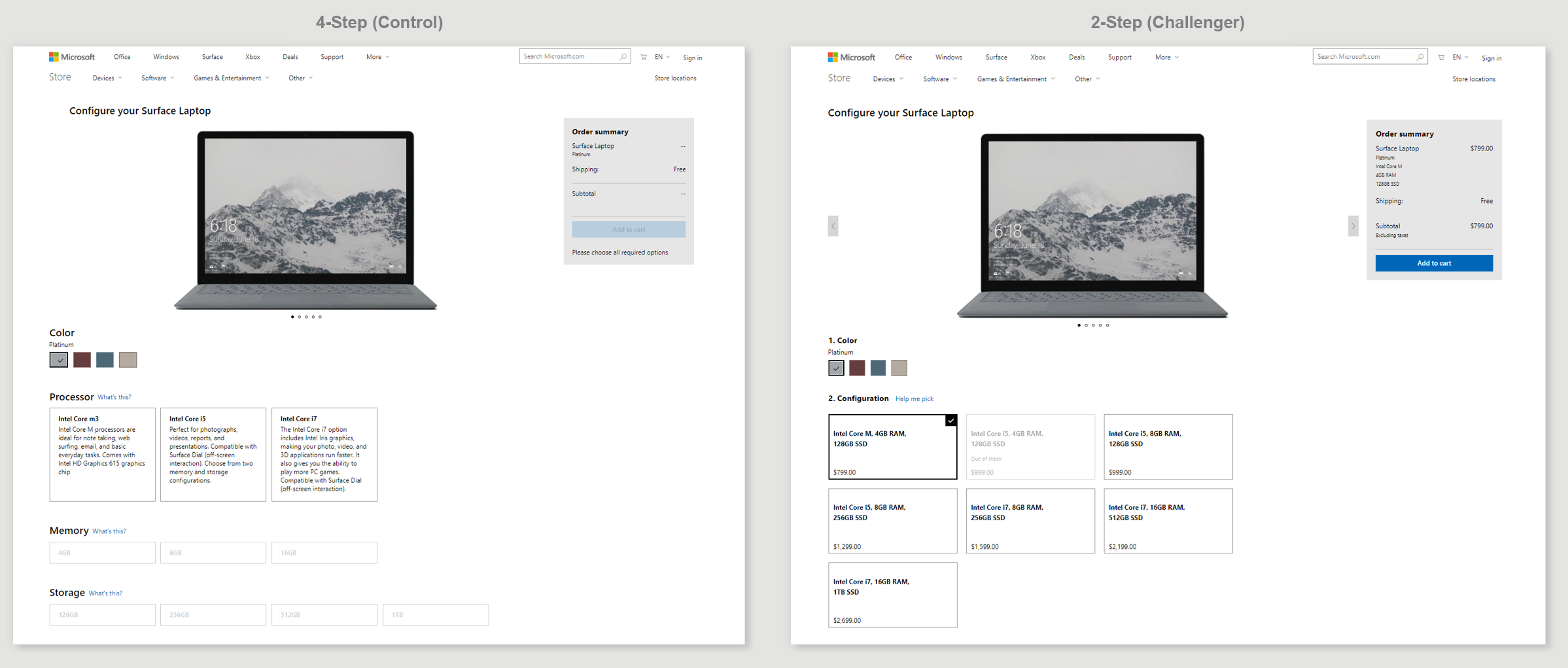
4-step process vs. 2-step process
Qualitative Test — What We Learned
Method: UserTesting.com, unmoderated study, 52 participants.
Finding 1 — "Clean" Design Doesn't Convert, "Clear" Does
"What's this?" on the 4-step tool meant nothing to users — feedback from me and others was the same. The 2-step's "Help me pick" wasn't any better in qual testing. The designer wanted small, minimal copy to keep the design clean. But a link people can't see or understand is one they won't click — and if they don't click it, it can't help them convert. Most participants in the study didn't use help text at all in either version. But once shown it, they rated the 2-step's single explanation more helpful and more confidence-building than the 4-step's three scattered prompts. That confirmed it: the content itself was good; it just needed to be impossible to miss. For the A/B test, I changed the copy to "Help me choose the right configuration" — bigger, and impossible to misread.
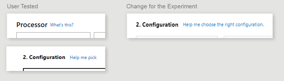
Finding 2 — The Cards Were a Sentence, Not a List
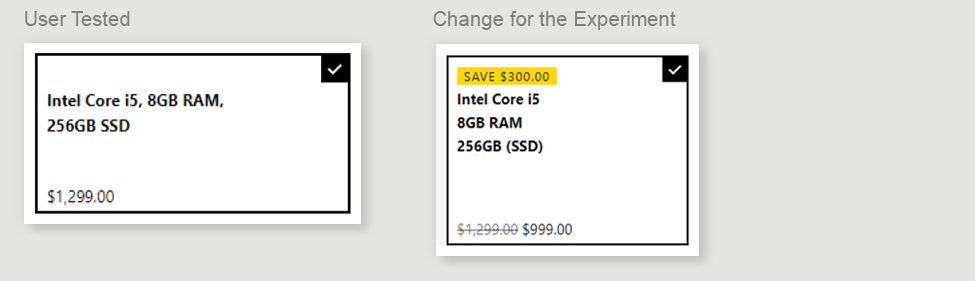
The 2-step cards were tested as a single line of wrapped text — not because it was the better design, but because the designer brought it into the qual test that way. Windows engineering had told him a stacked list wasn't buildable, so there was no point testing something they said they couldn't ship. But the qual data gave me what I needed: users said it was difficult to compare one configuration against another, since everything ran together in the sentence format. I took that finding to our own Experimentation engineers, who built the stacked version easily. It worked, and that's what we took into the A/B test.
A/B Test (Experiment)
Because the qual test was already built in Experimentation code — not a throwaway prototype — turning it into a live experiment was fast. We took the fixes from qual testing — the bigger help prompt, the stacked spec cards — and ran the 4-step model as control against the 2-step model as the challenger.

Result: The 2-step model won.
With the interaction model settled, the next question was cross-sell — which is what Learning 2 was built to answer.
LEARNING #2
What is the Better Way to Attach?
With the two-step model as the clear winner, we needed to test different ways to attach items to a device purchase. With a tight timeline, we were only able to test a "drawer" model. We lab tested it first, with strong results, and used our findings to shape the version we took into the A/B test.
Qualitative Test — What We Learned
Method: Moderated usability lab study, 6 participants.
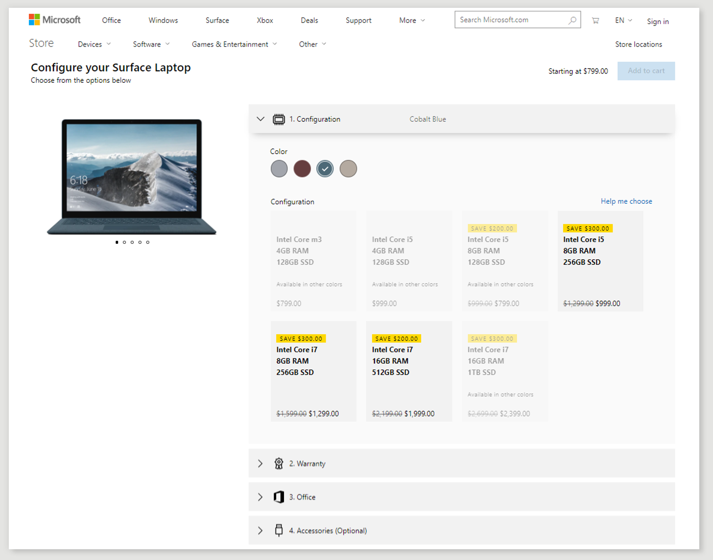
Overall, the tool tested well — participants called it easy to use and said it gave them the information they wanted. Two issues stood out:
Finding 1 — Out-of-Stock Status Was Easy to Miss
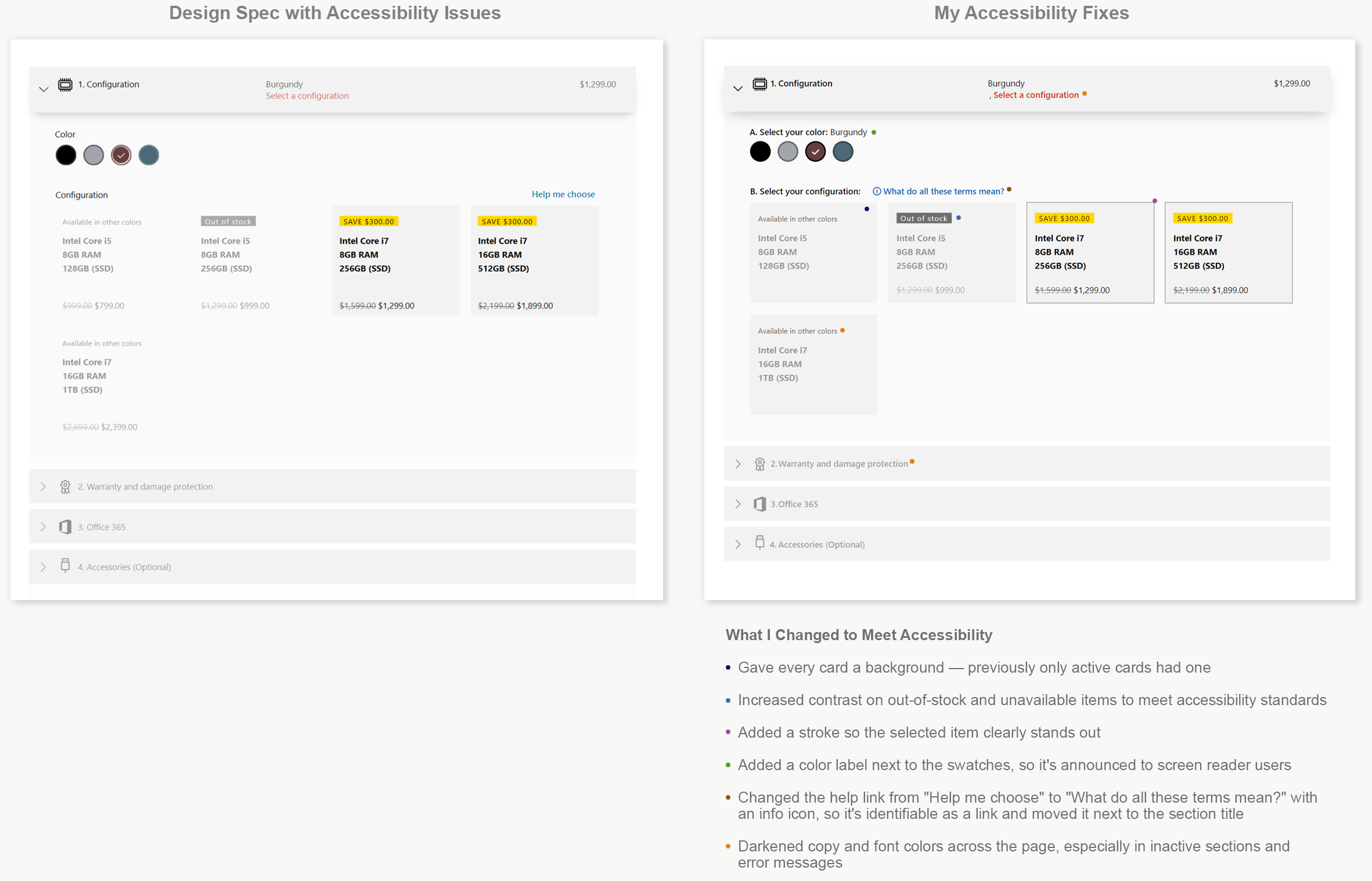
Low contrast on the configuration cards meant some participants didn't notice certain options were out of stock until they tried to select them.
"I would want to get this one, but I can't select it. Why can't I get it? ... Oh! It's out of stock! I didn't see that."
-Participant 3
Change for the Experiment:
I raised the contrast issue with the design lead directly and had our accessibility team and user researchers back it with a formal report. It wasn't addressed at the time — I fixed it myself once the Windows team was reassigned.
Note: the copy on the Help link went through three versions across testing — my original "Help me choose the right configuration," a shortened "Help me choose," and eventually "What do these terms mean?" for the final experiment. I kept pushing for clarity over brevity here, because a help link people don't understand is one they won't click — which is exactly what Learning 1 had already shown.
Finding 2 — Half of Participants Missed the Warranty Step
Three of six assumed they didn't need to interact with the warranty step at all, and missed that the standard option was included free.
"Oh! I didn't think I had to select that."
-Participant 4
Change for the Experiment:
An error message now surfaces if someone tries to add to cart without completing a required step.
Resource Change
Windows Design and Engineering Left. I Carried the Design and the Test to the Finish Line.
What changed:
Design team: gone, instantly
Engineering: a few resources stayed behind — enough to maintain Store and finish coding the configurator for the Device Day release
No new design owner assigned for the rest of the project
I Took On the Accessibility Fixes
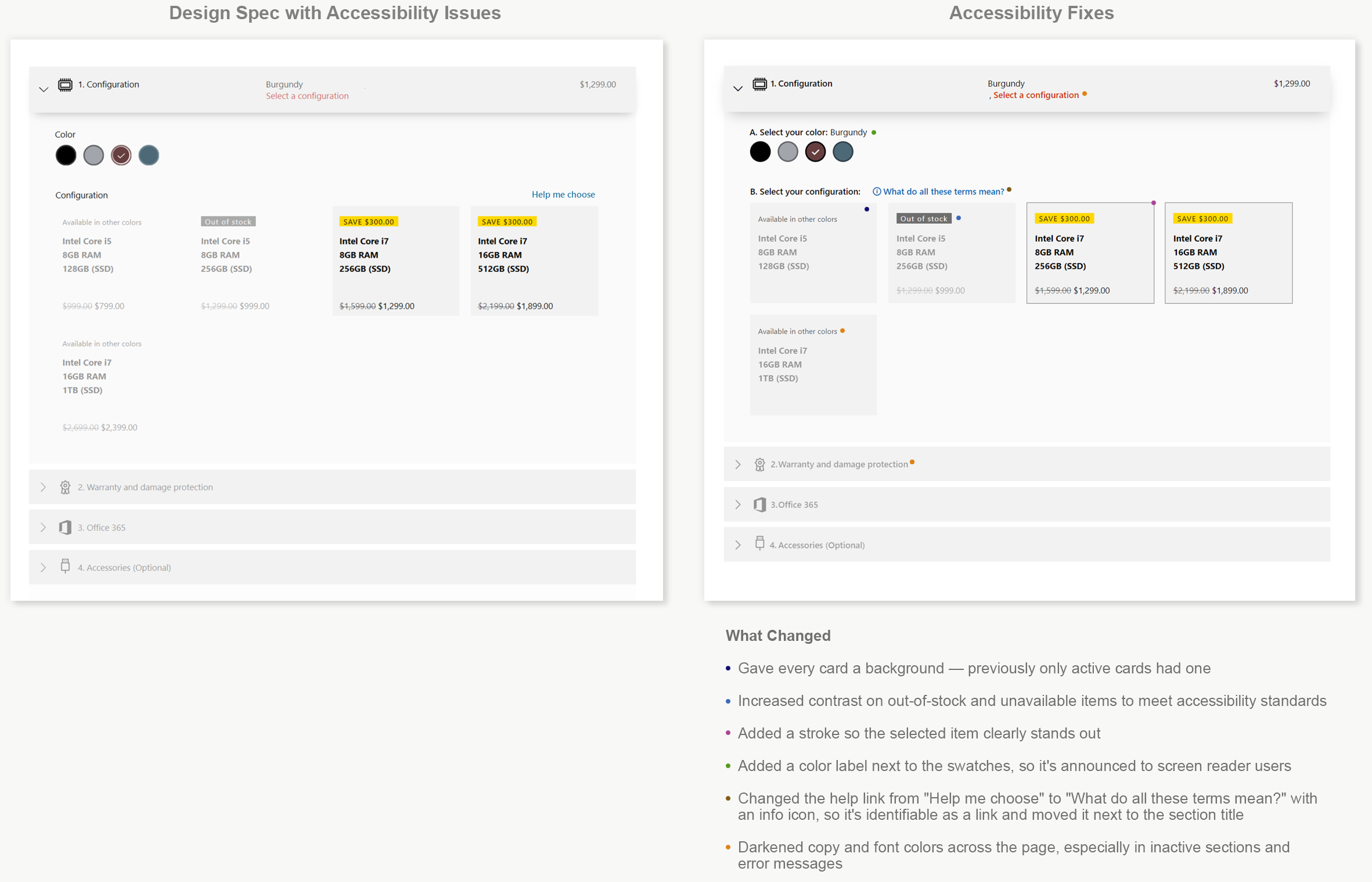
With no design owner left on the project, I used the opening to fix the violations our accessibility team had flagged against the AAA standard — the highest level they review to — including the contrast problem raised in Learning 2, backed by a formal report and never actioned while the design team was still on the project. The changes I made were simple CSS updates: Windows engineering was already coding for Device Day, and the same template would be reused for Xbox's game controller customization, so I stayed within what the structure could absorb. Accessibility also wanted a separate summary section, which would have meant reworking the page's structure — that was out of scope here, but something we'd address as part of continued iteration once this model shipped.
Resource Change
Windows Design and Engineering Left. I Carried the Design and the Test to the Finish Line.
What changed:
Design team: gone, instantly
Engineering: a few resources stayed behind — enough to maintain Store and finish coding the configurator for the Device Day release
No new design owner assigned for the rest of the project
Fix accessibility Issues
With no design owner left on the project, I used the opening to fix accessibility issues the team had never addressed — including the contrast problem raised in Learning 2, backed by a formal report, and never actioned while they were still on the project. The changes were CSS-level — I knew Windows was already coding it, and that the same template would be reused for Xbox, so I kept the fixes minor and easy to inherit rather than reworking the design outright.
Result
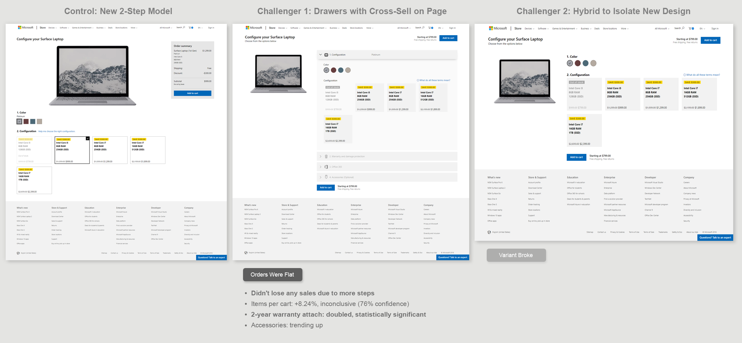
Flat Orders Were Good News
The added complexity of drawers and on-page cross-sell didn't cost us the 5% lift the 2-step model had already won in
Learning 1.
The Hybrid Broke, But We Had Enough
Challenger 2 broke mid-test, so we lost the chance to isolate design from drawers directly. Between what held up and what we already knew from Learning 2, we had enough to make the call: move forward with the drawer model, cross-sell on the same page.
The Office Gap
The SKU tracking Office attach went out of stock mid-test, and no one had been monitoring it — so the one number Office needed most was the one we couldn't deliver. That gap is what the final test was for.
A/B Test (Experiment)
What We Fixed First
Before running the live experiment, we addressed the accessibility fixes and the usability issues from the lab test — the out-of-stock contrast problem and the missed warranty step. Because the lab test ran on the same Experimentation code as the eventual A/B test, those fixes went straight into a live experiment fast — the same approach that worked in Learning 1.
The Setup
We used the winning 2-step model as the new control, since it had never actually been implemented in production. Challenger 1 was the new drawer model, with cross-sell folded onto the same page. Challenger 2 was a hybrid — the same new visual design, but with cross-sell kept on a separate interstitial page.
Why the Hybrid Challenger
I built Challenger 2 specifically to isolate the new design style from the drawers — so we'd know whether a win or loss came from the design itself, or from the drawers and on-page cross-sell.
FINAL A/B TEST (EXPERIMENT)
Get the Pure Numbers
We had time for one more experiment — one that could finally get us every number we needed, including Office attach, which their team was counting on to drive sales that were down for the year. I ran the original four-step model against the new drawer model with cross-sell on the page, a clean
before-and-after comparison.

Result: Huge Win
New Configuration Model to Be Released
Surface checkout rate hit +12.6%, up from the +5.13% we'd seen in the original 2-step test. Office attach came in at +58.9%, a real win for a team that had pushed hard to get this test prioritized, with sales down for the year and counting on this design to turn it around. The new model won decisively — and was greenlit as the configuration experience for all three new Surface devices launching on Device Day.
The Cost of Scale
Three new, tented devices. One hard deadline. A design team that was gone. What happened next is Phase 6.
Step by Step
A Closer Look at the Final Design
Choose Configuration

Help Overlay

Choose Warranty

Choose Office 365
Choose Accessories

Video Final Interaction
Phase 6 · Tented Launch Failure
It shipped buggy. I'd warned them. They gave it to me to fix.
What should have been a clean launch turned into a scramble to fix what shipped broken — and prove the model was still the right one.
Warned, and Ignored
We handed off the experiment code — the working design, with all the drawer interactions. But the design team was gone, reassigned with no replacement. I emailed the design lead to check whether all the device scenarios had been specced — Type Cover as its own step was one example — but got no response. He'd gone silent, with his new project now the priority.
With those scenarios still unanswered, I went to my manager and told her if this wasn't coded correctly, it could be horrible. I got myself onto the "Tented" launch team, since these were new devices with restricted access. I sent multiple email warnings to the people in charge of the Tented release, telling them I needed to see the build and check it against the full interaction model — the micro-animations, and every device scenario, like keyboard language selection and adding an optional Type Cover. It went out anyway. I don't know if anyone actually saw it before it went live.
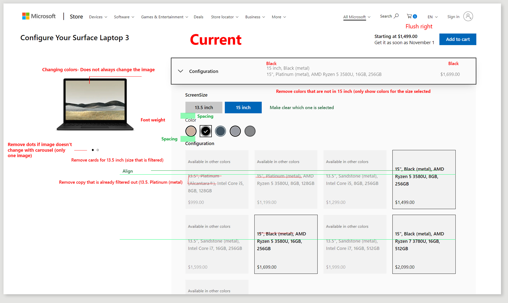
What shipped: screen size and color didn't filter anything — the cards stayed the same regardless. Items were listed as a sentence instead of stacked. Colors were listed twice, once for metal and once for the fabric keyboard, with no label distinguishing them. That's a few of the issues. Executives were upset. It was a bad release.
Steps to a Quality Release
No one was overseeing the build. I had no access to Windows engineering, no way to see what they'd specced — or whether they'd get the interaction right.
A Task Force Formed. I Kept the Team Focused.
They created a task force to fix it. I logged and prioritized bugs based on how the interaction was supposed to work — someone else owned the final call, but I knew the design better than anyone else in the room. One person on the task force hated the model — but what they were reacting to was the bugs, not the design. It was buggy enough that the real vision never came through. I pushed back with the data: I pointed to the winning experiment, shared the results, and shared the experimentation code so they could see it actually working. That kept the task force aligned around what executives actually wanted — revenue now, not later, and a good customer experience. The goal was fixing the interaction, not scrapping something that had already won
I Went Straight to the Engineer — and Beat the Estimate
We weren't supposed to message engineering directly, or even know who was working on what. When one engineer reached out to me with a question, I used it as the opening — I walked him through the major bugs myself, showing him exactly how bad the customer experience was and why, and what it should look like instead. There weren't many dev resources left, and the engineering PM on the task force said the major bugs would take about four months to get to. He had them fixed in about 20 minutes.
Result
Interactions stabilized, critical bugs fixed, all well ahead of the four-month estimate.
Fixed — and the Numbers Proved It
Live site performance exceeded previous experiment results.
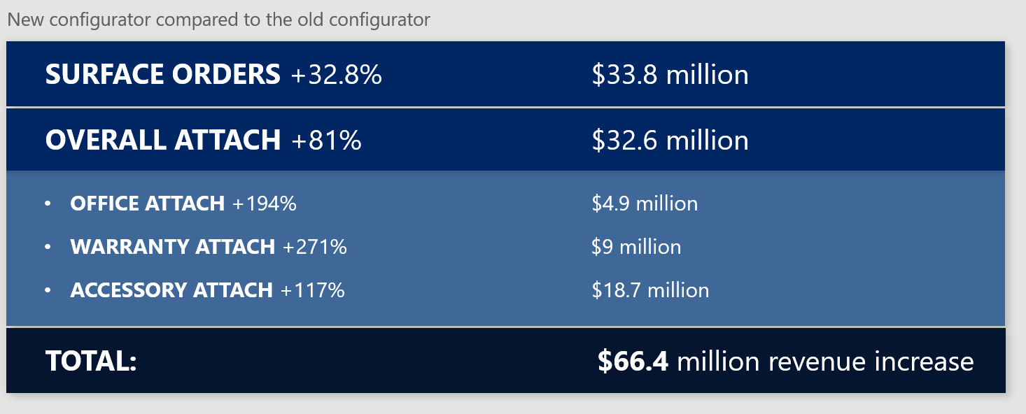
The project nobody asked me to do became one of the most successful launches on the team. It hit every goal we set out to solve: a proven, better experience for the customer — validated in lab testing before it ever went live — more Surface devices sold, stronger cross-sell across the board, and Office and warranty attach both climbing sharply.
Reflection
What I learned about influence without authority
I built the original concept alone, but the moment it became a real project, the Windows design team owned the design decisions — not me. I had influence, not authority, and had to earn trust with teams who didn't know me, twice, after two reorgs. That meant watching them take my drawer pattern and rebuild the exact problem I'd already solved — and not being able to just fix it. I had to prove it instead: build the alternative, get the data, make the case again. Giving up ownership of my own idea and steering it through other people's decisions was harder than building it in the first place — and it's the real reason it shipped successfully.
What I'd do differently
We let too much ride on one launch. The two-step model was a proven winner months before Device Day and was never released on its own — real revenue left on the table while we waited to ship everything together. I'd release proven winners incrementally instead of bundling them into one high-stakes launch. I'd also bring qualitative testing in earlier — most of what qual caught could have been found before the interaction model was locked in. That's part of why I pitched the Experimentation team to start our own qualitative testing program, which I built, and helped the design team start theirs.