

GEEK SQUAD - MEMBERSHIP UPSELL
I took over an upsell agents could skip or miscalculate, and rebuilt it as a required step that does the math for them.



Scenario
A customer brings a device in for repair at the Geek Squad counter. While building the work order, the agent should offer the customer a Best Buy Total Membership, which often saves them money on the repair itself.
Problem & Goals
The release had been scoped for a 1440px screen. Testing later showed it needed to work down to 1280px, a gap the team found before I joined, and the upsell component fell below the fold as a result. The membership name had also just changed, requiring the design to newly account for:
Updated branding, the membership name and logo had changed
Legal disclaimers, not part of the original design
A full list of membership benefits and value props, also new
The upsell component reliably visible, not below the fold in most cases
New yearly and monthly billing options
The business goal behind this redesign was simple: increase membership conversion at the point of repair. An agent can't upsell a component they can't see. The below-the-fold problem wasn't just a visual bug, it was actively working against the one number the project was built to move.
Solution
Drawing on experience running subscription and renewal experiments for Microsoft Office, I rebuilt the Best Buy membership upsell. I made it a required step instead of an optional ad, closed the gap between showing savings and showing real cost, and worked with the Membership and Legal teams to keep it accurate. As I was told of future requirements coming down the line, further discovery led us to expand the redesign from just the membership section to the entire right rail, future-proofing it to handle individual parts and labor pricing now, and a full parts list and cost down the line.
Responsibilities
I was the sole designer on this project, working directly with my product owners, the Membership team, and Legal. I was accountable for the full right-rail cost and coverage system, from wireframes and prototypes through final production-ready screens. My product owner, a former repair agent with a wide network of agent contacts, shared the screens for feedback and confirmed the savings math was clear with no confusion.

Diagnosis
Identifying the Issues
I inherited the release to fix its issues and update rebranded assets. Instead, I found a component with two separate problems: it could end up below the fold where an agent might never see it, and once added, it looked almost identical to its unpurchased state, no clear sign membership had actually been bought.
ISSUE #1
Strange Interaction Pattern
Preview Membership Price Issues
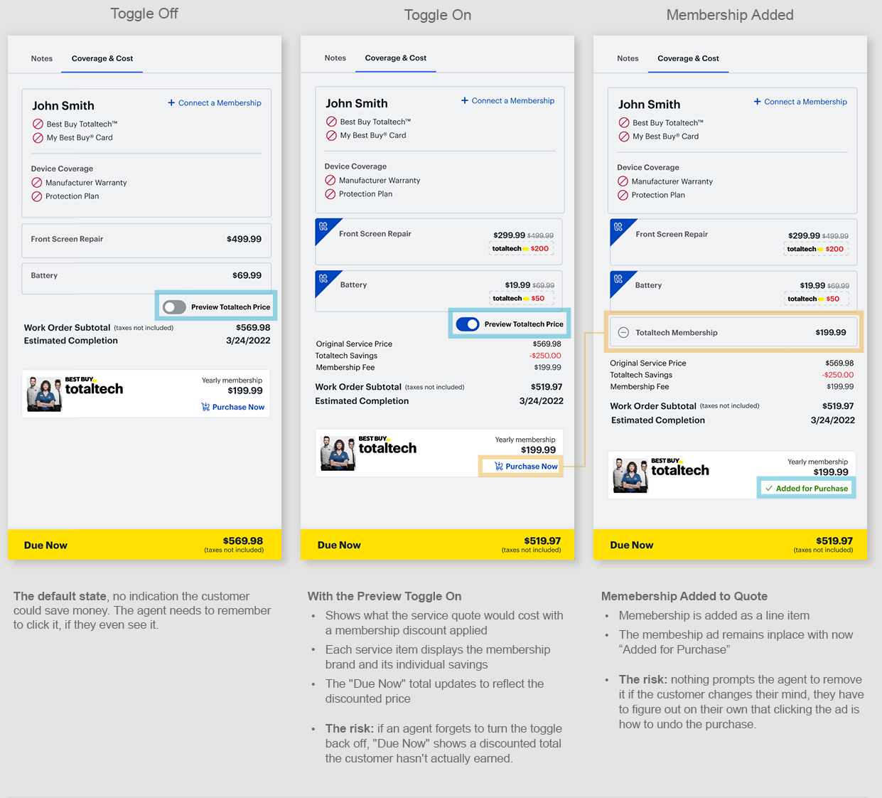
The current design had a genuinely useful idea: a toggle that let an agent preview what each repair service would cost with membership applied, showing the savings inside each service card. But the interaction stacked problem on top of problem:
Nothing prompted the agent to engage with it, checking whether membership was worth pitching depended entirely on them remembering to click the toggle to see if there was any savings for the customer
Previewing the savings didn't add membership, it only showed the price, adding it required a separate interaction with the "ad" itself
If the customer declined, the agent had to remember to toggle back off, or the sticky "Due Now" total would keep showing a discount the customer hadn't earned
The membership "ad" itself doubled as the toggle for whether membership was in the cart at all, purchased and unpurchased states differed only by small copy switching from "Purchase Now" to "Added for Purchase”
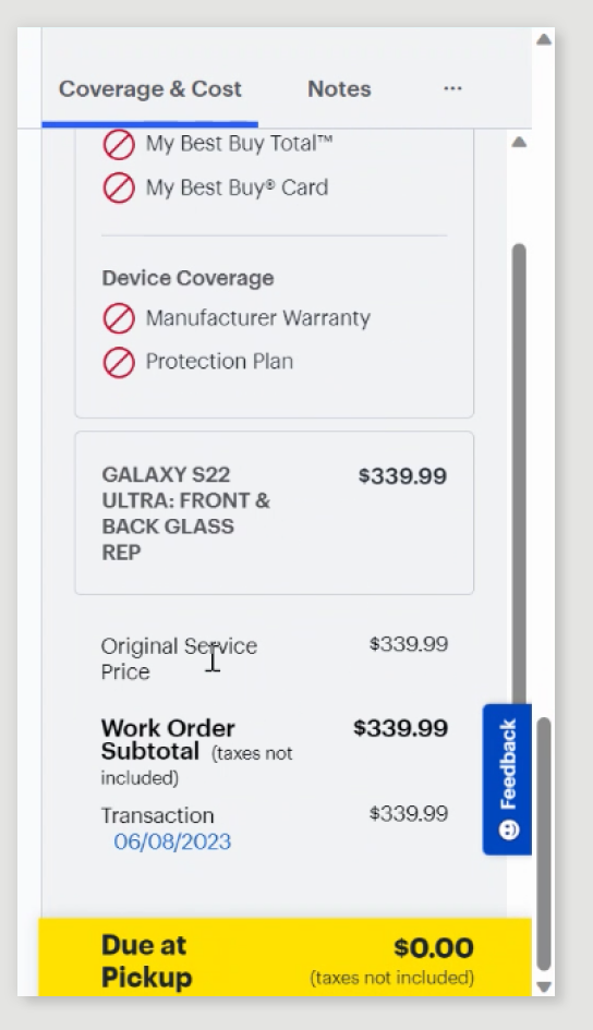
On top of everything else, these controls would most likely sit below the fold in the first place, so an agent had to remember to scroll down and find them before any of it could happen
Membership Component, Below the Fold
Actual coded screens showing the membership ad and toggle below the fold on a smaller screen resolution, along with a bug causing dual scroll bars.
ISSUE #2
Repeated Information and Wasted Space
Repeated Information
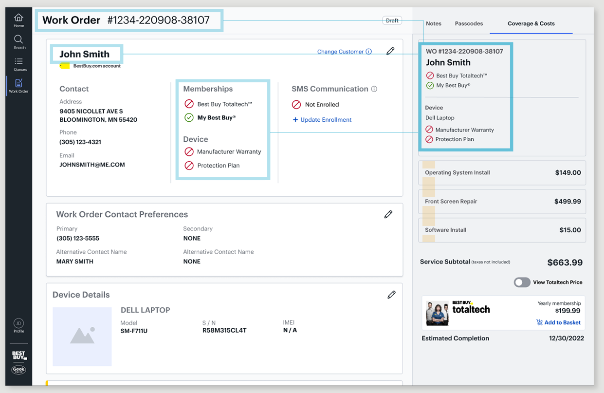
The top of the Cost & Coverage tab duplicated information already shown in the center-section Customer Information module: work order number, customer name, membership status, and device warranty. That duplication pushed the toggle and upsell component further down the page, below the fold in many cases.
Wasted Vertical Space
Every individual service was shown as its own full card instead of a simple divider line, using even more vertical space than the information needed, and making it even more likely the upsell component would end up below the fold.
Assignment
Review What the Membership Team Proposed
Alongside fixing what I'd inherited (important interactions pushed below the fold), I was also asked to review the membership team's own proposed redesign of the upsell, decide whether to build on it or take a different direction, and work with them either way.
What the Membership Team had Proposed
Change they Made
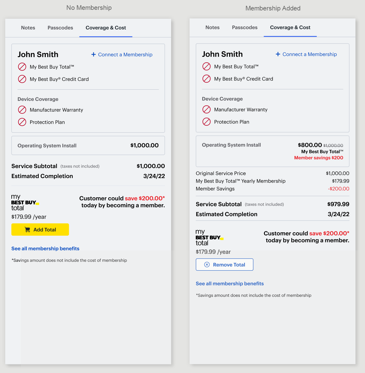
New marketing pattern, a way to tell customers how much they could save
New branding and logos for membership
Legal requirements addressed
A way to see all membership benefits
A button to add the membership, the same button to remove it
The membership team saw the potential in the repair scenario to help hit their own yearly goals. Their designer put together a proposal and presented it to the Product Managers before I joined the project.
Areas that Still Need Improvement
"Add Total" and "Remove Total" lived in the same location, acting as a toggle rather than behaving like a real shopping cart, where the item itself would live in the quote and get removed from there
The same $200 savings figure repeated twice once membership was added to the quote
"Add Total" read strangely as button copy, especially sitting in an area meant to show the total cost of the repair
The design only showed the savings amount, not what membership actually meant for the customer once its own cost was factored in, so the agent and customer still had to do the math themselves
What They'd Already Solved on the POS Terminal
An Idea Worth Bringing Over
The membership team showed me their POS terminal design, netting the savings directly against the membership cost: "Become a Total member for just $80.00," shown for the Total tier on the right side of the screen. One real number, no subtracting the membership savings from the price to know what it would actually cost. I loved the concept, and decided to bring it into my own design, if engineering could build it and I could fit it into a much smaller space than the POS terminal had to work with.
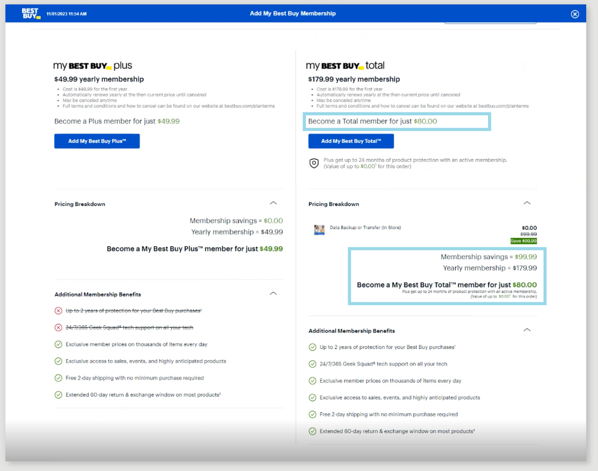
This reflects the membership structure at the time, Plus and Total tiers, before the rebrand consolidated it to Total only.
Exploration
Solving the Ask, But Pushing for the Real Issue
I brought two options to Product. One stayed entirely in scope. The other pushed further, exploring ways to keep the upsell component above the fold more often, testing how flexible Product would be with ideas outside the original ask.
Staying Inside the Constraints
Solved the Ask, Not the Issue
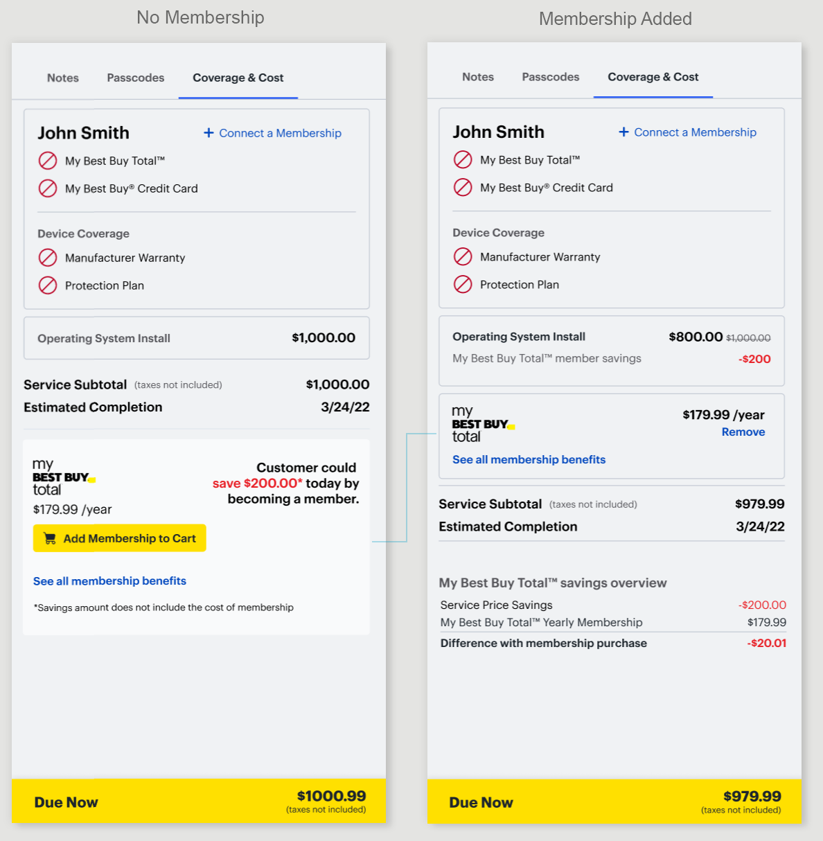
The first option I presented solved only what was originally asked, fix the toggle and upsell component, update the branding, leave everything else in the right rail untouched.
What it improved:
Gave the upsell component its own background, so an agent could spot it at a glance
Membership became a line item in the quote once added, with a standard "Remove" action to take it back out, common cart behavior
No more ambiguity about whether membership had actually been added to the quote
Where it fell short:
Nothing else in the right rail changed, the safest option for engineering
The upsell component and toggle would still end up below the fold on smaller screens or repairs with more services in the quote
Pushing Past the Constraints
Solving the Real Issue
I knew we could never guarantee the upsell component would land above the fold. So, alongside the narrower version, I explored a few different directions, including moving the component out of the right rail entirely, into a modal or the center section. (I'll compare those directions in more detail further down the page.)
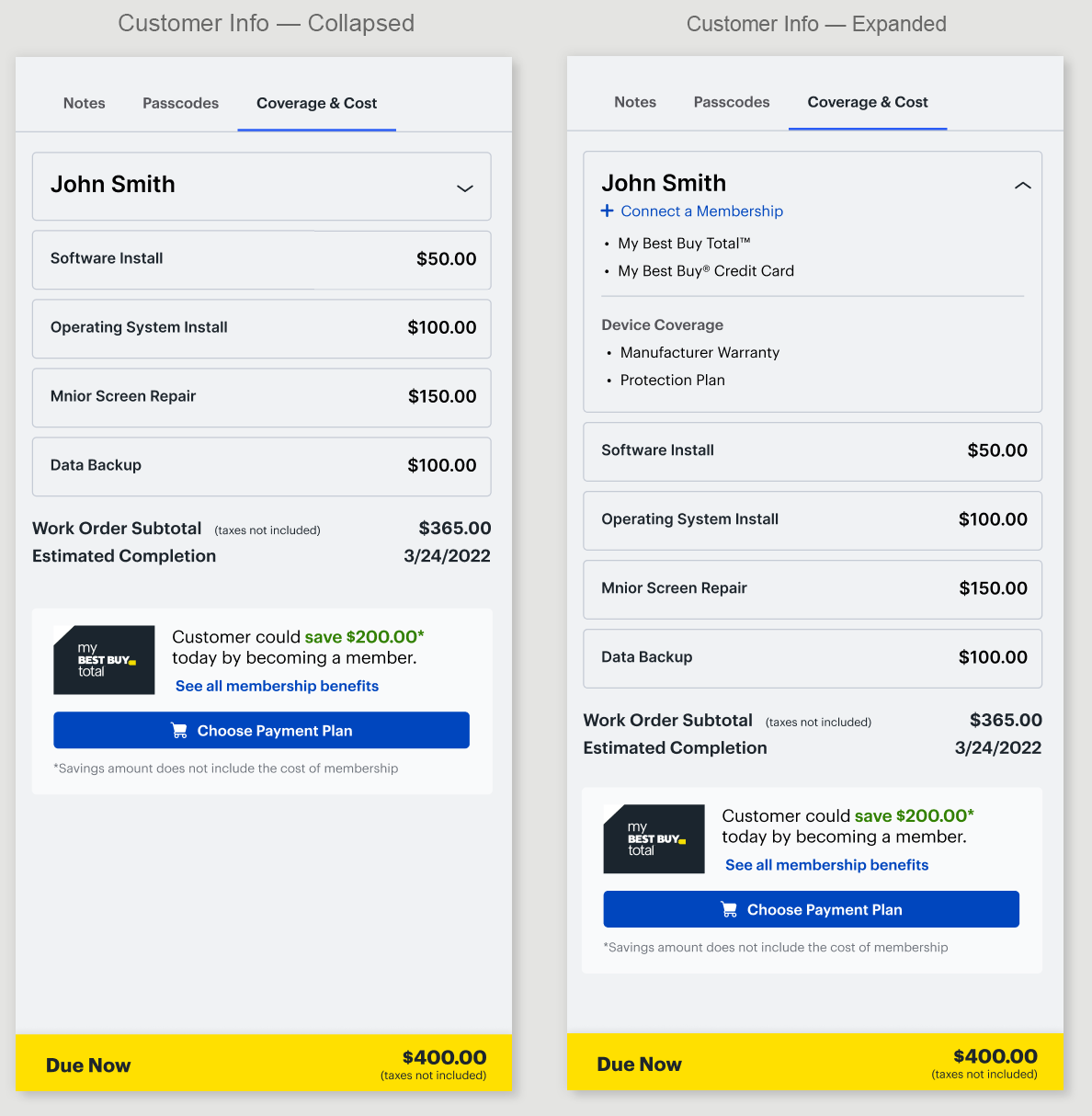
One of the biggest issues was all the repeated information already sitting in the right rail, customer name, membership status, warranty details, duplicated from the center section above. I put it into a collapsed-by-default container, cutting the visual noise and freeing up enough vertical space to move the toggle and upsell component higher on the page.
I showed my new product owners the full range, to see how open they'd be to solving the real problem, not just patching it.
Scope Expands
Build It Right, or Build It Twice
Seeing that I was already exploring past the original ask, Product agreed a bigger scope made sense, redesign the right rail as one unit, with new components where needed, not another round of patches. They told me why: future sprint requirements they hadn't shared yet, each one likely to push the upsell component further below the fold.
Requirements That Were Coming
Labor and parts priced out individually for each service
Eventually, a full parts list, priced per part for each service, not just a sum total
Yearly and monthly billing options for membership
Three Placement Explorations, One Required Step
With the bigger scope confirmed, I explored where the redesigned upsell should actually live. Wherever it landed, I was also designing it as a required step, an agent couldn't move forward without either adding membership or declining it on the customer's behalf.
In the Center Section
Placing the upsell component in the main intake flow (center section) meant an agent couldn't miss it, already part of the modules they were filling out in sequence. But it created two problems. The module grew very tall once the pricing breakdown and disclaimers expanded. And the timing was wrong: pitching membership during intake, before the full repair scope was known, meant asking too early. A customer might decline there, then once the agent opens the device and finds more work needed, the added cost could make membership worth it after all, but that module was already behind the agent, out of the flow they were in.
As a Pop-Up Modal
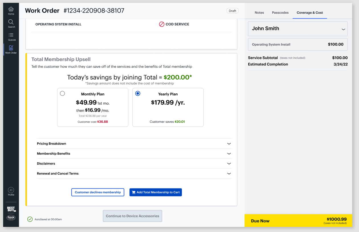
A modal would trigger at the right point in the intake flow, and could even be repurposed to appear again later in the fulfillment flow, if the repair scope changed and membership made more sense at that later point. But it would still need a persistent link somewhere on the page, so an agent could reopen it or edit a customer's choice, monthly versus yearly, after the fact.
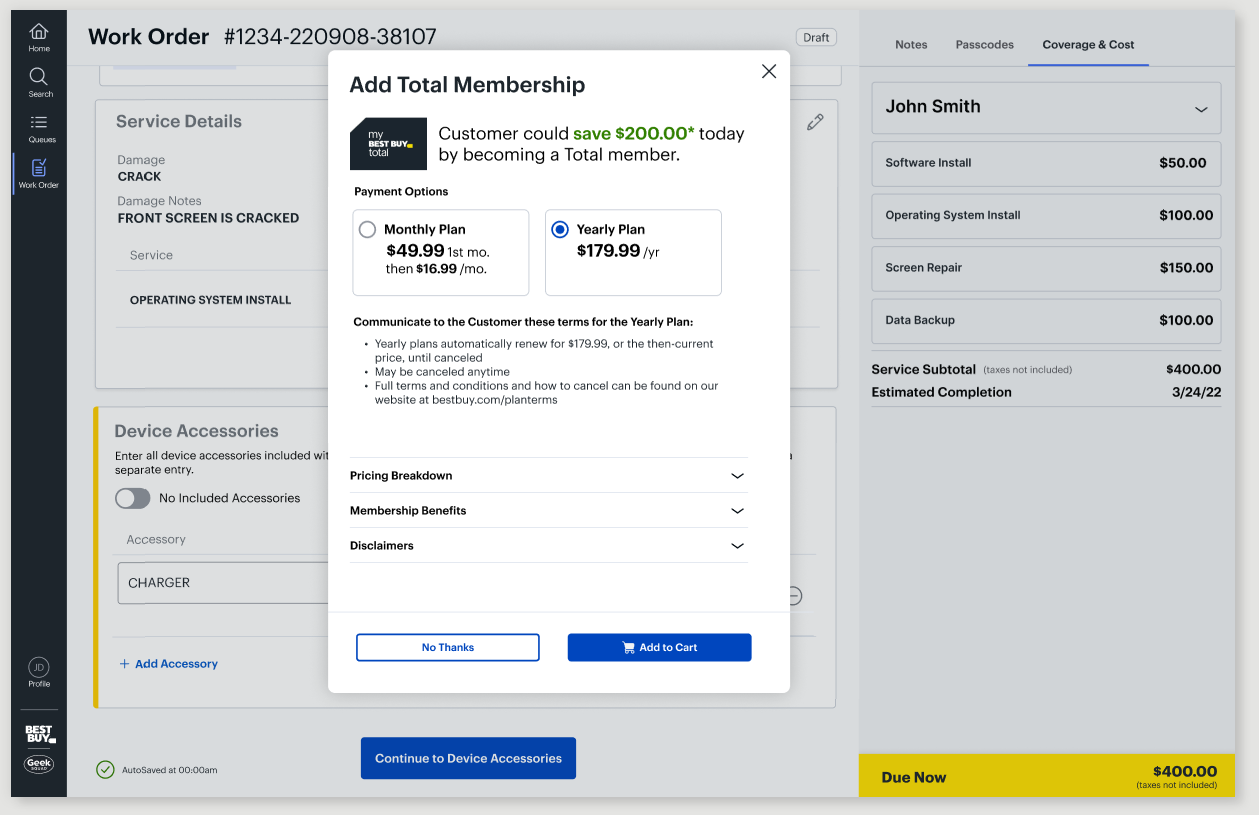
In the Right Rail
Of course, one option was keeping it where it already lived, in the Cost & Coverage tab of the right rail. This kept the upsell as one unit for engineering, reusing code and dependencies already built there instead of connecting new work across other parts of the application. The real con was visibility: an agent working through the center section's main flow would likely not remember to answer it in the right rail at the proper point. But it was an issue we already had a working solution for, the same required-field error message already built for other right-rail items. Not ideal, but the pros outweighed it.
Decision: We chose the right rail, as a team. The engineering constraint was the driving force, and it stayed consistent with a pattern agents already trusted.
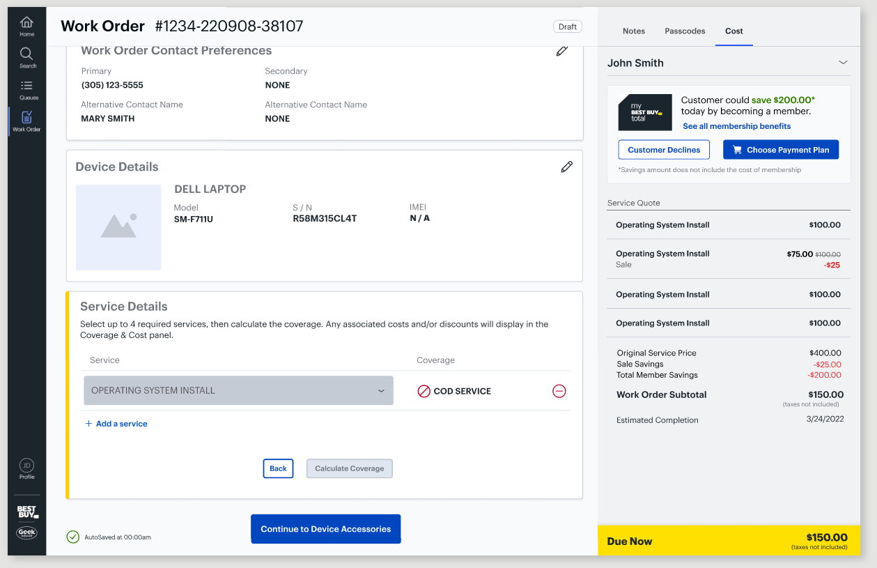
The Solution
No Math, No Missed Step, No Scenario Left Out
With the right rail chosen and the scope confirmed, I built the system: a required step so the “ad” can't be missed, monthly and yearly pricing shown clearly with no math left for the agent or customer, redesigned service cards and badges, and coverage for every scenario in the Cost & Coverage tab.
Redundant Information Now Anchor Linked
The right rail module repeated information already shown in the Customer Profile module at the top of the page, in the center section. Once I had more room to work with, I kept looking for ways to save even more space. Since the center section works like a wizard, rendering one module at a time, that information was still there, just further up the page. Why repeat it in the right rail at all, when I could point to the module that already had it, and let engineering maintain it as one component instead of two? So instead of hiding it in a collapsed container in the right rail, I removed it entirely and added an anchor link back to the Customer Profile section, saving a bit more space and letting the upsell component sit more comfortably at the top.
An engineer caught a dead click I'd missed, if an agent clicked the link while already at the top, nothing happened, no sign it worked. I added a yellow flash, matching our brand colors, so the click always confirmed itself.
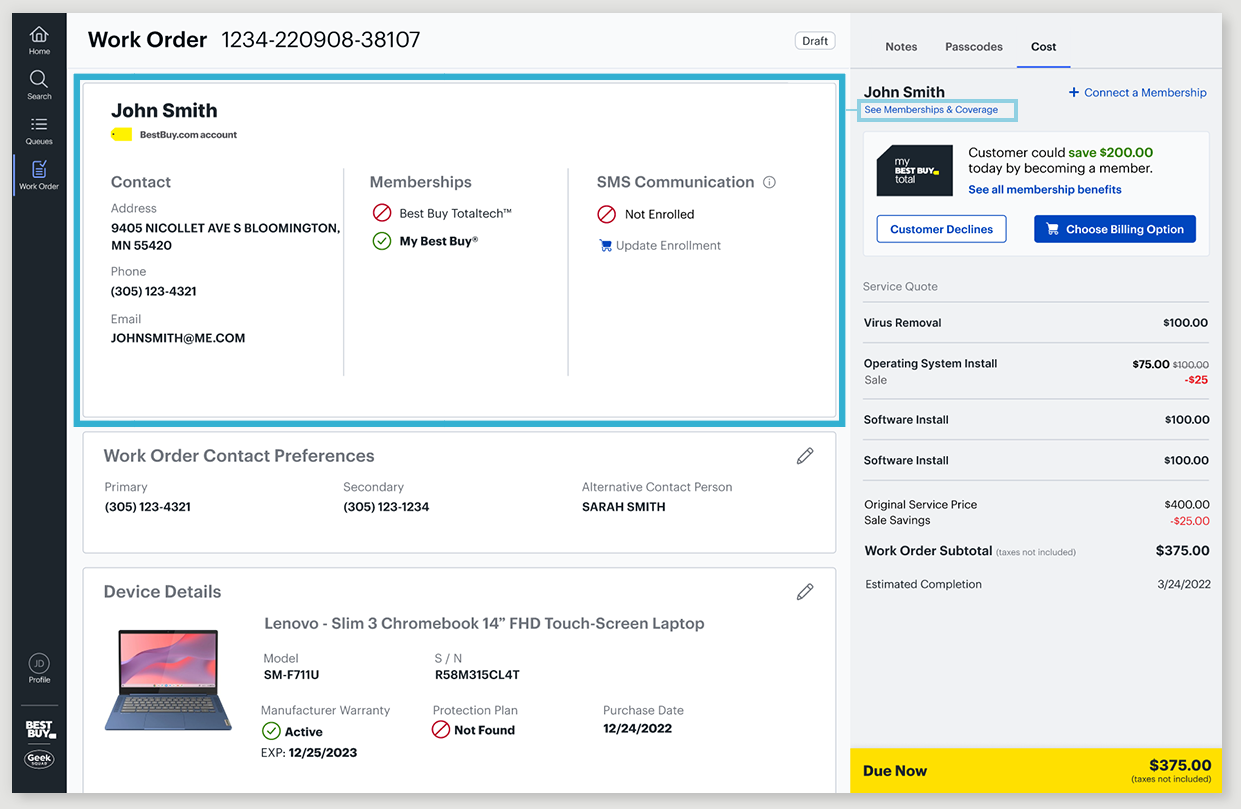
The Upsell Component, Rebuilt
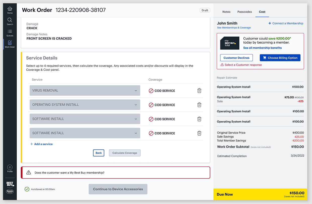
With the space that opened up, I moved the component to the top of the right rail, so it would never end up below the fold again.
Component Features:
New membership name and branding
Link to see all membership benefits
Two clear actions: Customer Declines, or Choose Billing Option, opening the modal to pick monthly or yearly
Two headline states: a savings amount when there was one, a generic version when there wasn't
Service line items simplified from full cards to single lines, cutting wasted vertical space
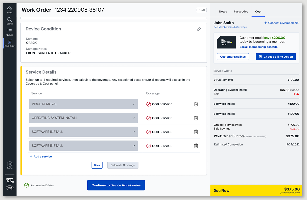
Now a Required Step
If an agent tries to move forward without adding membership or declining it, the error state reuses the same required-field pattern already built for other right-rail items, no new pattern to learn, just the same message they already know from elsewhere in the app.
Choose Billing Option
Monthly or Yearly?
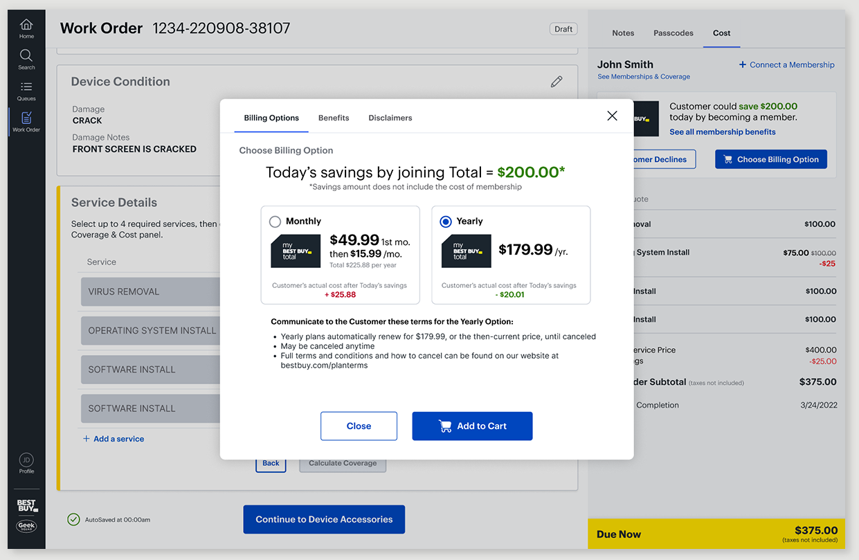
The membership team added monthly and yearly billing options, and the comparison wasn't simple. Monthly cost more over time, and was complicated further by an uneven first payment, the first month priced differently than every month after it. I wanted every number visible directly in the billing option cards, nothing left in fine print an agent or customer would have to dig for to actually understand what they were choosing between.
What Will This Actually Cost Me?
A customer hears "you'll save $200 with membership," then asks how much the membership costs, $179.99, and now everyone's doing math mid-conversation. I wanted to skip that entirely and just give them the important number: $20.01 saved. But the outcome wasn't always a savings, sometimes membership cost more than it saved. I used a green "+" for actual savings and a red "−" for additional cost, so the outcome was clear at a glance either way.
To validate it, we sent the design out to agents for feedback, and it came back clear, no confusion on the numbers.
Membership Benefits
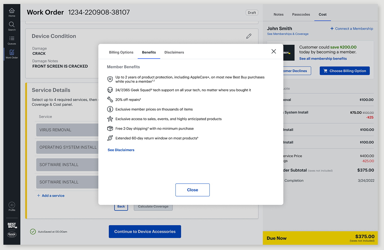
Listing the full membership benefits was a business requirement, Best Buy Total Membership offers more than discounted repair services, and Product wanted agents equipped to communicate that. I added a link in the upsell component to access the full list directly and quickly, so an agent could reference it during the conversation, or simply turn the monitor around for the customer to read themselves.
Disclaimers
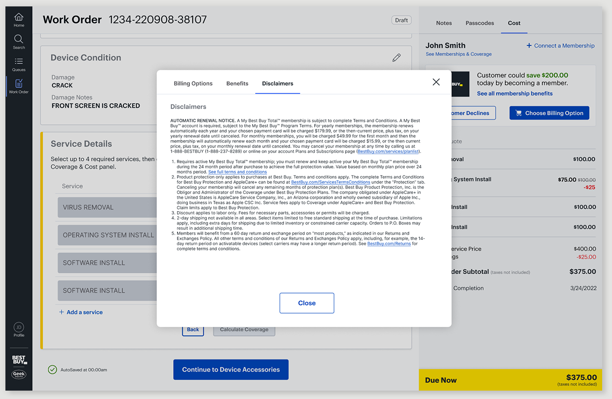
I worked with the Legal team to determine what disclaimers needed to be shown, then made the case for showing legal callouts only where they mattered in the flow, and only once, not repeated across multiple places. Legal wanted the "savings doesn't include the cost of membership" caveat on the top-level upsell component in the right rail. I convinced them it only needed to appear once, in the Billing Options modal, right under the $200 savings figure it was actually caveating. The full legal disclaimers still get their own dedicated tab.
Membership Added to the Quote
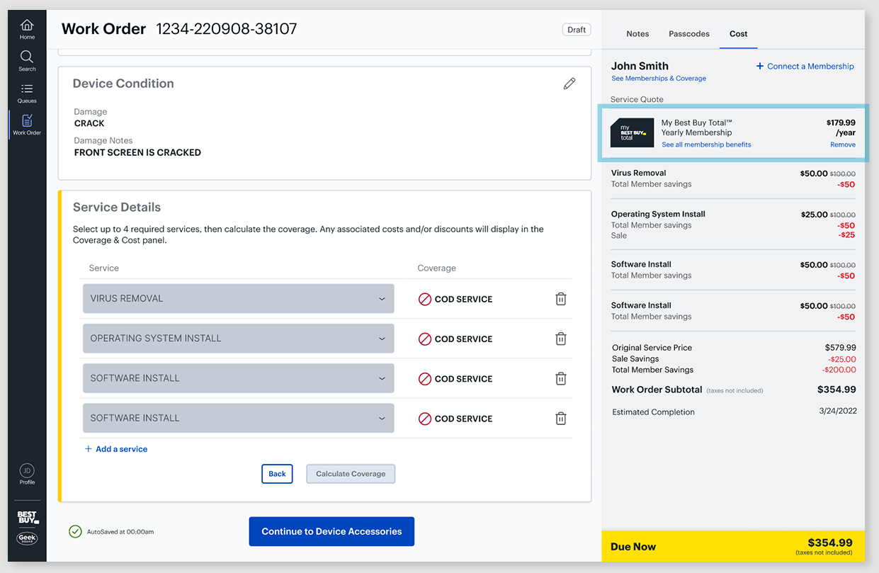
Once a customer decides to purchase membership, it's added to the Service Quote as a line item, with a standard "Remove" link to take it back out, the same shopping cart pattern used across Best Buy's e-commerce experience.
Customer Declined Membership
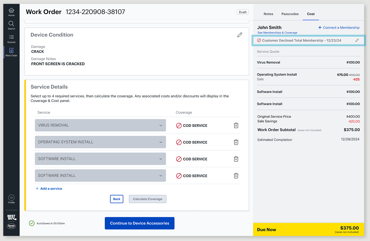
If a customer declines the membership, the upsell component is removed from the right rail to get rid of clutter, replaced by a single line, "Customer Declined Total Membership," with the date and an edit icon. Recording the decline itself was doing two jobs:
Stopping repetitive re-asking. Different agents interact with the same customer throughout the repair process. The dated line let any agent see it had already been asked, so no one re-pitched membership to someone who'd already said no.
Keeping the door open. Decline isn't necessarily final, an agent might find more work needed than the original diagnosis, and at that point, membership could genuinely save the customer money it wouldn't have earlier. The edit icon made it easy to reopen if the situation changed.
Future Proof & All Scenarios
The redesign still had to fit labor and parts priced out individually for every service, a requirement I knew was coming, into a module already packed with information. The upsell component now lived at the top, so it could no longer fall below the fold, but I wanted as much service information visible above it too. So I moved line items out of individual cards and into a more compact format, saving space and cutting down on scrolling.
Color-coded the total, so an agent could tell at a glance whether the customer owed money, paid in full, or was due a refund
Added status badges, Pending Approval or Unable to Complete, to services that needed one
Accounted for bundle discounts, and every stacked discount combination, in the engineering handoff, so nothing was ambiguous at build


Results
62% of previously non-member repair customers converted to membership, generating $30M+ in annualized revenue.
The prior system couldn't be measured the same way, so there was no before-and-after to compare, but Product and the business were thrilled with the result.
Reflection
Great New Collaborators
This was new territory for me, my first full project with the product owners on Reunion, one of the workflow areas within the application, alongside Fulfillment, which I already owned. But the collaboration clicked quickly, they started to trust my design rationale, the options I explored, and the customer insight behind them early on. The membership team was glad for the redesign too, especially once membership became a required step, no agent could miss the opportunity to offer it to a customer.
What I'd Do Differently
Real before-and-after numbers would have made a stronger case, both for the business and for the design decisions themselves. The old system's data didn't map directly to the new one, so there was no way to compare them or calculate an actual increase, we knew the new design performed much better, just not exactly how much. Next time, I'd ask earlier, both for a baseline before launch and for a target increase the business was hoping to see, harder inside Best Buy's legacy internal tools than it sounds, but worth pushing for sooner. I'd also want direct agent feedback on customer reactions in the moment, what actually motivated someone to say yes, insight the conversion number alone can't give me.